

What did you learn?
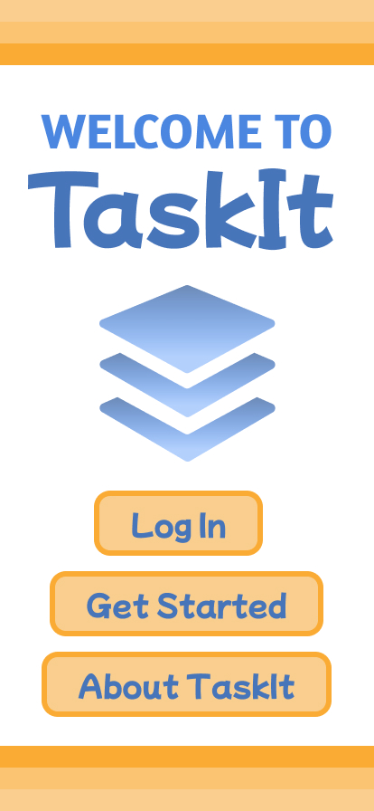
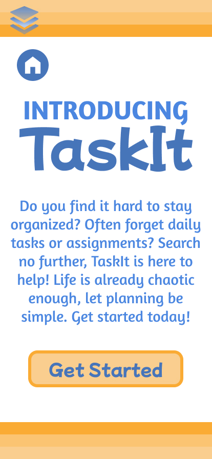
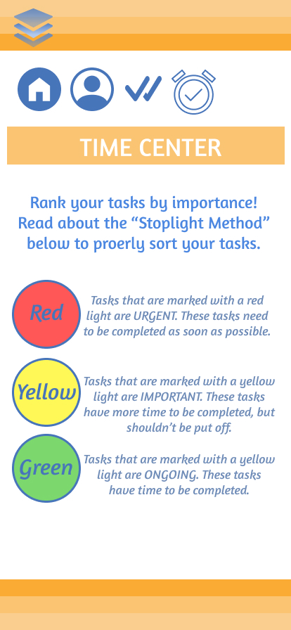
In this project, I learned how to design the frames of an app. Most importantly, I learned how to use the “Prototype” feature to make the app easily accessible and interactive.
What was easy?
I think that choosing the color schemes and features of the app were easy.
What was challenging?
Initially, it was challenging to work through the creation of components and variables. Previous to this project, I did not have much experience with making interactive pieces. Once I worked through this issue a couple times, it became very easy!
How could your submission be improved?
I think my submission could be improved by taking more time to brainstorm and sketch beforehand. Once I chose my features and color scheme, everything eventually lines up, but it took longer to get there! Additionally, I wish I developed a more efficient “flow” between my pages.
How could this assignment be improved for the next class?
I believe that the assignment is very clear and well-thought out. I don’t think there needs to be any changes.
How might you apply your knowledge in future assignments or work scenarios?
The skills and principles I learned from this project will be very beneficial for future assignments and work scenarios. I could use this as a marketing or social media strategy to engage my audience or bring life to my artwork.
How did a specific reading or video inspire or help you?
Although there was not a specific reading or video that inspired my images, I was inspired by all of the student examples. I went through each of the examples provided and could not believe how amazing they all were! Through this, I tried to make something just as great.
Link to my Figma prototype:
https://www.figma.com/file/kqEChLzoydL9FzWJPOaEw8/DMA217_Project1?node-id=0%3A1