2D Graphics – Project 4

1. What did you learn?

In this project, I learned about multiple tools and techniques in Adobe Illustrator. First, I learned how to use the pen tool to create a shape and properly make strokes. Then, I learned how to use the live paint tool to fill a designated area. Finally, I learned how to create a infographic that is both aesthetically pleasing and follows a consistent color pattern.


2. What was easy?

Due to the fact that Adobe Illustrator has a similar layout to Adobe Photoshop, I think that creating symbols, the legend, and compass were the easiest parts. Additionally, incorporating my color theme and text allowed me to be creative.


3. What was challenging?

In a different way, I did encounter a few challenges in this project. Although it was not extremely difficult, I did struggle to trace all the roads. Sometimes, the pen tool would not let me mark points close to the edges of areas on my map.


4. How could your submission be improved?

Overall, I am very pleased with how my submission turned out. However, there are a few things I could improve on. First, I would take more time to ensure that all of my roads are lined up to the colored areas. Also, I would create more variation with my trees – perhaps different types of trees.


5. How could the professor improve the assignment for the next class?

I believe the professor did an excellent job providing information, answering questions, and showing examples with this assignment. I really do not think this assignment can be improved for the next class – it is already well thought out and explained!

6. How might you apply your knowledge in future assignments or work scenarios?

The tools and techniques I learned in this project will be beneficial for future assignments or work scenarios. The pen and live paint tools in particular will be useful for clients or assignments in the DMA field.


7. How did a specific reading or video inspire or help you?

For this project, I did not have a specific reading or video that inspired or helped me. I analyzed past submissions for the assignment throughout the project. Other than this, I followed the demo shown in class to complete the it.
2D Graphics – Project 3

1. What did you learn?

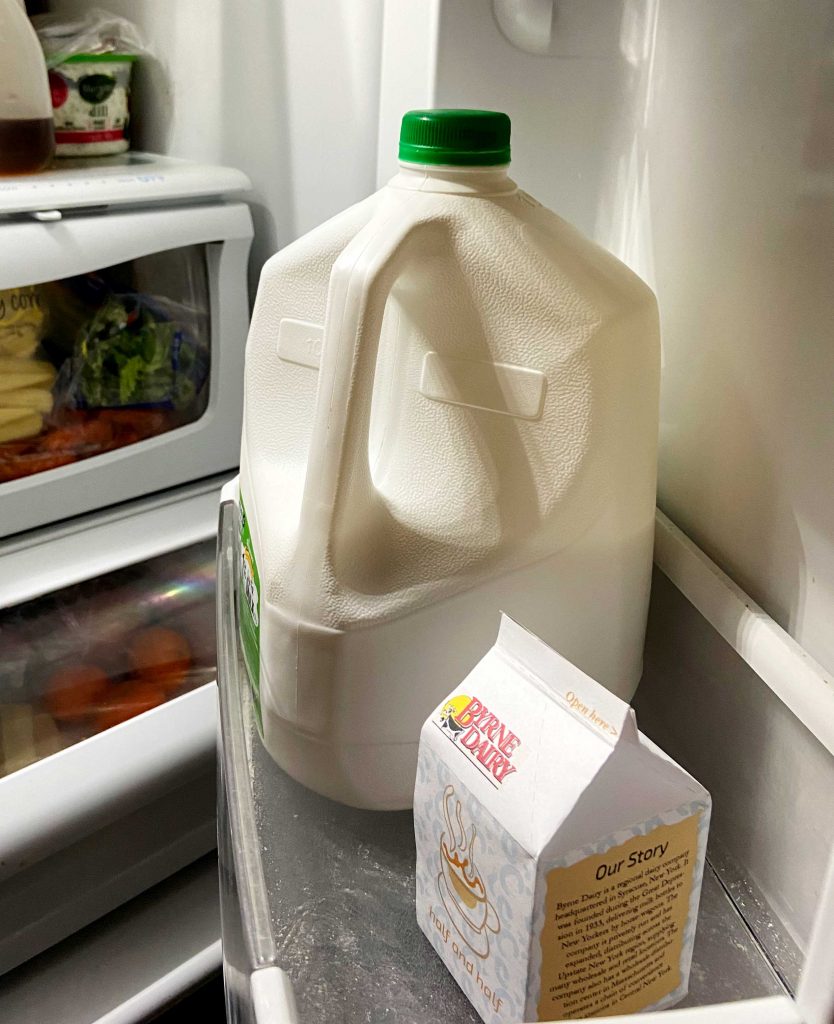
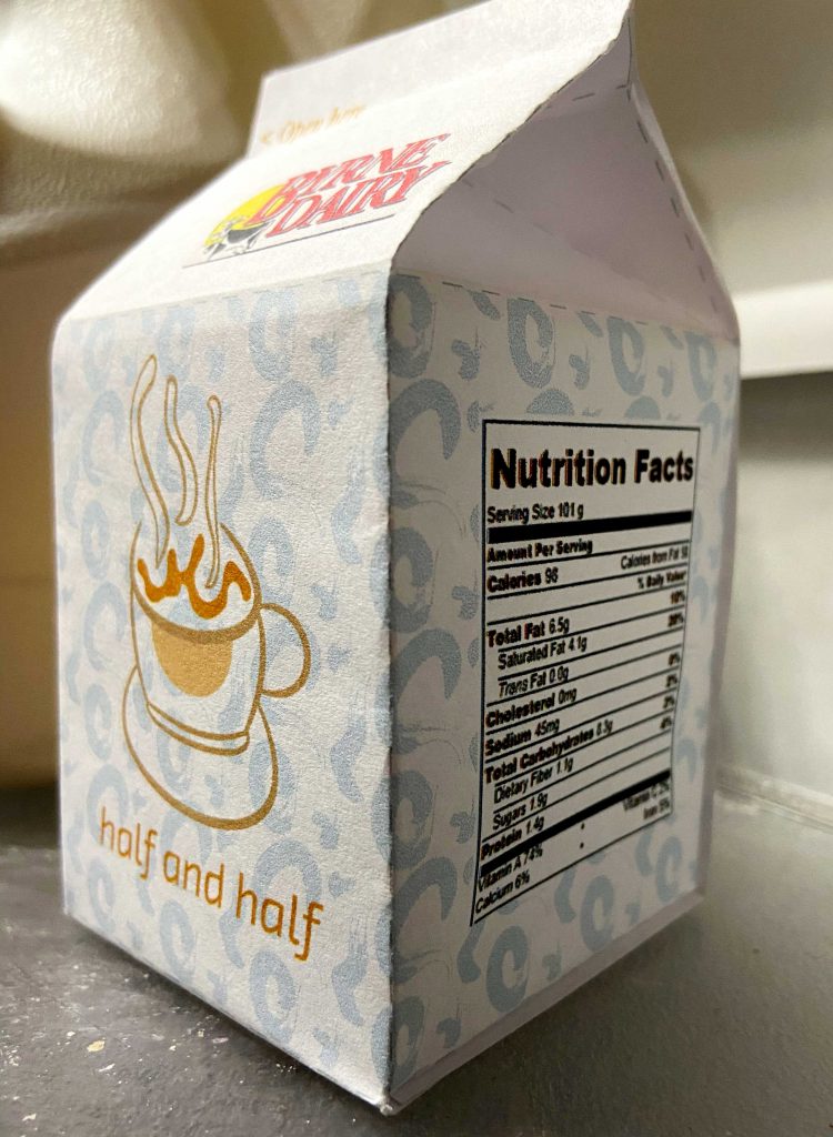
In this project, I learned about multiple tools and techniques in Adobe Illustrator. First, I learned how to use the pen tool to create a shape and properly make strokes. Then, I learned how to make and apply patterns. Finally, I learned how to present an item or product in a professional way with the constructed milk carton.


2. What was easy?

Due to the fact that Adobe Illustrator has a similar layout to Adobe Photoshop, I think that creating and applying a pattern was easy. It was a very simple process and allowed me to be creative.


3. What was challenging?

In a different way, I did encounter a few challenges in this project. Although it was not extremely difficult, I did struggle to make the coffee cup – mostly because I wanted it to look perfect! The most challenging part of this project was assembling the milk carton. I am not very good at constructing things made of paper and found the top of the carton to be extremely difficult.


4. How could your submission be improved?

I believe that my submission could be improved with the Byrne Dairy logo. I would have liked to use the version of the logo that I made, but it did not look the best. If I had the time, I would try to remake the logo and use it on my milk carton.


5. How could the professor improve the assignment for the next class?

I believe the professor did an excellent job providing information, answering questions, and showing examples with this assignment. I really do not think this assignment can be improved for the next class – it is already well thought out and explained!

6. How might you apply your knowledge in future assignments or work scenarios?

The tools and techniques I learned in this project will be beneficial for future assignments or work scenarios. The pen and pattern tools in particular will be useful for clients or assignments in the DMA field.


7. How did a specific reading or video inspire or help you?

For this project, I did not have a specific reading or video that inspired or helped me. My pattern was modeled after a half and half carton in my refrigerator that had a variety of blue swirls on it. Other than this, I followed the demo shown in class to complete the project.

2d Graphics – Project 2

1. What did you learn?

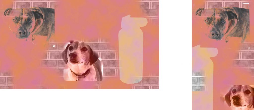
In Project 2, I learned many things! First, I downloaded a texture and applied it for the first time. Then, I learned more about creating a background. I began with a simple clouds background then used the paint tool to create a new background with the texture. Additionally, I became more comfortable with the pen tool and making my shape transparent.


2. What was easy?

Due to my background in photoshop, I found numerous things easy! This includes cropping and scaling all three images, creating a background (clouds), and using the pen tool to make a shape out of my third image.


3. What was challenging?

In this project, I found working with the texture to be the most challenging. Prior to this, I only used textures from my photographs. Instead of doing that, I downloaded a texture from the website you recommended – which is out of my comfort zone. However, after re-watching the class and experimenting, I solved my minor issues and created an image I am satisfied with.


4. How could your submission be improved?

I believe that my submission could be improved with the texture aspect of the project. I did not like how my only option for the texture was my dog’s fur. So, I downloaded a texture from the website you recommended. As a result, I would have spent longer searching for a better or more effective texture for my project.


5. How could the professor improve the assignment for the next class?

I believe the professor did an excellent job providing information, answering questions, and showing examples with this assignment. I really do not think this assignment can be improved for the next class – it is already well thought out and explained!

6. How might you apply your knowledge in future assignments or work scenarios?

In regards to future assignments or work scenarios, I think that my knowledge about Photoshop. I know a lot about the program and can my knowledge to freelance and professional work.


7. How did a specific reading or video inspire or help you?

In this project, there was not a specific reading or video that inspired or helped me. Since the images I used are from Project 1, I wanted to portray my dogs in a different way. Here, my dogs (Teddy and Toby) are shown in a unique and artistic way whereas the first project portrays them in a very realistic, yet enhanced, way. As a result, my project was influenced by Project 1.

2D Graphics – Project 1

1. What did you learn?

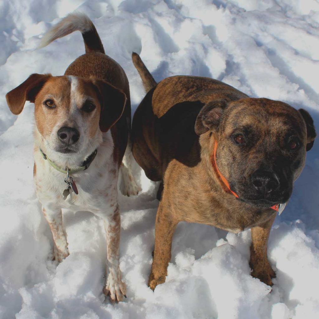
In this project, I learned that altering different properties of an image drastically alters it. When you take a picture on your phone or camera, it can look great with good lighting, angles, clarity, and other characteristics. However, if you change the brightness, contrast, saturation, sharpness, levels, and curves, the image can be even better. Additionally, I learned more about the tools I use in Photoshop and used InDesign for the very first time!

This picture, for example, is completely different from the original (which is unfortunately too big to add to this post). Here, you can see how the light hits both of their eyes as well as the saturation of the their fur ad collars enhance the photograph. Without these adjustments, the picture would be quite dull and lack appeal.


2. What was easy?

Due to my background in photoshop, editing the pictures in Photoshop was the easiest part. After the first photograph, I seemed to get into a system where I would bring a picture into Photoshop and follow the same routine: edit the properties, save full version of the image, save the web version, and then save the thumb version.


3. What was challenging?

Throughout the time I worked on the project, I encountered a few issues. First, when I would attempt to save my photograph for web legacy, the width and height would not cooperate. Traditionally, the photograph should be 1920 x 1080 but when I would try to alter the numbers, they would equal or mirror each other regardless of how I typed it in. A solution I came up with for this problem was “unlinking” the width and height and manually entered the measurements.

Another issue I encountered was my web portfolio. I used Brackets to upload all of my images to my virtual portfolio. But, when I clicked on the thumb version of my picture, the web version would not show up. Fortunately, I was able to solve this issue fairly quickly by changing and matching the titles of the images!


4. How could your submission be improved?

I think my submission could be improved in InDesign with my print portfolio. Some of my photographs were taken or photoshopped vertically while others are horizontal. Each page has the same size rectangle box to place the photograph, but due to the variety of measurements and layout, everything does not match. Although this is not a huge flaw, I would like to come up with a solution for this.


5. How could the professor improve the assignment for the next class?

I believe the professor did an excellent job providing information, answering questions, and showing examples with this assignment. However, I think it would be beneficial if the class could see a full example of an print portfolio in InDesign and a more in depth lecture on how to apply all the pictures in the images folder to Brackets.


6. How might you apply your knowledge in future assignments or work scenarios?

In regards to future assignments or work scenarios, I think that my knowledge about Photoshop, InDesign, and Brackets will be beneficial. Although I am not completely comfortable with InDesign or Brackets, I know foundation information for each program. With Photoshop, I know a lot about the program and can my knowledge to freelance and professional work.


7. How did a specific reading or video inspire or help you?

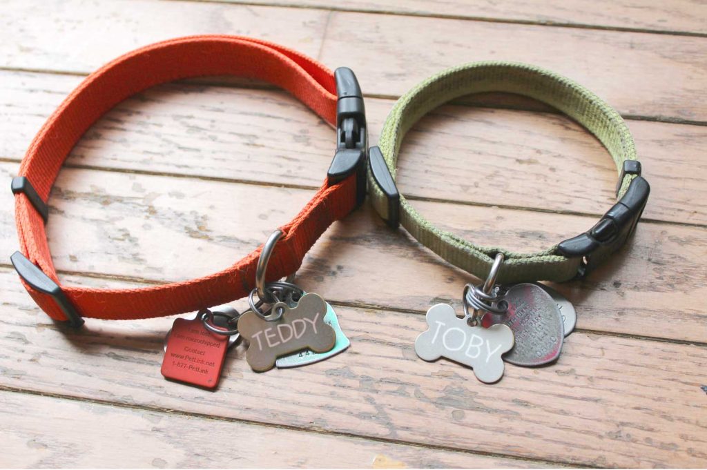
When I was trying to choose a theme for the first project, I tried to choose something very meaningful. The first idea that came to mind was dogs! I truly love dogs and believe they make my life ten times better. So, I was not inspired by a specific reading or video but by my own dogs: Teddy and Toby! When I began editing, I really did not know where my portfolio was going or what kind of edits I would make to all of my images. As a result, my dogs solely inspired a very original collection of images.

2D Graphics – Lab 1

  1. Compare your photo with the one with Unsplash. What are the differences? Why is one “better quality” than the other?
  2. Compare your photos with scans. What are the differences? Why is one “better quality” than the other?
  3. What could you do to improve the quality of the images acquired by each method?
  1. For this lab, I chose the picture of the beagle on the left from Unsplash.com. I took a picture of my dog, Toby, to replicate the original. With both photos side by side, it is evident that there are a few differences. In the “professional” photo, it is brighter and incorporates warm tones. It also seems to have been taken on a higher quality device compared to the picture taken on my IPhone. While my picture is not as bright and incorporates cool tones. If I were to chose one of these images to share on Unsplash.com or social media, I would use the “professional” image simply because it seems to have better quality.

2. Here, I have one of my three scans: a picture of me and my great grandmother. I took a picture with my IPhone on the left while the right was scanned onto my computer. It is clear that the scanner altered some of the colors and lighting in the picture. For example, the Nike sweatshirt I am wearing is a bubblegum pink in the original (which is the correct color) while the scanner caused it to appear magenta. Through this, the lighting is also different. If you look at both my great grandmother and my faces, you can see that the original has more lighting and color. If I were to share this picture online, I would definitely use the original because it looks more natural and brighter than the scanned copy.

3. In regards to improving the quality of the images from each method, there are a few things I could do. In the picture of my dog, I could changed the setting — perhaps somewhere that has better lighting or where I could capture the picture at a better angle. Additionally, I could improve the quality of the picture by adjusting some of the settings such as: brightness, exposure, warmth, sharpness, definition, etc. In the old picture, I could try taking the picture in different ways: with flash, closer, or further away.