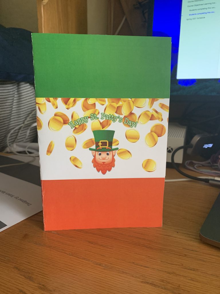
In the process of completing project 1, and working with photoshop to make my holiday card, I learned a-lot more about the intricacies of working with photoshop to create a professional looking print. I’ve used photoshop before many times to create fun images and whatnot but this was the first time i’ve used my skills to actually print a physical copy of something in a higher quality with good resolution. For me, the actual design process was fairly simple but I had difficulties in the printing. I struggled with formatting my design to cover the entire page, when I would open my .pdf file of the card in acrobat the designs would only cover about a quarter of each page and I couldn’t resize to fit the whole page. Eventually I figured it out however as I was able to resize the images in a different program. I think that my submission could be improved maybe by just a more creative greeting or concept as a whole. I think that I could’ve made my card more eye-grabbing and reactive definitely. I think the professor could improve the assignment for the next class maybe by having the students use a bit more tools in photoshop or even just requiring them to make them use a few different design techniques to further enhance the card if possible. I will apply the method of tying on a path definitely in the future when I work on assignments and I will also make sure that I have do more adjusting and testing in regards to my printing. The wikipedia reading about print design helped me figure out what my cover design was going to be because it talked about the use of a stamp and I figured I’d use a leprechaun to act kind of as a stamp and emboss it a bit to make it stand out like a 3D element almost.
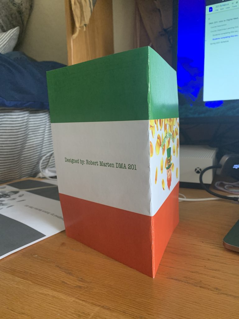
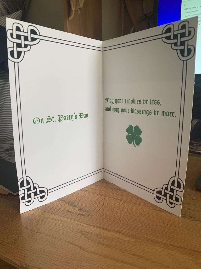
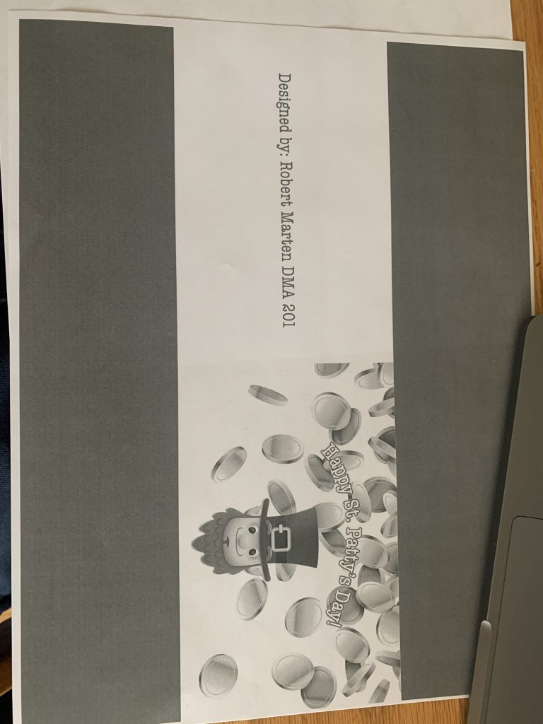
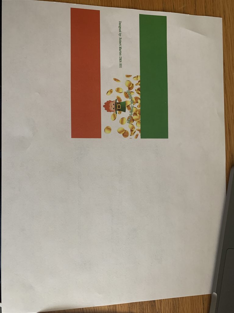
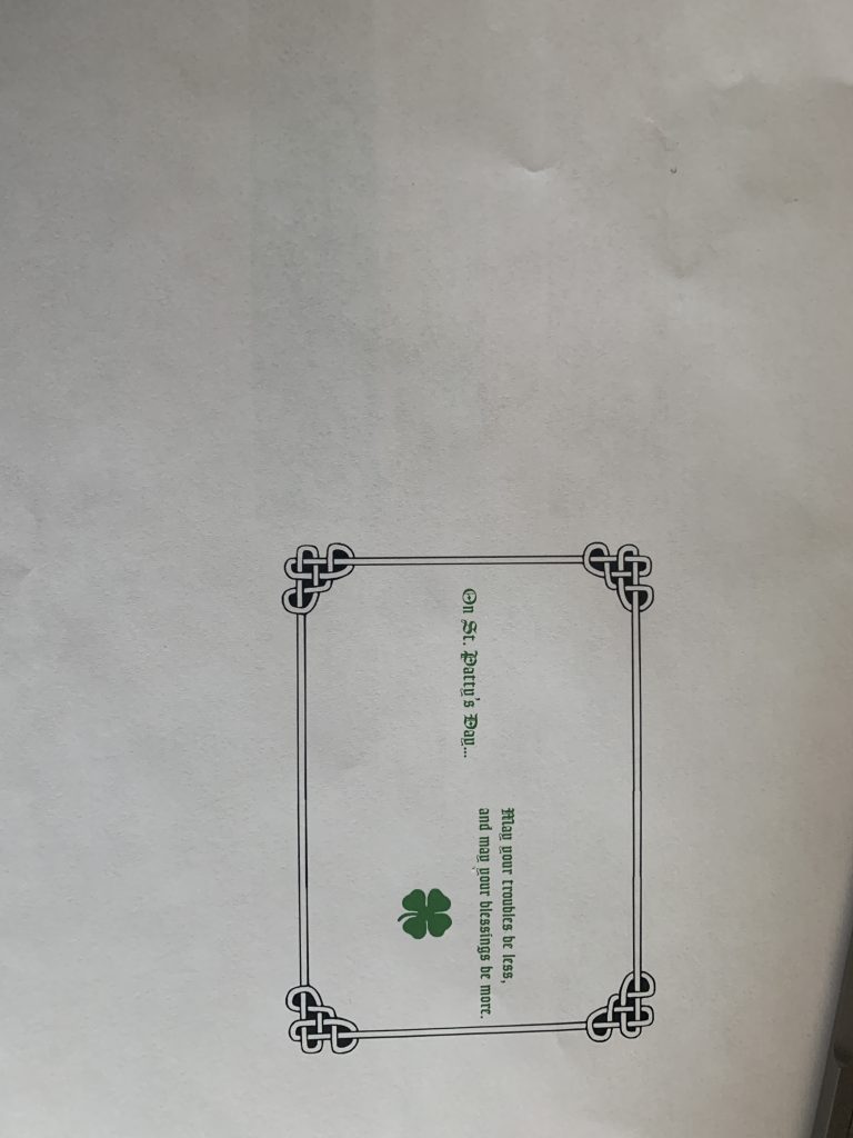
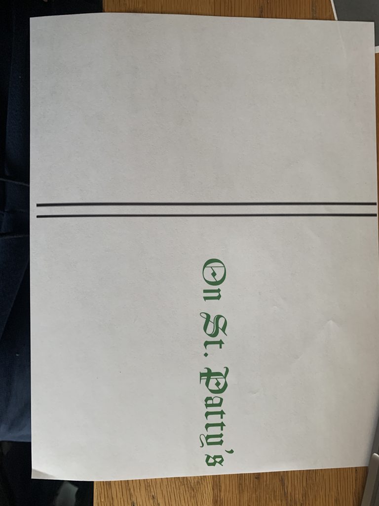
Here are the images of my final printed card. Thank you!


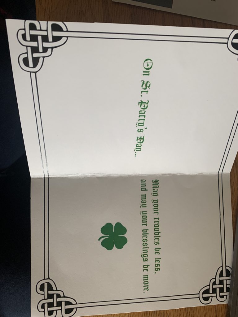
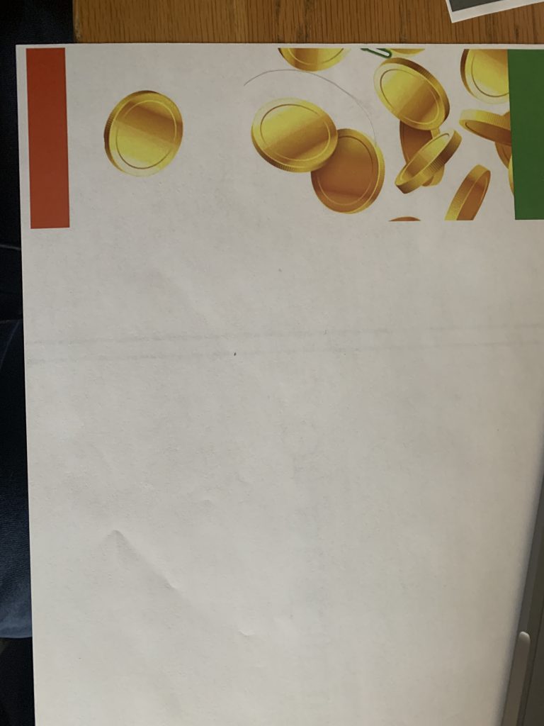
W.I.P pictures; these were the results of the difficulties I was having when printing and had to work around. I was mainly having sizing issues.
