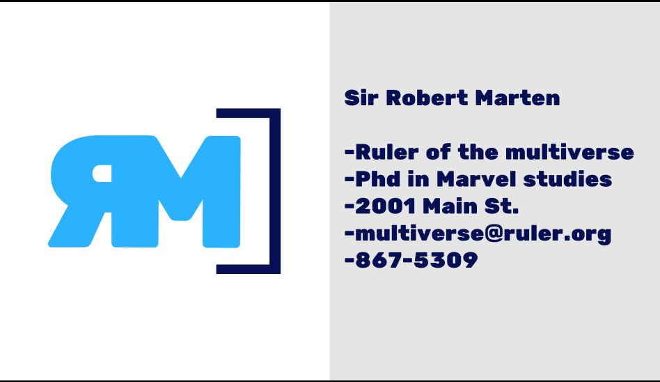
After completing my second project for this class being the creation of a brand or making my business card, I actually learned a-lot of new stuff about the vector arts. First off, on my laptop I have here at school I do not have illustrator, whereas normally for vector or logo related tasks I would just use my pc at home, so instead I had to download and use Figma. I love Figma. I had to learn the program from scratch and it was extremely easy to pick up and begin scaling. I learned more about the scaling process in the sense of the points, and where to look at the points of my art and how to manipulate them to scale everything better. For me, the initial design process was easy, and it didn’t take me long to get my rough shape out of what I was going to create. I decided to play with my colors a-lot, changing about three or four times the theme I was going with, but it was all made very easy for me with the user friendly face of Figma. Something I struggled with was adding new shapes and really getting everything to look proportionate and like it belonged on my card in the area it was placed. I think my submission could have been improved maybe by adding additional graphics or even effects. My card I believe is a very clean design, fairly simple, but straight to the point. Maybe I could’ve added some additional shapes or elements to make my card design more dimensional. I think for the next class maybe we could do more on the back of the business card kind of like the holiday card we did. That might be fun. I will apply what I learned in future assignments definitely and also in future work scenarios whether that be in creating another monogram logo or even something like a flyer or poster. Vector graphics are extremely useful and practical in the every day world. It is also just really good to be fluent in as many programs as possible as it makes you more valuable. A specific reading that helped me was actually a video on youtube I watched about the design process and the idea of keeping things simple. Clean lines, small details, consistent flow with maybe a little something extra to catch the eye, etc.
