The final project of the semester is creating your own video out of an emotion. I had good film on my phone from the summer so intended to use that because I remembered a video I took that actually quite scared me. I’ve always had a fear of open water and swimming in the ocean. I’ve also never been cliff jumping before. So combining the two when I went to Italy this past summer definitely embodied the emotion of Fear.
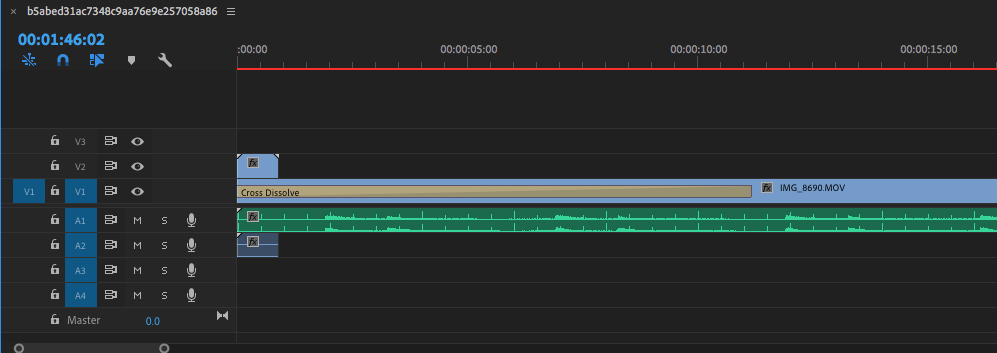
The first portion of my clip was the animation that I created with the word fear scrolling across the page. I made the cross dissolve longer so the black of the animation would fade nicely into the next clip. I then added 5 of the clips I would use for the project. I used them in a unique order to show my travels of the trip and to build suspense through out the entire video.
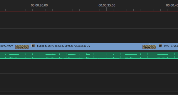
For each clip I used the cross dissolve transition as I feel it is the most visually pleasing to keep the video moving.
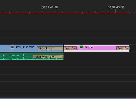
At the end I also used the cross dissolve to end the credits theme as I couldn’t figure out how to get the credits to scroll. I felt as if this was an appropriate function for the credits. Lastly I added the sound. The sound track I created at home and honestly took me the longest to create out of this entire project. I used two instruments in garage band and that was the grand piano and the tuba. I feel as if the long notes of both of these instruments captured the emotion of fear very well. the beginning of the audio is slightly different from the rest of the clip as it gradually goes into the clip. All in all I enjoyed this project as I have used adobe premiere before but a lot has changed in the last 10 years since I used the program. It was a good skill to finish out the class with. Overall I learned a ton of information about digital media and the programs we used over the last semester.
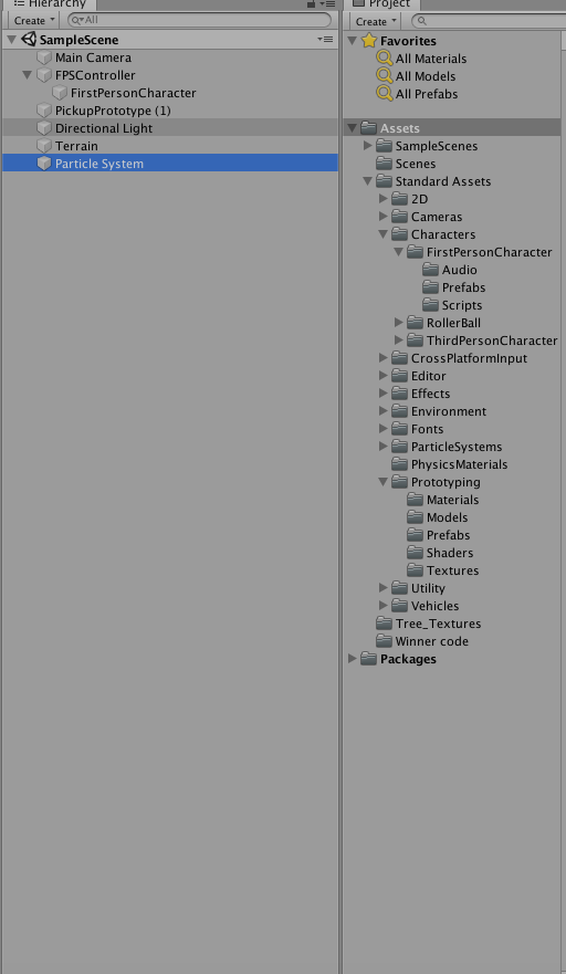
I found this project to be very challenging and one of the harder tasks out of all the projects and labs. The frustrating part about this project is first, the computer I originally sat at did not have the unity program on that computer so I started off very behind on the game because I wasn’t able to go along with the professor. Second due to the fact that I was behind I had to semi teach myself from the lecture video which was difficult because there is a lot that goes on with this project. Third I had to start over 5 times.
After doing 5 projects all the way through it is a little disheartening and the crazy part I still wasn’t very proficient with this program.
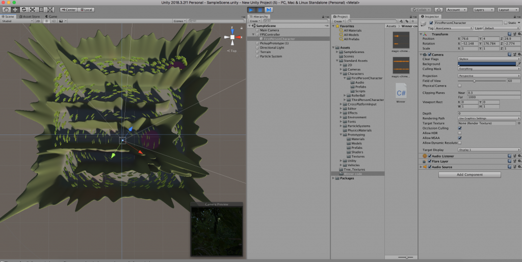
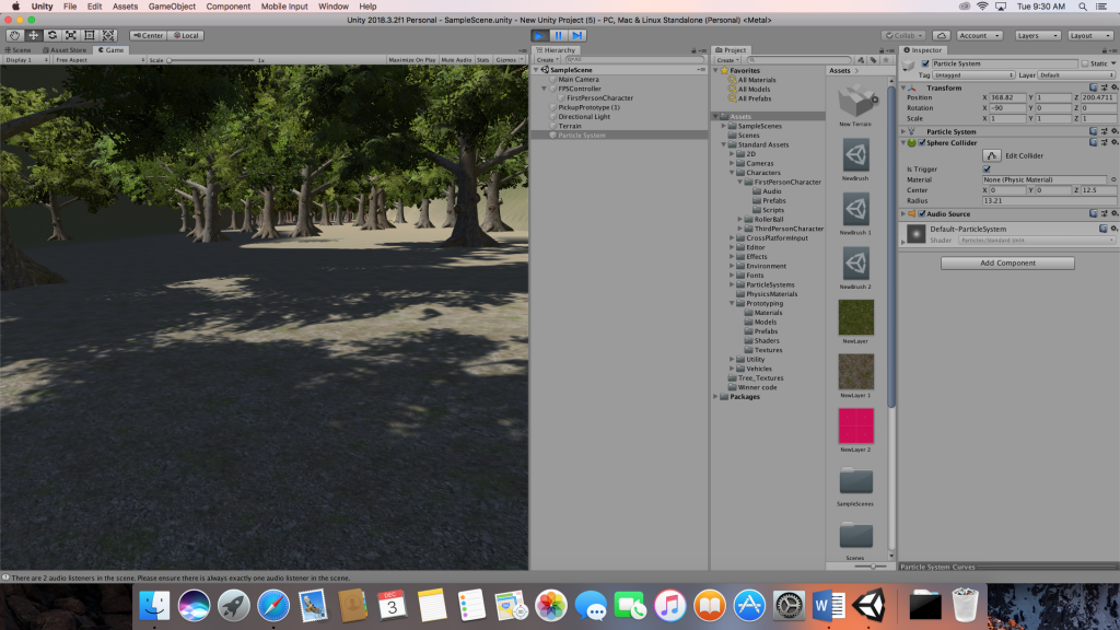
One of the biggest challenges is learning the amount of files that go into just one project. There is an unlimited amount of things that you can do with this program though which makes it quite interesting. I did find myself searching the assets store seeing what someone can make with Unity.
One of my main difficulties with the program was figuring out the camera angles and being able to move the camera angle around. As well as the character that we built to wander the maze. However, I was still able to create my character and navigate him through the maze. This was nice to be able to do after starting the project over 4 times.
The last and final issue I had that I was unable to figure out was the collider with the coin and the animation that would follow that. Even though I input everything correctly I was still unable to get the animation to work. I didn’t feel as bad because others were having the same issue that I was having.
First the monogram, I liked the idea of having two smaller initals linked with a the first larger initial. The S worked perfectly with that. The only hard part about the monogram was linking the two smaller initials with the larger initial. It took awhile to tinker with the curvature of the lettering before it looked natural and smooth.
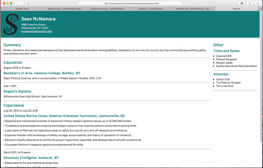
This is my first time ever working with code so it was a completely new skill. When I first opened up Dreamweaver and downloaded the scripts I needed to start my page I was quite intimidated by what I saw. To someone brand new to this the script looked like hieroglyphics, but after doing some of the simple tasks editing the page it started to become easier to me. Towards the end of the project it was actually quite entertaining to rearrange the script and watch your web page change. My favorite aspect of the project was changing the color of the header and the title words. I believe it ads a unique touch to my resume.
I also changed up my side bar to add a little bit more of a personal touch. I enjoyed this project the most out of the other four. Which is surprising because I really do enjoy working with photoshop!
Hello all, this is my first project for DMA 201. This project made me flash back to when I was in 11th grade. That being because I haven’t used Photoshop since then. Surprisingly, that was 10 years ago and a lot in Photoshop has changed since then. There are a few things that have remained the same. Some terms definitely stuck with me, such as the “marching ants” and the magnetic lasso tool. However, Photoshop has definitely evolved and become much more complicated. So being fully truthful I had some difficulty with this project and adjusting to the changes that have been made. Another thing that has made this challenging is using a Mac. Ive never had a Mac computer and always used windows software so this added a bit of challenge to this as well. I am happy that we are using Mac’s because I did end up being a Mac desktop a week before we started this class, so I will definitely will take a great deal out of this class.
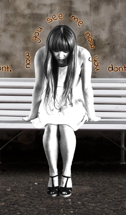
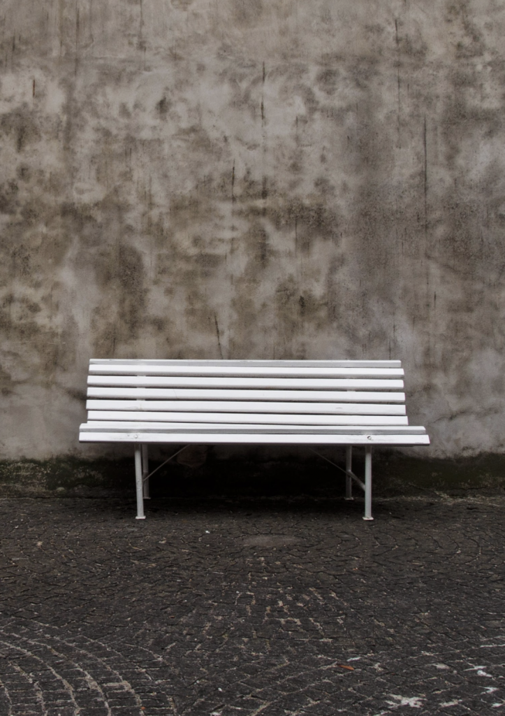
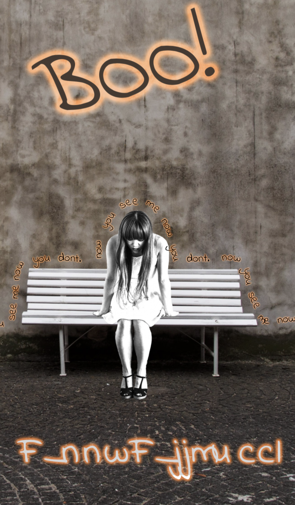
First off, I wanted my Halloween card to be spooky. So what’s more scary than something appearing out of nowhere? I started looking for a simple image to use that could play as a good background and easily piece a second image in. (basically the thing that appears out of nowhere.) I found this image on google using the tools. It fitting the right parameters of being a large size image and being labeled for reuse. So I found my background image, I thought that the tricky part would be to find someone or something scary to put sitting on the bench but I actually got pretty lucky and found an image that went well with the background and sat well on the bench.
This image of the girl I found had felt like a good find. She pairs well with the bench and the image size was around the same size as the bench I just had to size her image down a touch. I used quite a bit of the touch up brush to bring a lot of the image back because some of it the tool didn’t pick up. (like the portions between her heels and arms.) Other than that this was pretty simple.
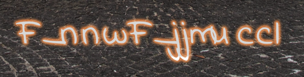
The text portion of this project was interesting. I had no clue that you could download different fonts off the internet and after learning this I have started noticing a lot of differences in text between advertisements and other businesses use. This portion of the project was simple as well. The professor mentioned that I should put an outer glow on my text to make it pop and I think it does a good job of doing so. It also adds a little more color to a rather black and white Halloween card.
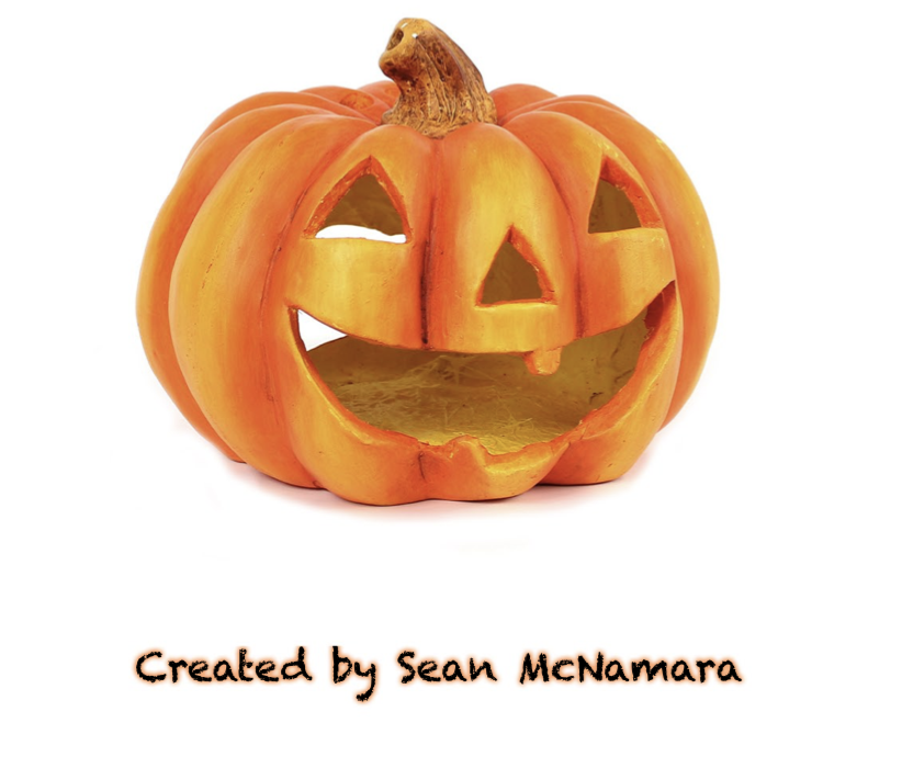
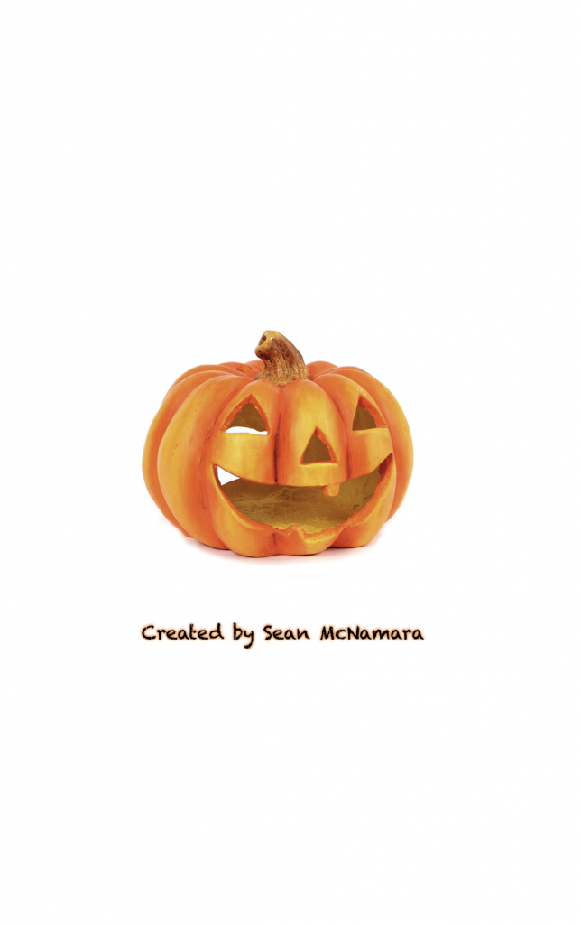
For the back of the card I did a simple image from google but I did edit the image a bit. The white background that the pumpkin came on wasn’t a complete match to the white background that I had on the card. Particularly around the shaded parts of the pumpkin. I actually reduced a good amount of the shading underneath the pumpkin. The image originally looked as if light was coming in from the right side of the pumpkin creating more shadow on the left side. I took away most of it and now the shading is more towards the bottom. I feel as if this gives it a more pleasing look. I used a different font for the back of the card but copied the look of the outer glow because I liked this look.
The portion of text that is wrapped around the image is poorly done I believe. It was difficult and it took me about 20 mins to just get a basic line around the image to wrap the text and it still ended up crossing over parts of the girl. (pictured above.) As well as portions of the bench. These are factors I’m going to have to touch up.
Finally, I was ready to change my Photoshop card into a PDF so I could print the card. One issue I ran into was when I changed the file format the text that said “Happy Halloween” at the bottom of the car had malfunctioned. I don’t know why this occurred but it was something I had to go back and change. Then recreate another PDF file.
In the end I feel like my project turned out well with how long it’s been since I’ve lasted touched Photoshop. There were a few other things I had trouble with. The first being the layer masks. I was struggling to grasp the fact that this wasn’t just Microsoft paint and I couldn’t just crop out an image. after awhile I think I got the hang of it but I definitely need more practice. The next was printing. The first time I printed out my card it both sides were opposite facing each other. This was frustrating and I wonder if that was because of an error I did on the printer or an issue with how I printed the file from the computer. All in all I feel like there is still some work to be done on making this a better project but believe this was a good start to honing my Photoshop skills.