

What did you learn?
I learned about creating imagery in Photoshop. I learned how to mask different parts of layers and edit the layers masks using the brush tools. I also learned how to use and export artboards to create multi-page documents in Photoshop. In addition, I learned about the role of type and the different ways in which certain fonts and typefaces can be used to communicate ideas and emotions.
What was easy?
I found it easy to add effects like outer glows and to cut out images from their backgrounds. I also thought it was pretty easy to find and install fonts from DaFont, which is something I’ll probably make use of a lot in the future.
What was challenging?
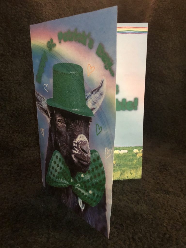
I had some trouble with figuring out how to use type on a path because I found the pen tool to be pretty confusing. Eventually, I was able to make it work and I got the type to go around the goat on the front cover.
How could your submission be improved?
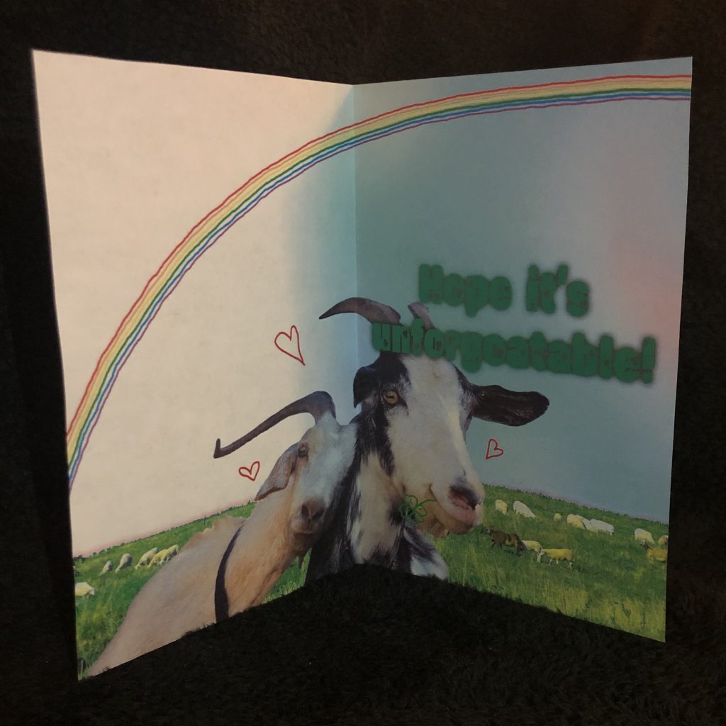
I think I could have added a little more to the inside of the card. After we first did critiques in class, I added some drawings like the rainbow, the hearts, and the clover in the goat’s mouth, but I think that it could have been fun if I had added even more designs on the inside.
How could the professor improve the assignment for the next class?
I think that the assignment was pretty straightforward already. I liked how everything that we did was demonstrated in the Zoom classes, but maybe doing a little more explanation on the pen tool could have been useful as that was what I struggled the most with figuring out.
How might you apply your knowledge in future assignments or work scenarios?
I think that what I learned about fonts will be really easily applied in the future. Whenever I have to do a project for this class or make a presentation for another class, I will be able to choose fonts that are appropriate and select ones that best fit the mood and subject matter of whatever I am presenting. In addition, I think that knowing about how to bring images together in Photoshop will be a good skill to have if I ever have to make a poster or flyer for anything in the future.
How did a specific reading or video inspire you?
I really liked the article “A Brief History of Print Design,” as I thought it was really cool to see how different kinds of typefaces and design elements have been used for different purposes throughout history and as print design has changed over the years. I was inspired by the photomontage examples in the “Photomontage” page of Wikipedia to add the big goats to the background with the field on the inside of my card, creating a new composite picture. I was also inspired by the fun and lighthearted graphics I’ve seen in other greeting cards in different stores and supermarkets.