Click HERE to access my gestalt interpretation of I’m A Little Teapot.
GESTALT PRINCIPLES SEEN:
IMAGE 1: Continuity: a fluid connection among compositional parts
IMAGE 2: Closure: A tendency to perceive a set of individual elements as a single, recognizable pattern, rather than multiple, individual elements. Refers to the mind’s inclination to connect fragmentary information to produce a completed form
IMAGE 3: Repetition: occurs when we use the same visual element or effect over and over
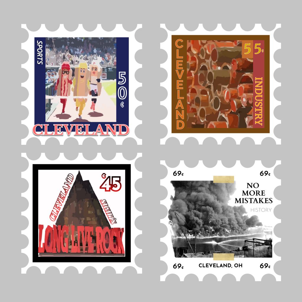
IMAGE 4: Containment: a unifying force created by the outer edge of a composition or by a boundary within a composition
IMAGE 5: Proximity: unification of objects due to distance OR separation of objects due to distance between them.
IMAGE 6: Continuation: Elements arranged in a straight line or a smooth curve are perceived as a group and are interpreted as being more related than elements not on the line or curve.
REFLECTION:
What did you learn?
“As my first ever digital media class, besides the last time I took a computer class in high school where we learned Paint, I learned a bit about Lightroom, Figma, and how gestalt is used to make some pretty amazing icons. I never knew that’s the principle used to make the iconic WWF logo and many others. It definitely gave me a lesson on different ways things can be perceived.
What was easy?
“NO, coming up with idea and how I wanted to tell the story of I’m a little teapot was pretty simple after some time, but actually putting my ideas on a computer, without much experience with these softwares, was the hardest and probably only frustrating part.”
What was challenging?
“After taking my own time to look at tips on how to use these softwares better and asking Professor Dunkle for help, I tried to minimize my challenge of not knowing Lightroom or Figma. As someone who never really considered themselves an artists, I am still unsure of all the little tips that might make a design a bit better, which was also a challenge.
How could your submission be improved?
“After seeing other example from class, I could have created less simplistic and literal designs. As someone from the science field, I want to challenge myself in understanding more creative perspectives.”
How can the professor improve the assignment in the future?
“I really enjoyed the project; It was like making a short picture book. I am not sure what I would change as an improvement but something fun I think we should make is a small story book instead of mounting them and then give them to kids at the school near by to grade/assess them”
How might you apply your knowledge in future assignments or work scenarios?
“I would love to make a pop up book one day and these principles would be fun and interesting to incorporate.”
How did a specific reading, video or example inspire or help you?
“https://www.smashingmagazine.com/2014/03/design-principles-visual-perception-and-the-principles-of-gestalt/ this link helped me to understand the different concepts and perceptions within gestalt that I was unsure of.
Here are my locations of color!
Urban : primary-triadic (black, blue, red, yellow, white)
Aquatic-Arctic : split-complimentary (blue, yellow-orange, purple, white)
Extraterrestrial : complementary (yellow-purple) – meteor shower
Desert : analogous (browns, reds, oranges, yellows)
I learned so much about color and playing with shading through learning gradient techniques. It was fun trying to make more complicated figures as well compared to The Little Teapot.
This assignment was not very easy, but it was so much fun to see my final products after incorporating all the lessons and tips I have learned since the first project.
The most challenging part of this assignment was pushing myself to learn how to create and draw these figures using tools I had never touched before, like the Pen and Swatches, to truly create the environments I had wanted.
- How could your submission be improved?
I think my cityscape looked better in my head, but limited to my knowledge. I would have tried to make streaks past the buildings (to look like moving cars) so there was more red in the scene.
- How could I improve the assignment for the next class?
Thought it was fun location options and open ended left more room for even more creativity. I would add the challenge to incorporate students favorite color in each location under different color themes
- How might you apply your knowledge in future assignments or work scenarios?
Like shown in the aquatic arctic scene, I would make these little location designs to show an animal’s behavior in relationship to it’s environment.
- How did a specific reading or video inspire or help you?
https://www.smashingmagazine.com/2010/02/color-theory-for-designer-part-3-creating-your-own-color-palettes/
This article in particular gave me insight to the current ideas surrounding how color may affect the brain and how it is viewed by the majority. I never really felt much emotion to the other colors except for when I seen my favorite or in reaction to warning colors. It was nice, in particular, to be able to reflect a bit on how each color makes me feel and the things I associate them with.