Project 4 was the final project of the semester and we used multiple applications, Premier by Adobe for Video Editing and Audacity to create a soundtrack. My emotion I was trying to invoke in this short video was peace. The shots are all of nature or familiar things to humans, such ads a corner store, a game of basketball, or biking. All of these things are where people blow off their stress and do something other than the usual grind of the day. I went to multiple parks, Yates Park and Chestnut Ridge Park where I shot the woods, the lake, and the gazebo. I was trying to show nature and the serenity that comes in a suburban town, which is especially quiet during quarantine. I worked hard on Audacity and created a soundtrack, but it somehow got deleted so I had to create another one. I have been using music software such as Fruity Loops for years before, and the layout is quite similar to Audacity, so I enjoyed creating a soundtrack as that is one of my strong suits on a computer. The videos were fun to edit and I especially liked the warp destabilizer that allowed the shots to look smoother than when I originally took them. Premier has a lot of cool effects such as fading and editing the sharpness of the clip. I experimented with them a lot, some I tried to give a vintage feel, well others I tried to create an abstract looking shot that was unique but still very much real. That’s why a lot of the videos look very different from each other as I could not stop testing out what looked best, which I think may have made the final product look messier than it could’ve been. However, overall this was a good experience and my favorite lab of the semester.
Category: Uncategorized
Lab 6 Discussion
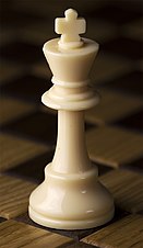
Lab 6 we worked with Blender to create a 3d chess piece. Blender is an easy to use software that was easily accessible and simple. I followed the directions off of D2L and had little struggle figuring out how to navigate the software. There are a variety of ways to make shapes expand and compress, as well as rotating and scaling the shapes to different sizes. All of this was readily available through edit mode and using shortcuts. In order to specify what part of an object you want to edit, you simply must highlight the “points” throughout the object, at the top or bottom. Through this I created my own signature chess piece that looks like a king without the crazy crown. Although Blender is easy to use, I am still not advanced enough to understand making the unique shapes found at the top of a chess piece.

Project 2
Project 2 was an exciting one to me that I found to be useful considering what we were making, as well as how. I’ve always been fascinating by coding but have never found time to learn about it. Although it was much easier to code due to the professor’s instructions and the easy format that the Brackets application offers, I still found it to be cool. I struggled exporting my logo into Brackets from Adobe Illustrator. Coloors was cool as well because it allowed me to make the resume my own and something I could use this summer for a job during break and next year for an internship. I also probably spent the most time on this project because Brackets worked on my computer, and I did not have to access the computers in Lyons to use any exclusive software.

Lab 5 Discussion
For Lab 5, we worked on prototyping on Figma by creating an imaginary app. The Figma website allows us to prototype and create links through different button features that take us form one page to another. I made mine a fitness app that allows people to track workouts and see tutorials on how to perform each workout. The buttons were hard to make and I believe I followed instructions correctly as I created different components, starting with the master component on the app home screen. The other components were used taking the master component and editing each button in order to fit the function of the button such as making a menu screen, that leads to a list of workouts. The workout lists includes the different body parts, which are labeled. If you select core, it will take you to a list of core workouts. From there, you are able to chose crunches, clicking on this component takes the user to tutorials and the suggested setsXreps for the workout, as well as an image. The program was kind of tricky and I had trouble duplicating the same aesthetic on the app for each page. This is something I am looking to correct later in the semester.

Project 1
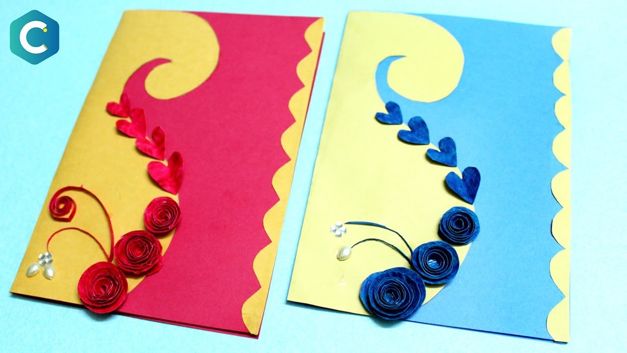
Project 1 was a very creative project that allowed us to be free and hand’s on. We used Adobe Photoshop to create a card, mine was a Graduation Card. The project was very difficult as I am not very good with navigating photoshop. However, I picked it up through trail and air and customized the templates into a witty, and more aesthetic looking card. I did struggle cropping and moving images the way I would’ve like too and also had trouble printing the project. my favorite part must’ve been using the fonts and seeing the effects and adjustments I can make to their shape.

Lab 4 Discussion
For Lab 4, we worked diligently on creating business cards with monograms. It was my introduction to Adobe Illustrator and an assignment I enjoyed very much. I learned how to adjust the size, shape, and color of individual letters, and bend them to create an aesthetic monogram. I had always wondered how business’ created their logos and this lab gave me an insider view of how that was done. Although I struggled at first adapting to Adobe Illustrator, I learned to prefer it over Photoshop due to its seemingly easier navigation for the user. The thing I spent that most time on in this project was figuring out a smooth way to make all three of my initials look symmetrical and come together as one large logo, well all three letters still were easily identified.
Lab 3 Discussion
Fonts
In Lab3 we focused on the different fonts that are used in the graphic design worlds, including what’s easier to read and what looks better on a computer, and which fonts are appropriate at which times. We learned from the video posted in class as well as with the hands on nature of the assignment. The fonts we used are from google fonts, and were downloaded to the computer; however I had trouble downloading the fonts onto my computer, I still was able to use a Sans Serif font that was reccomended.

Lab 2 Discussion
In Lab 2 we learned how to get rid of backgrounds of a picture in the photoshop app. We learned different styles and methods such as the lasso and magic pencil features on the Adobe photoshop app. This is useful in putting other images over backgrounds that may be different from the original image.

Lab 1 Discussion
Hello world!
Welcome to DMA Sites. This is your first post. Edit or delete it, then start writing!