1. What did you learn?
How to use Figma and create hyperlinks behind text and images.
2. What was easy?
The basic controls of Figma were pretty intuitive which made them simple to use.
3. What was challenging?
Making everything flow into each other and keeping consistency.
4. How could your submission be improved?
Through taking Additional time to ensure everything is spaced perfectly and ensuring my pages aren’t too overwhelming or empty.
5. How could the professor improve the assignment for the next class?
Finishing the slides for resume and contact as it was difficult to know what was expected just by looking at the slides.
6. How might you apply your knowledge in future assignments or work scenarios?
If i ever have to create a website I now know some basics of design and creation i can apply during future opportunities.
7. How did a specific reading or video inspire or help you?
The Class videos helped tremendously as I was able to use them to get all the information I needed at a pace in line with how fast I worked, the slides also helped to give me an idea of what I should be doing.
8. Post images of your work.
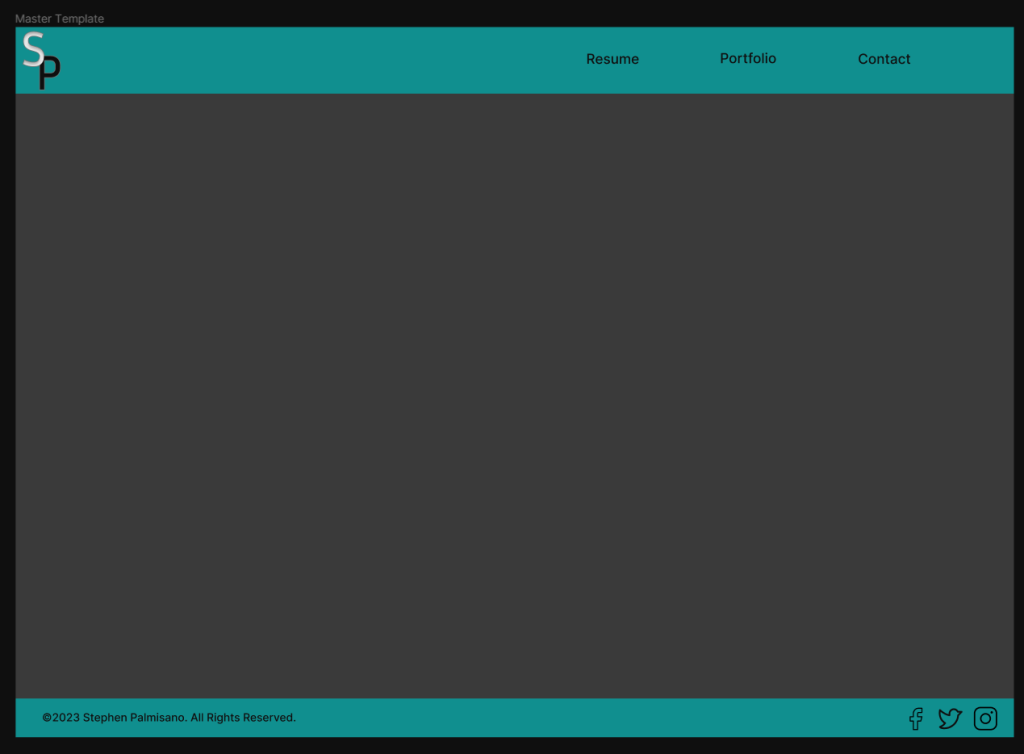
I went with a dark theme to ensure no unnecessary strain on the eyes and because it is my personal preference with websites.
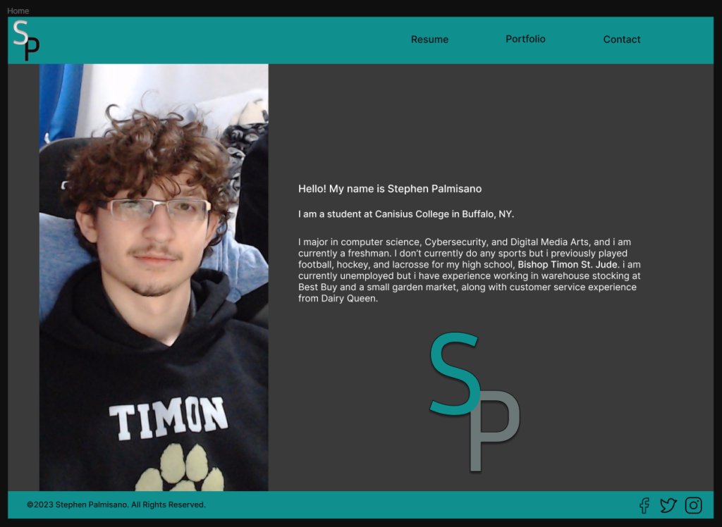
I went with a simple image of myself and a short introduction of who I am and some of my experiences.
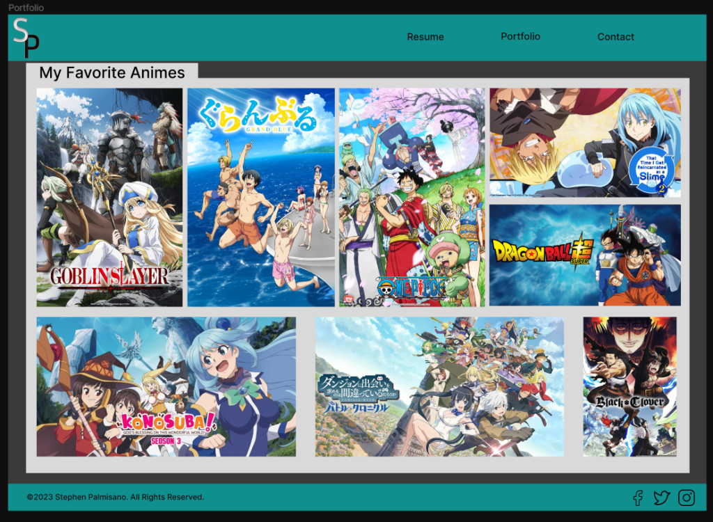
I choose to make my portfolio show some of my favorite anime’s along with including links to where they can be watched by clicking on them.
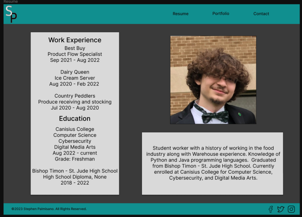
I wanted to make it a simple cluster of information that was easy to read through and gave some general important information for an employer.
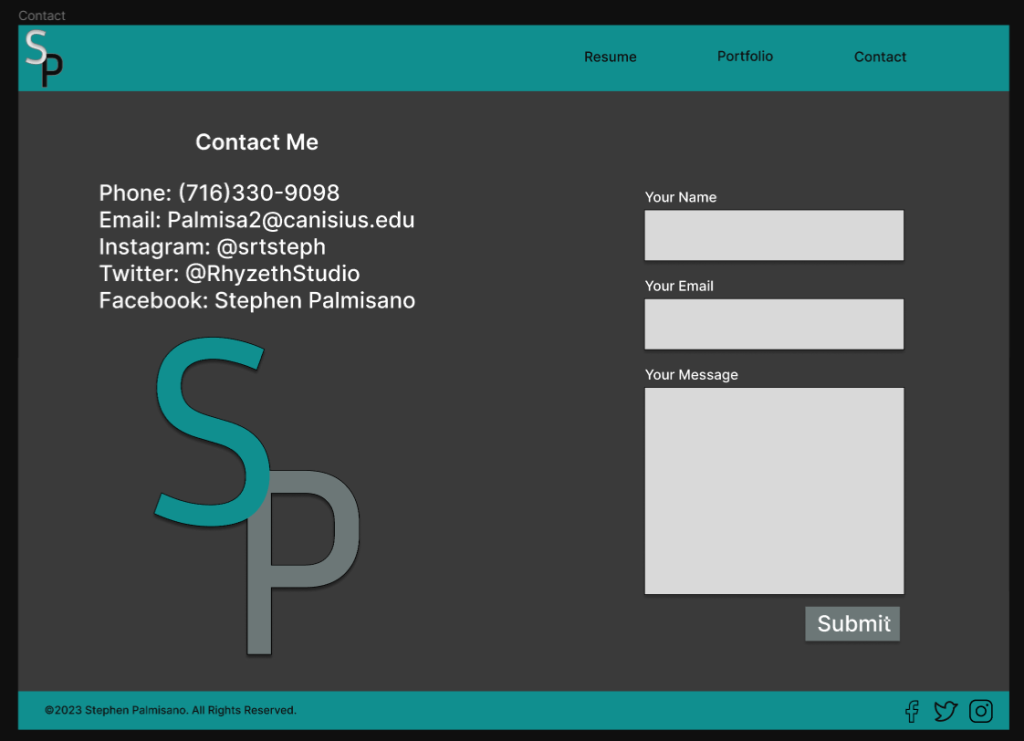
A simple page containing my links and a (non-working) built in way of contacting me, I added my logo to fill space and add to the aesthetic.