1. What did you learn?
About the variability of text, and the difference between multiple different texts styles, like sans or sans serif.
2. What was easy?
The initial design came relatively easy, but I did change they layout from what i had in my sketchbook.
3. What was challenging?
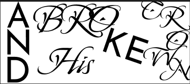
Finding the fonts that got the message across I wanted, or when I found one the lack of variability was a bit unfortunate.
4. How could your submission be improved?
More small tweaks to position and size, I was pretty happy with how it turned out.

This frame especially I feel I could have spent more time to get some of the spacing and positioning a but better.
5. How could the professor improve the assignment for the next class?
Maybe more fonts given as potential uses, as the variability of fonts was cool to tweak but I didn’t know too many different ones that allowed for a lot of variability.
6. How might you apply your knowledge in future assignments or work scenarios?
I can use my new knowledge of typography to make future text within projects seem more in tune with the rest of my project, and make my text seem more natural.
7. How did a specific reading or video inspire or help you?
I don’t think I was inspired by any specific reading or video, however the talks in class about Roboto flex definitely inspired the path I went along with how I approached my text variability.