- What did you learn?
I learned new terminology such as the term “onboarding”. Onboarding process is the user’s first impression of your application. If the app is designed effectively, the user has a positive response during the onboarding process. Pagination is another word I learned which means the results per view. I also discovered the different categories of the application such as front end (user archive, pagination, search, sort, filters, alerts) and back end (dashboard/statistics/graphs, user management, messaging). It was cool to learn this new terminology while creating my application!
- What was easy?
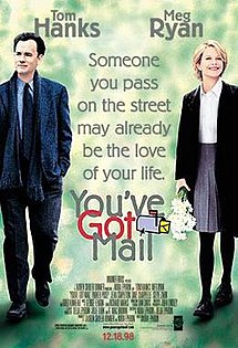
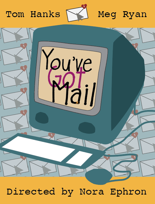
I thought the easy part was picking the movie I wanted to create for my poster. I was thinking of my all time favorite movies and You’ve Got Mail was the first movie that popped into my head so I went with that option and am happy I did.
- What was challenging?
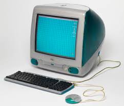
I thought the challenging part was creating the old iMac G3 computer. I originally was going to use an image trace on the original image but decided to try out the pen tool. I am not familiar with the pen tool so I thought it would be good practice.
- How could your submission be improved?
I think my submission could be improved by creating a better iMac G3 computer. As I already mentioned, I am not yet comfortable using the pen tool. After I drew the computer I could see some of the edges were not exactly how I wanted them. Some sides were curved and others were not. I think once I get more use to it I think I could create an even better computer with that tool.
How could I improve the assignment for the next class?
You could improve the assignment for the next class by putting the option of using the Adobe wheel link on the Project 2 directions. I remember you telling us in class about this but I think it would be useful to have it on the directions page as well. I think it is good for people to remember how important color scheme is on the poster and to use that to their advantage while creating their poster.
- How might you apply your knowledge in future assignments or work scenarios?
After this project, I have learned the importance of color scheme (as mentioned in the previous question). At first, my poster had all sorts of colors and Professor Dunkle told me that the poster needed a sense of theme to it. The color scheme I chose were colors that reflected the 90’s. After redoing my color scheme I thought my poster represented a poster from the 90’s than it did previously.
- How did a specific reading or video inspire or help you?
The reading, “Meet 10 Hand Lettering Artists You Should Know” inspired me to seek different kinds of font styles and which style best suited the poster I was doing.