What did you learn? I learned how to create unique designs while staying in the margins and using a grid. We once again used our knowledge of color scheme for this project and we learned new skills on typography. Combined, these skills can create something that looks organized and blends well together despite the fonts used being opposite of each other.
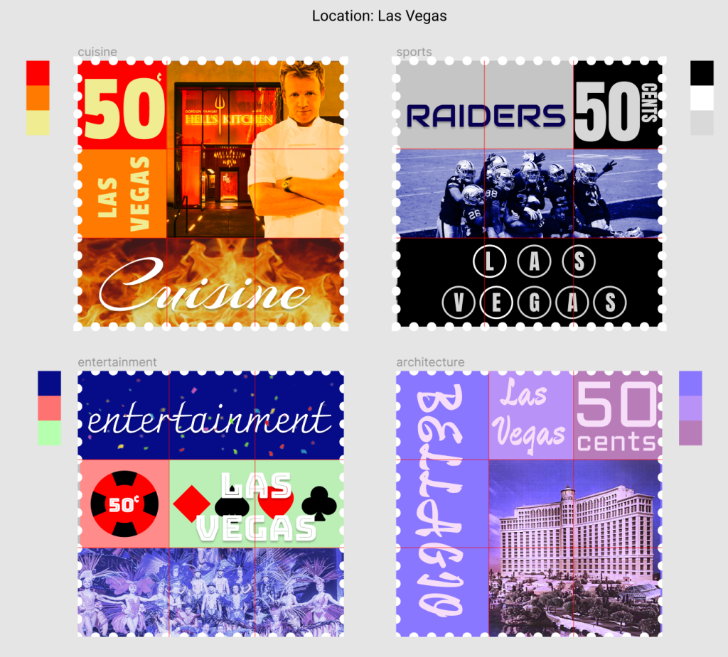
What was easy? Picking the color schemes was the easiest part. For the Las Vegas Raiders stamp, I just used the same color schemes that the actual team uses plus I added some blue to it to make it stand out. For the Cuisine stamp, I used a warm color scheme that fit well for the theme of Hell’s Kitchen. I didn’t have a clear color scheme in min for the ther two, but I found ones that worked good after experimenting with color for a while. Deciding on the location and which aspects to choose were easy to since I am planning on going to Las Vegas with my family soon plus I already knew a few things Las Vegas was known for in terms of cuisine, sports, and entertainment.
What was challenging? Deciding on which fonts to use and making the designs look nice was difficult. I had to use Figma’s Font Preview plugin for a while to pick fonts and I changed my mind quite a few times as well plus it took me a while to get the images fitted into the frames the way I wanted and to get them to match well with the color schemes.
How could your submission be improved? I propably could have done a better job fitting the text within the margins and the font choices could have been better probably. I have learned that typography is not really one of my strengths, but I still think the stamps came out nice. The color schemes of the Architecture and Entertainment stamps were a bit eandom, but it took me a while to decide on which would work best. Plus, the Sports stamp looks a bit strange with the blue, but I didn’t want it to look bland since the color scheme of the Raiders is really just black & white.
How could I improve the assignment for the next class? Next time, I would figure out how to work better in the margins and I would take more time determining my fonts and color schemes. There just are so many options that I did not want to spend way too much time deciding.
How might you apply your knowledge in future assignments or work scenarios? I will definitely be using Figma’s grids again as I found them to be very useful and of course they can make any design look more professional. Also, I plan on considering color scheme and typography more in the future on all designs.
How did a specific reading or video inspire or help you? I looked at a couple articles and videos about the history of Las Vegas for inspiration which ultimately pointed me in the direction I went in for this project. I also looked up a couple different color wheels to make sure my color schemes fit well.