For this project, we were to design a Media Player. I took some ideas from an article I read in GQ, where the Apple Ipod is rising again in popularity. People are buying Ipods on Ebay, then retrofitting them with new SD cards to hold media, (A 30 GB Ipod from 2004 can be adapted to hold 1 TB, for example) and using the Ipod as a modified external Hard Drive. People can watch movies and listen to music without an internet connection (useful if you are overseas or stationed in the military). Although Itunes is heavily scorned my music purists and most techies (and Apple discontinued Itunes a few years ago), the platform is still heavily used in Europe and Asia. Most club DJs use Itunes for their music. After reading the article, I was thinking about getting an old smartphone and retrofitting it to hold 1TB of media.
One of the features I used to like about Itunes was when you bought an album. you would occasionally get several different covers for the album, and cover art for singles. An album with twelve tracks might have a US cover and a British Cover (or the original cover and the modified G-rated family friendly cover). If the album had 7 singles, you would also get the cover art from the singles, so you could customize the display of the Ipod when you played the track. I really like album art and concert Tshirts, so I wanted to make a media player, which also focused on album art.
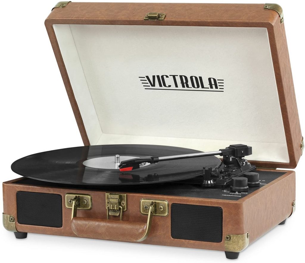
As I am the oldest student in the history of Canisius College, I naturally used a record player for my logo. I found this stock image and used it for the logo.
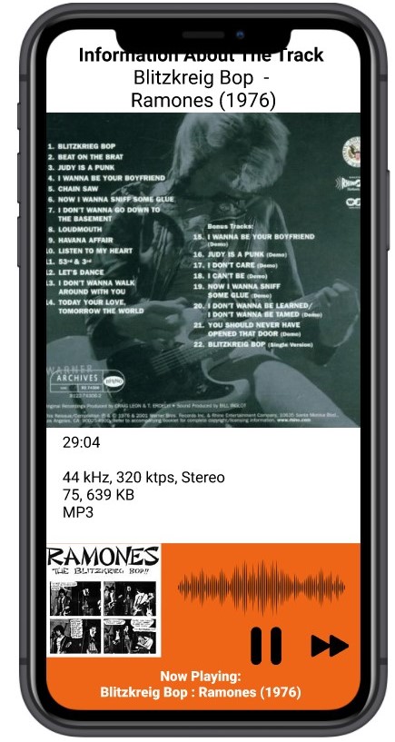
My media player contains five tracks from one album (an exceptionally simple media player): The 1976 debut release from the New York band, the Ramones:
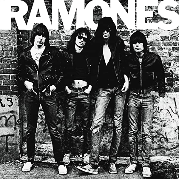
There is no shortage of literature about the history of the band and their influence in the 1970s New York punk scene. What I do like, however, is the story of the album cover. The band established a residency at CBGB’s in the Bowery, playing on Sunday nights. The woman who worked the coat check at CBGB was named Roberta Bayley, who was a friend of the band. The Ramones got a record deal from Sire Records for their first record, and had a budget of four thousand dollars.
At this time, cameras were an expensive luxury, and Roberta was the only person they knew who owned a camera. They convinced her to take their album picture. They went to a playground basketball court near CBGB’s and Roberta took pictures of the band until “they got bored and wandered off.”. This was the photograph for the 1976 debut release, Roberta Bayley was paid $125 and went on to have a career as an accomplished concert photographer.
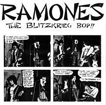
The tracks I picked were singles, so I found some cover art and used them for the animations.
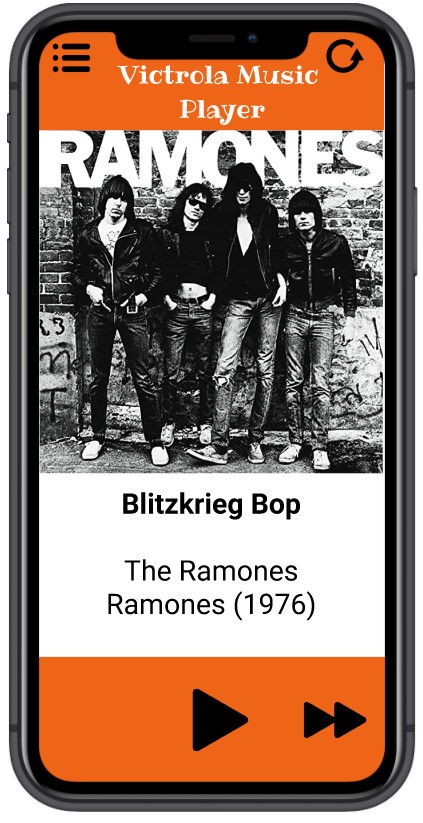
Using Professor Dunkles recommendations, the user will click on the album cover, the front of the album will animate to the single (using position and scale) then also display the back of the album and the liner notes. This is a really nice effect,I am happy how it turned out.
One thing I learned about this project is the importance of my sketchbook. I kept coming up with new ideas or changes and making sketches of the ideas and concepts I wanted to use. I usually make a basic sketch at the beginning, but when I start working with Figma, I stay with Figma. This project I used my sketchbook for the entire project.
One challenge I had was I originally had an idea of what I wanted, but once I had the prototypes, I couldn’t get it to work the way I had intended. Originally, I wanted the animation to be a seamless transition from one cover art to another cover art. I kept experimenting with the smart animate feature, but could not get the effects that I wanted. After some feedback and suggestions from my professor, I changed the design. Instead of flowing from one cover to another, I used the animation techniques of position and scale for the animation. When the user clicks on the large cover art, it will animate to a smaller version of the artwork for the single, which travels to the lower corner of the screen. I am happy I got to use the cover art for the single (which was my intended effect) and I like the result. On a seperate note, this resulted in scrapping the project and starting from scratch, which usually doesn’t happen for me. I usually don’t get frustrated with the progression and start from the beginning, or I find parts to salvage. I wasn’t frustrated, exactly, but a few weeks into the project, I felt it was going into a different direction and decided to start from the beginning and started with new sketches.
Five tracks and one album is probably the absolute minimum to display the effect and the results I was looking for. If I was to do this again, I would probably pick three different albums from three different artists with distinctive cover art, five tracks each, to get a better effect. (Michael Jackson’s Thriller album, The Beatles Sgt Pepper Album, London Calling by The Clash, Led Zeppelin IV) Fifteen tracks total, three album cover art, fifteen covers arts for the singles.
Otherwise, I am happy with the way this project progressed and turned out. (If I had to do anything different, I might have picked a Led Zeppelin album, rather than the Ramones.)
I liked it that Professor Dunkle required us to turn in a prototype of the work before the final submission, this gave me some valuable feedback and some ideas of how to proceed. I think if he gave us some samples/examples for good media players and bad/ineffective media players, it might be valuable from a design standpoint. Usually with media players, I don’t pay much attention to the design, I just press play, adjust the volume and listen to the music.