- What did you learn?
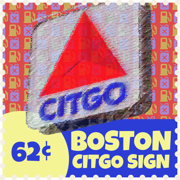
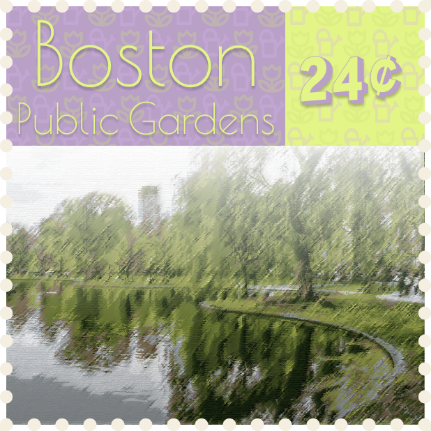
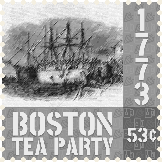
- I played around a lot with the Illustrator “Trace Image” feature. I was able to get some interesting results by using an artistic stylization filter after simplifying the colors with the trace.
- What was easy?
- The part I found the easiest was finding the images once I decided on a location. There were a good amount of creative commons images for each of the topics I thought of.
- What was challenging?
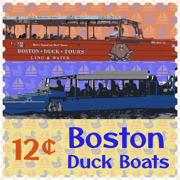
- I did some pretty painstaking manual background removal for the interior of the duck boats. Other than that, deciding on layouts for the stamps was also a bit challenging.
- How could your submission be improved?
- I did a bit of simplifying of the vectors on the blue duck boat, but I think more could be done. Since the image was flipped horizontally, I decided to completely remove the reversed text from the side.
- How could the professor improve the assignment for the next class?
- Maybe there could be some other ideas for themes other than just locations. I feel as though it would be fun to make stamps based on other things.
- How might you apply your knowledge in future assignments or work scenarios?
- I thought this project was good practice with adding together multiple techniques/ideas we learned in class. I definitely feel as though laying things out in a grid and deciding on the color palette first was a good way to start out.
- How did a specific reading or video inspire or help you?
- One reading I think back to a lot is the one with the many examples of color pallets. I feel as though knowing about different ways to match colors together will be very useful going forward.


