Skip to content
- What did you learn?
- I learned that some fonts have a surprising amount of variables that can be adjusted. Using those, you can be incredibly precise.
- What was easy?
- I found the act of choosing fonts to be pretty easy. I would scroll and look through a lot, and found myself instinctively knowing when I found what I was looking for.
- What was challenging?
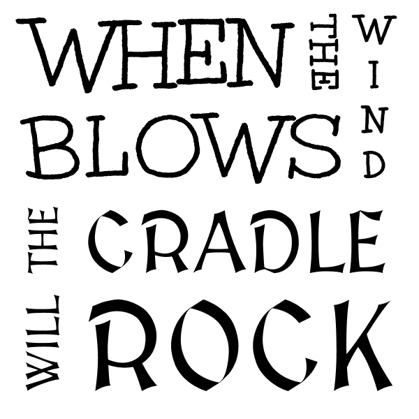
- Actually assembling the “Tetris” pieces into an aesthetically pleasing design was fairly difficult. I found frames that had more words were easier to make layouts for than the ones with only a few words.
- How could your submission be improved?
- I think there are a few areas where the word-Tetris could be a little tighter. Also, I’m sure there are some word placement choices that could be improved on.
- How could the professor improve the assignment for the next class?
- I think starting off without the square frames would be good. My initial approach to the assignment was with the assumption that they had to be square.
- How might you apply your knowledge in future assignments or work scenarios?
- I think knowing how to lay text out in an aesthetically pleasing manor is a universal skill. It can be helpful both with text on a computer, and with handwritten text.
- How did a specific reading or video inspire or help you?
- We briefly looked at some kinetic typography which was very helpful for getting the general idea of what the assignment should look like. It also gave an example of how what we were learning could be applied elsewhere.