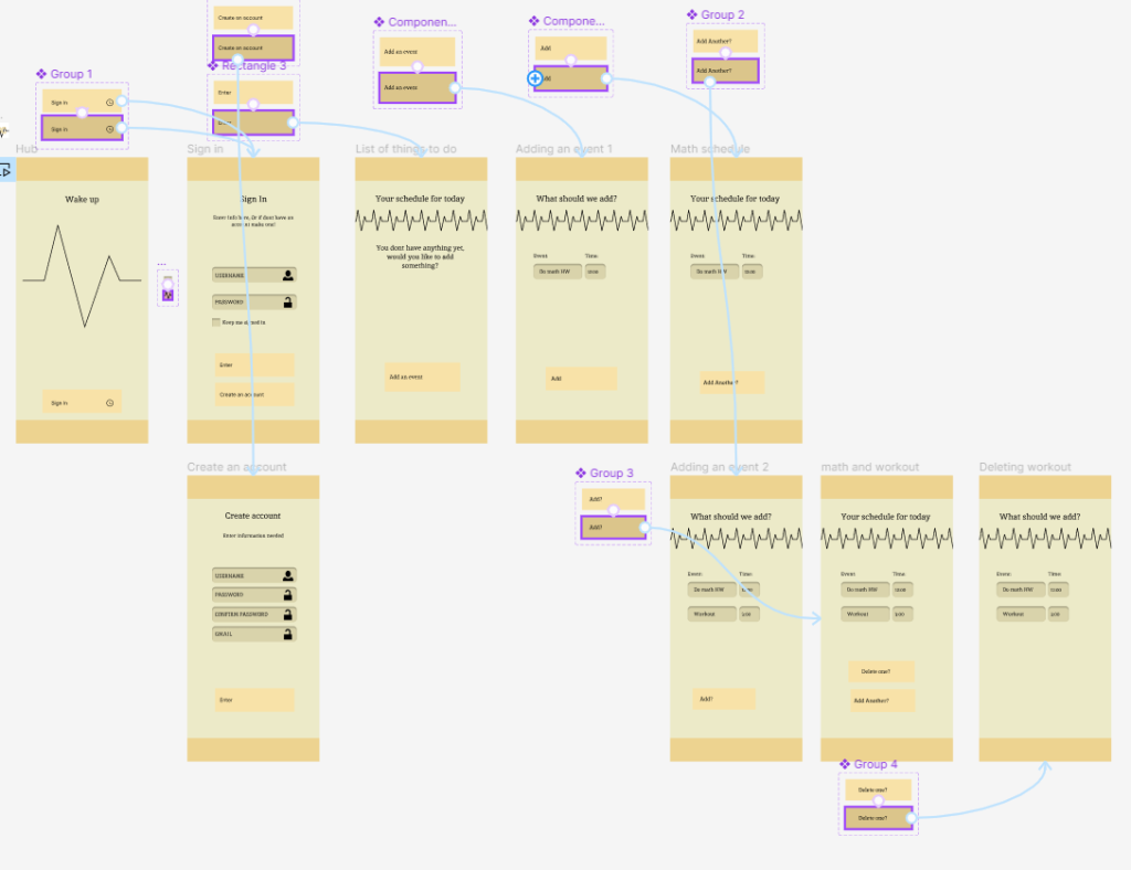
For our first project of DMA 217 we had to create an app prototype within Figma which made us learn about the interaction between different webpages/ app sections and how to connect them together and to create something we can present to a coder so that they understand what we wanted from the design.
With this huge layout seen above I connected the different pages to display on button presses that then switched to what indicated it to switch to. With the development of this prototype I was able to confirm The login page and setting up an account, as well as being able to make the schedule function clear.
With all of this setup the usable link is below where it will show you how it works on the iphone13
This project for our final was a good idea and concept i just wish we had a few more time and instructions to drive us to a specific way of doing a video. It was kind of hard to think of ideas and how to get footage when you are busy with other everyday things and other projects for finals.
So it was hard to get things done for this project and honestly I kind of ignored it until it was to late. I should’ve worked on it more but at least I got something done and while its not the best its decent and gets the message across.
I haven’t used this program in a long time so its cool to learn about the other things we can do with it and also to have our own freedom of footage for it.
Having this as our final project seemed good to end off the semester as having to focus on other classes a simple project would be nice to work on instead of two huge projects to work on.
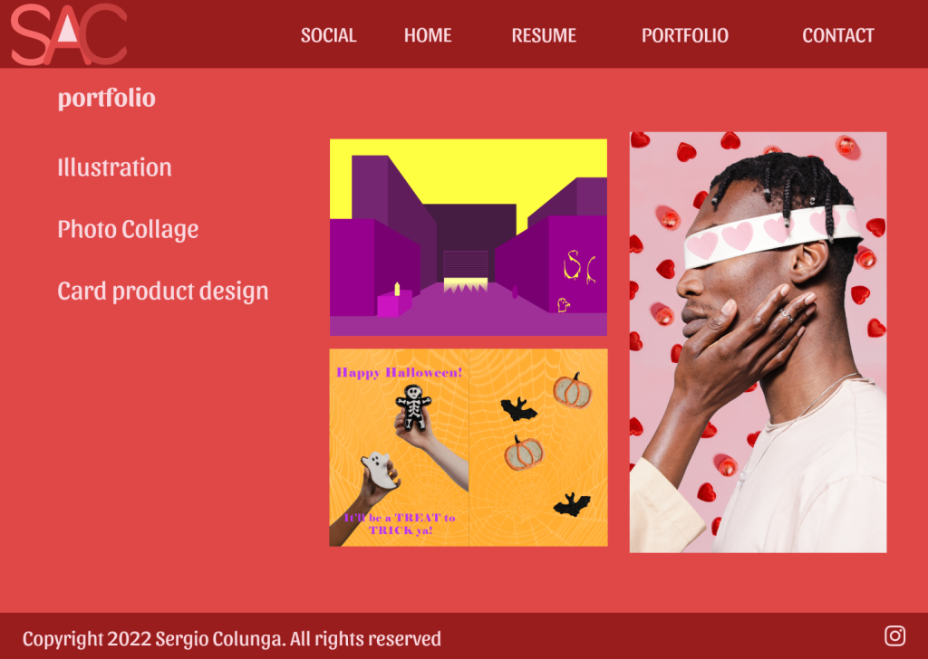
I think in designing these stamps I was confused on how to effect i should put on the image and the color, so instead I chose the image first for the stamps and for Las Vegas while it also being free and not copyright, such as Elvis being a hard image to find for. Once I selected my photos I attempted to put them into a Tetris format that would work out well, as well as using the image itself to add itself outside of the stamp like creating dimension.
Once that is set up I chose colors from the image and made some small adjustments to make it all work together well. I believe the use of color is the main thing that sets up this project well together as well as having all the different effects in the background to make some images and things pop out more.
My favorite stamp would probably be the food one as that is where my mother works and also the Elvis one looks quite nice with the clouds and the colors chosen.
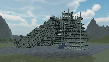
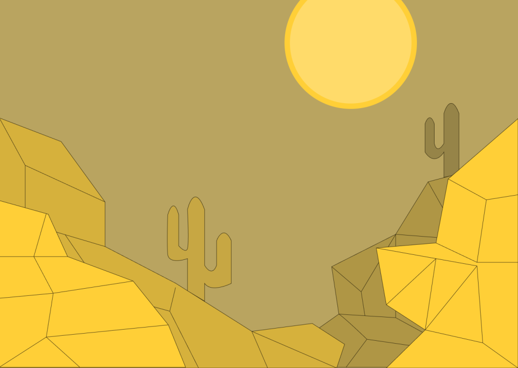
Learning to develop and add assets into a unity scene was a refreshing lesson to learn as I previously learned about this program in highschool.
Working on this project was complex as I didn’t have time to work on it a lot. There was a snowstorm and not being able to access the classroom with my specific computer that held my project.
Overall it was fun and the work put in was the best i could do within my limits. I had to change textures for the file will run properly and it was fun to come back to it for the short time that i had with it.
I had to learn and manage space and text to fit into a frame and for them to work together to show a message while also having the creativity to not be straight lines and text. Some words and type have boldness and different senses to them that show the image to be different. I wasn’t allowed to do anything with vectors or illustrations which was limiting and hard to avoid.
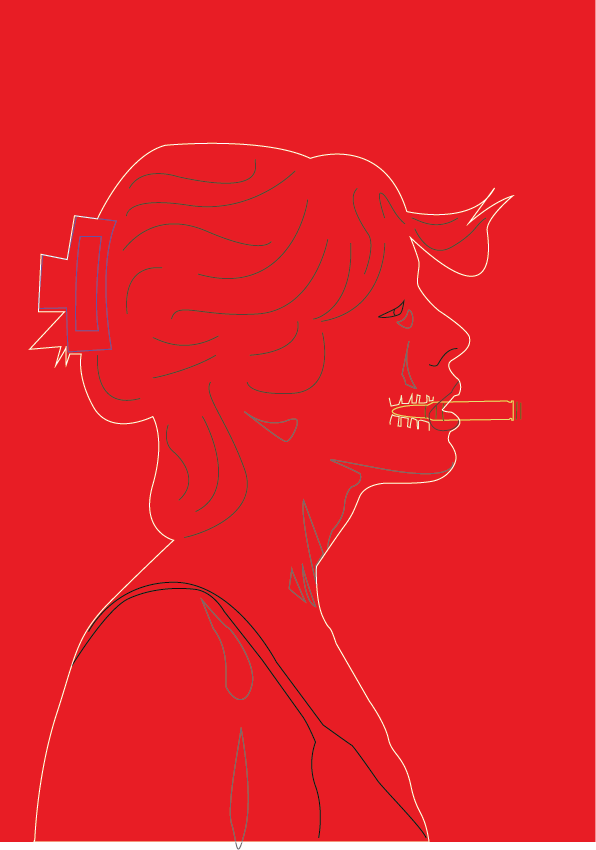
During this project I got stumped on my ideas and how to show them and execute them into an actual project. This caused me to restart twice and unfortunately unable to finish with something I was truly proud of. I tried my best to combine two different photos to make the artwork and design show up as something new that didn’t look to out of place until the third attempt.
This was my third project that i attempted to create as a more illustrated result but I did use photos to trace and as reference.
Unfortunately the images from my first attempt and the second from photoshop are not able to be shown on this website due to file size.
Learning to develop and create your own website and being able to manage how you want to design your own work was a complex project to show how you want to manage yourself and present yourself. I attempted to showcase some of the design tools and also showcase the fonts to match my personality.
While I do have multiple parts to improve I do believe for my first attempt creating a personal website it was a decent attempt and result. I would like to know how to actually create our own website that can actually be used from the web which can be used as a personal one.
Others students projects were interesting to see so I wanted to try and develop my own website based on what I saw from others and what I liked.
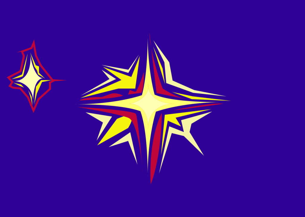
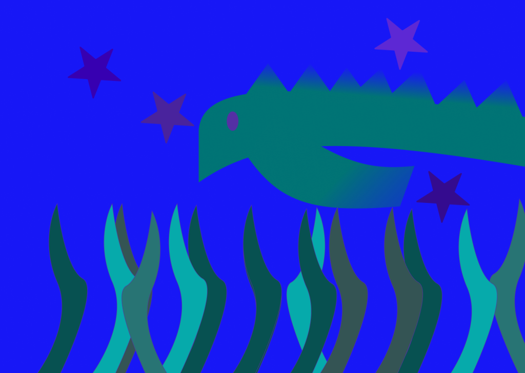
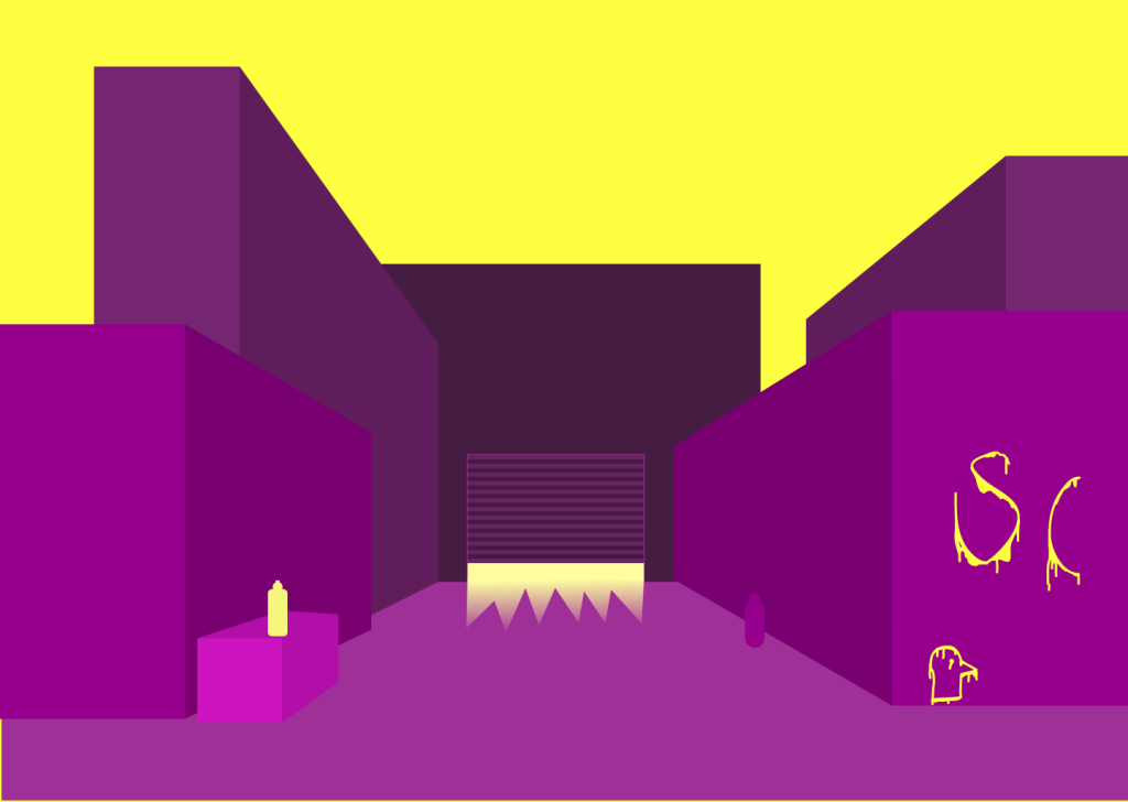
During this project I attempted to use useful color combinations to create useful unity and contrast to make the artwork pop out and be more of a pleasant view for the eye.
I believe the color and learning about the color wheel will be useful in future projects as it showcases some of the main useful combinations of colors. Its also interesting to know how the gradient works and the use of how they work together.
The one I like the most would be the Urban city Complimentary artwork. I think with more time on this project I could’ve done better.
I learned a lot of things in project like how to attract the costumers eye to a main subject as well as product design in an attempt to learn how to make a letter better. Combining colors to create a match is also a new thing to learn as I figured out how to combine two different colors but still have them match.
A reading I saw online showed me how to create contrast as well as unity to make the card go together well. Learning some basic color techniques was interesting to try and combine them with a product for people.
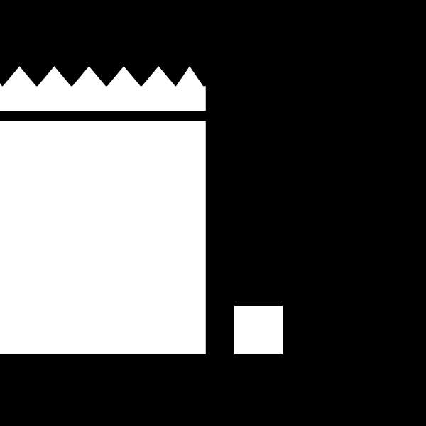
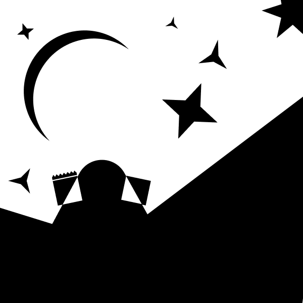
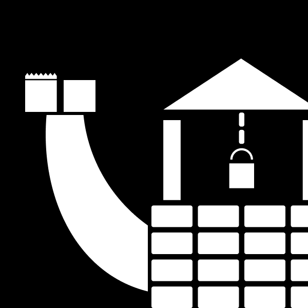
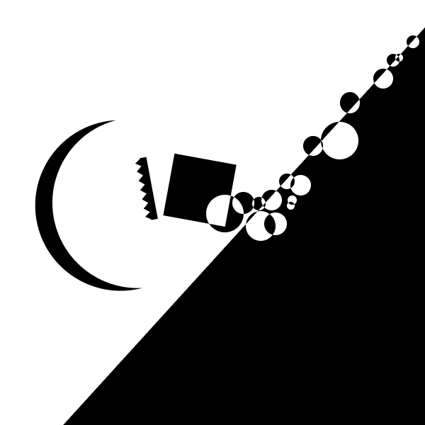
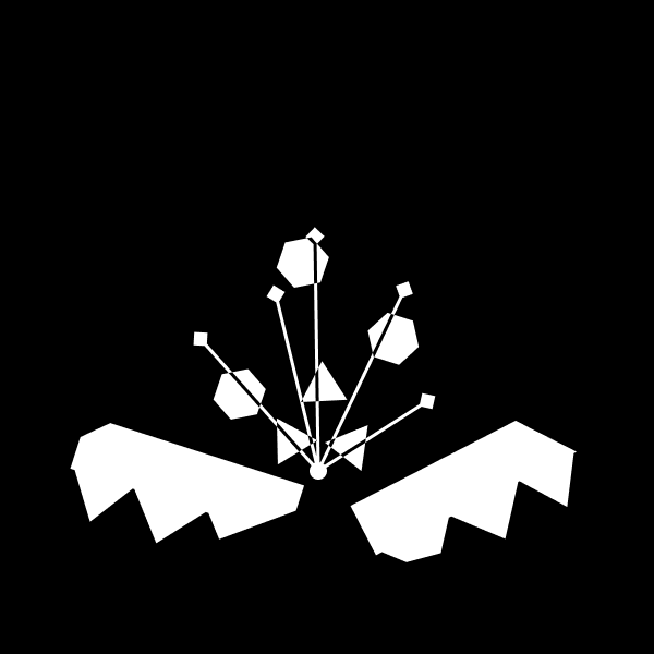
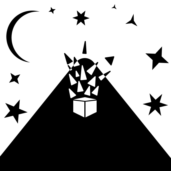
This first project was the start of DMA 214s projects and it had use showcase our style of dealing with problems where simplicity restricted some creativity. The only colors we were allowed to use within this artwork was simply black and white where we attempted to create object’s that were recognizable as well as have every frame be creative and unique to itself with contrast showcasing its focal point.
With the use of this project it taught us about how to use contrast of different works to present a sense of depth and using our ability to be creative and change the shapes around to how we want to present them.
I believe with the images I’ve created could be improved with some time and more options of shapes. Id also like to add color but since it was restricted I don’t know exactly how I would improve it further.
I think our professor was good at presenting us with the basic information, but i do wish he showcased a bit more of the techniques that we could be using and also if he went over some of the student examples from previous years as those showcased other possibilities and techniques we didn’t see.
This first project was a unique way of teaching us contrasts and focal points and working with objects without thinking of the colors connected to it. This is a great way to learn and adapt it to future projects as it makes us think about the frame and the objects and how they present themselves in the scene and how we will be able to create a bigger world within our artwork for next time.
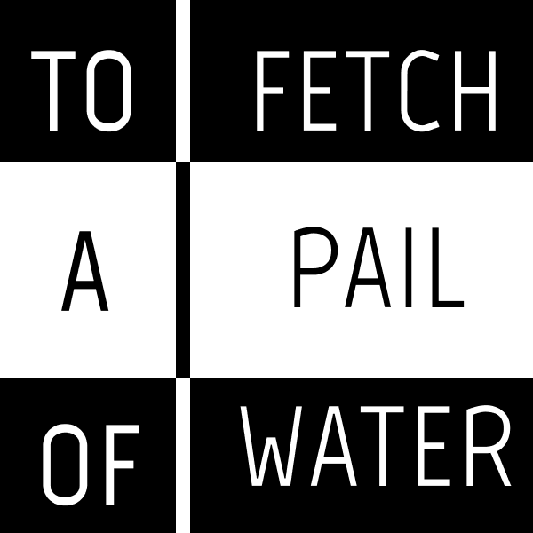
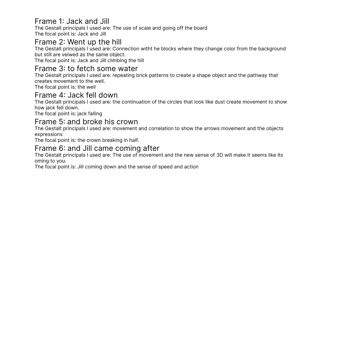
Jack and JillWent up a hillTo fetch a pail of water
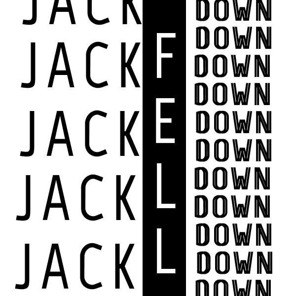
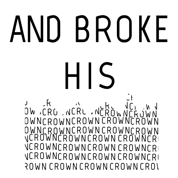
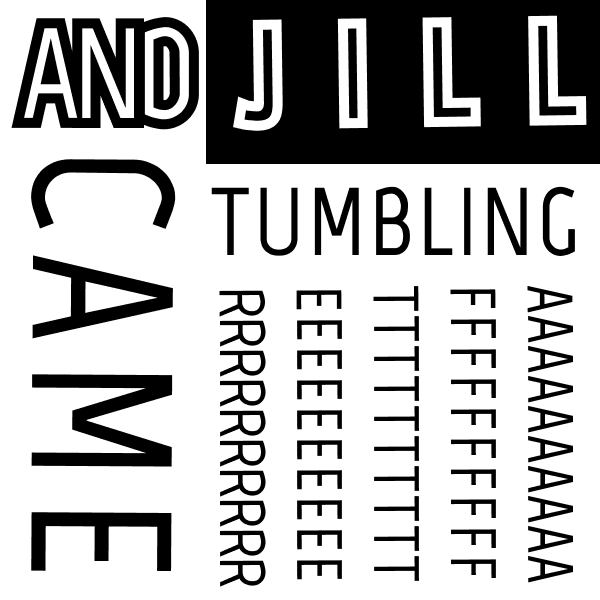
Jack fell downAnd broke his crownAnd Jill came tumbling after