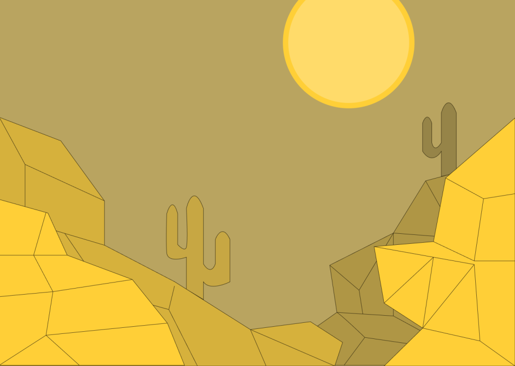
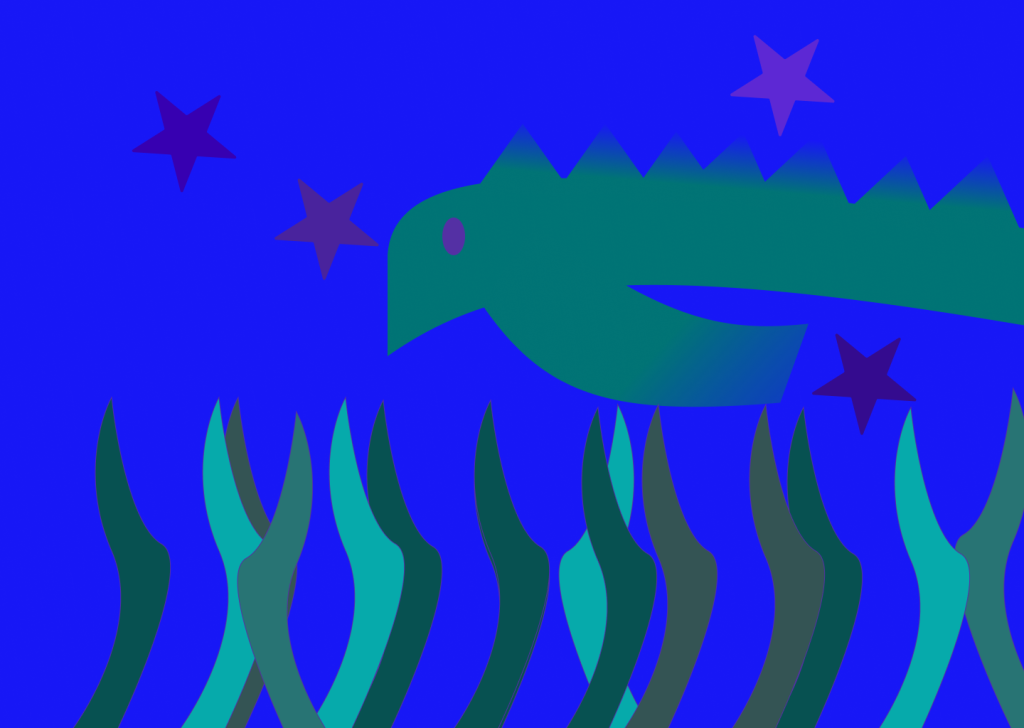
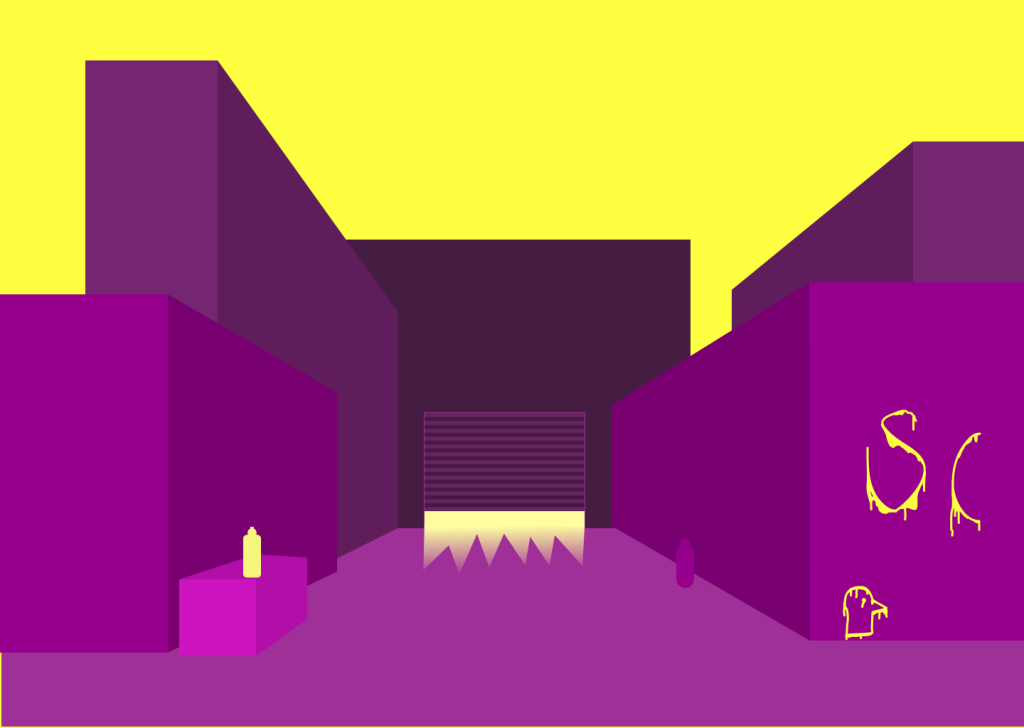
During this project I attempted to use useful color combinations to create useful unity and contrast to make the artwork pop out and be more of a pleasant view for the eye.
I believe the color and learning about the color wheel will be useful in future projects as it showcases some of the main useful combinations of colors. Its also interesting to know how the gradient works and the use of how they work together.


The one I like the most would be the Urban city Complimentary artwork. I think with more time on this project I could’ve done better.