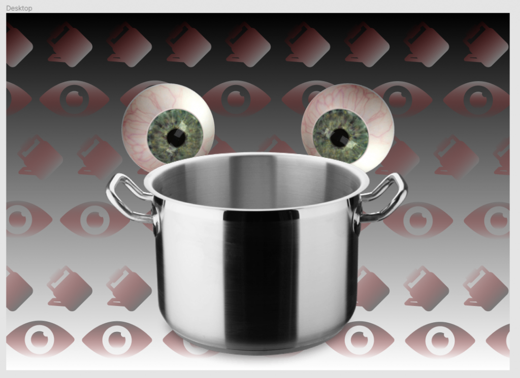
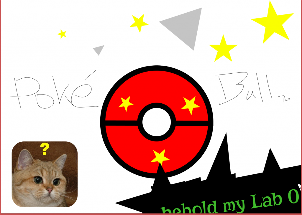
For Project 3 we had to create a design based on a common metaphor or phrase. I chose the phrase “a watched pot never boils,” mostly because of the weird visual that jumped into my head as soon as I thought about it.
My favorite part of this design was the pattern in the background. I chose to have a slightly transparent gradient scheme with a touch of red to make it seem like each image in the patter was sort of oozing out of the background, or like it was a little bit difficult to perceive. I chose red to match with the veins of the bloodshot eyes looking at the pot.
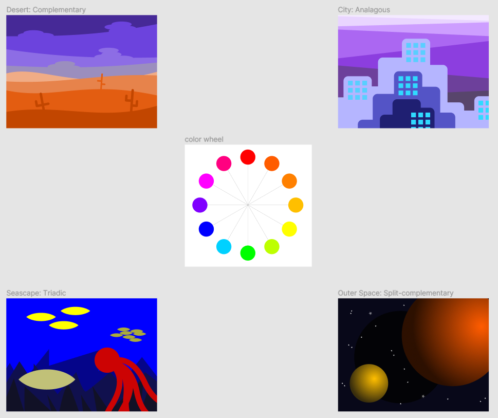
Project 2 was all about colors. We had to design four landscapes keeping color theory in mind. We had to design a desert using complementary color scheme, a city using an analogous color scheme, an ocean with a triadic color scheme, and finally a split-complementary color scheme on an outer space landscape.
This project was a lot of fun! I really enjoyed playing around with the layers in the desert landscape, and the bright contrasts in the triadic ocean landscape. Learning the different names and qualities of each color scheme was interesting.
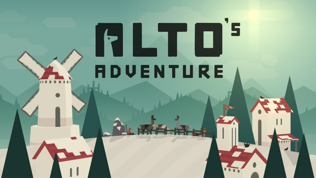
I didn’t know the name of it, but my favorite color scheme in design has to be analogous. Alto’s Adventure is one of my favorite mobile games (one of the only mobile games I play) and a big part of that is the evolving color scheme which changes throughout the day. All in all this was a fun and informative project like the others.
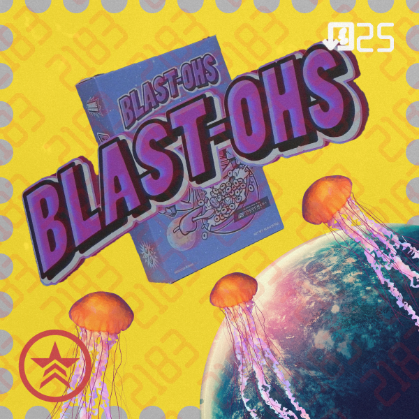
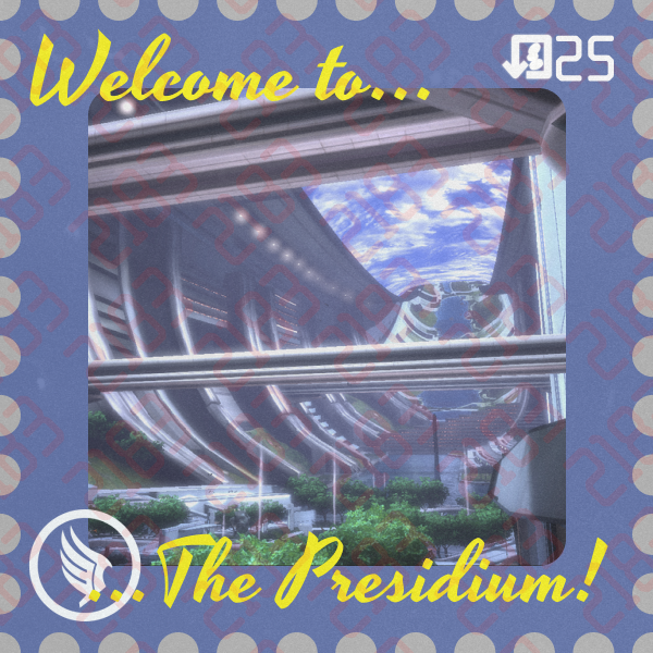
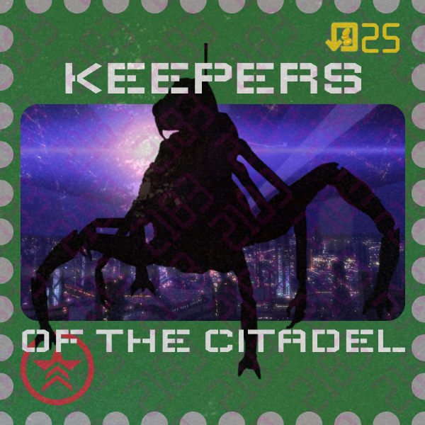
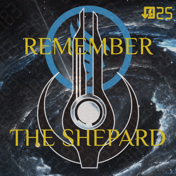
For project 4, we had to make stamps based on a location of our choosing. Since fictional locations were on the table, I chose the Citadel from Mass Effect, one of my favorite video game series.
“A lover in every port, and a gun in every tentacle.” –Blasto
For food, I chose Blast-Ohs, one of the only explicitly referenced foods in the Mass Effect universe. Blast-Ohs are based on the character Blasto, who is a James Bond parody character that happens to belong to the Hanar race–a species of nonviolent floating jellyfish. I wanted them to look a bit like postcards, so I added a grainy, dingy overlay to make each stamp look as if they had been through the mail. I also added a pattern displaying the year 2183, which is when humans were first allowed onto the Citadel, a 25 credit label in the upper right, and a “renegade” logo from the game’s morality system in the lower left.
For sights, I chose the Presidium on the Citadel. It’s basically the Central Park of the Citadel–simulated sky, lots of water and trees, plenty of open space. I went with a less futuristic font to make it seem more like an ideal place to be. I added the “paragon” logo in the bottom left this time, and overexposed it to match better with the background.
For industry, I chose the Keepers. They’re a race of beings that seemingly were engineered for the explicit purpose of maintaining the Citadel. They’re basically the entire industrial sector of the Citadel.
Lastly, for the history stamp, I chose a more abstract design using a “mass effect relay” logo (key elements to the story of the game) with a call to “Remember the Shepard”. During the course of the game, you play as Commander Shepard, who sacrifices themselves to save the entire universe by the end of the trilogy. In the far flung future, they are only known as “The Shepard.” I placed the paragon logo behind the relay logo because I thought they lined up nicely, and chose a yellow font to pop against the blue for the text.
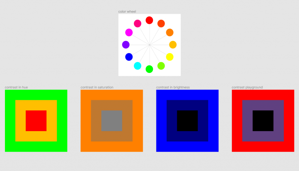
For this lab, we had to learn about contrasting colors on the color wheel.
I’ve always been interested in color theory and knew a few little thing like how blue and orange contrast, and cyan and magenta, so it was cool to get a more in depth explanation on some of the finer points.
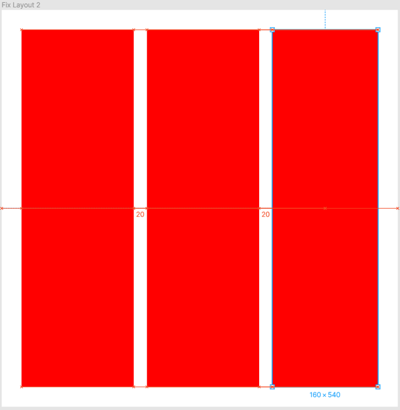
It was deceptively simple compared to the others, to the point where I had to check in with the professor to make sure I wasn’t misunderstanding. I think my experience as a photographer makes it easy for me to understand the purpose of a grid in composing something, whether it be a photo or a Figma exercise.
The file we had to copy remained mostly unedited by the time the video ended. One improvement that could be made to this lab is having students start off with a blank slate and make each element on their own. I think this would help in learning how to use Figma as well as make it more interactive.
For Project 1, we had to represent the lyrics of a rhyme or lyric with both abstract and explicitly representative iconography. I chose the opening lyrics to the old track “Butcher Pete (Part 1)” by Roy Brown, which has been stuck in my head for years since I first heard it in Fallout 3. They are as follows:
Hey everybody, did the news get around about a guy named Butcher Pete?
Oh, Pete just flew into this town and he’s choppin’ up all the women’s meat!
The lyrics aren’t actually about mass murder, but about a promiscuous man, but can be about murder if you, say, put it in a game like Fallout 3.
The abstract representation was a bit difficult. I initially thought the song was easy enough to translate, and it definitely was for the most part, but I’m not totally confident the lyrics came through for the abstract section. I really like what I did for the representative section though.
I’m currently way from my usual two-monitor set up and operating on a slightly outdated Lenovo. This DMA thing is really, really hard without two screens, not to mention I’m working with half the RAM I’m used to and a terrible LCD screen (I can’t even play Apex!). But, as they say in the pharmaceutical industry, the show must go on.
I don’t think they say that in the pharmaceutical industry.
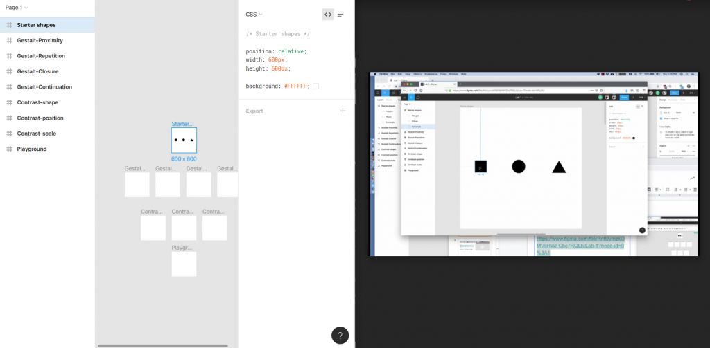
That said, I’m really starting to enjoy Figma, especially as a lightweight, less resource-intensive alternative to Illustrator while I’m away from the battle station. Learning about the concepts of Gestalt design is also very interesting. I’m noticing a lot of the concepts we’re being taught are ideas I recognize in things I like but never had a name for or even necessarily recognized as deliberate.
For our first assignment in DMA 214, we had to submit two sketches, one analog and one digital using Figma. I’d never heard of Figma before this but I already like it much more than I like Illustrator. It seems like what Illustrator would be if it could freely update without keeping legacy users in mind (the pen tool in particular is leagues ahead of Illustrator).
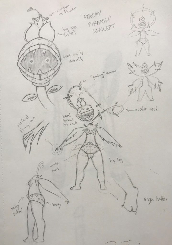
Graphic design is my passion.A poorly taken photo of a character concept sketch I made based on the Mario character Petey Piranha.
We also had to read an article on TechWhirl on Gestalt theory, which focuses on the way art is interpreted subconsciously as well as consciously, and how to design with this in mind. It’s broken down into a number of subsections and lists, but it’s still pretty complicated so I’ll probably have to read it a few more times before I really get it. Here’s hoping I can understand it in time for the final project!