For Project 3 we had to create a design based on a common metaphor or phrase. I chose the phrase “a watched pot never boils,” mostly because of the weird visual that jumped into my head as soon as I thought about it.
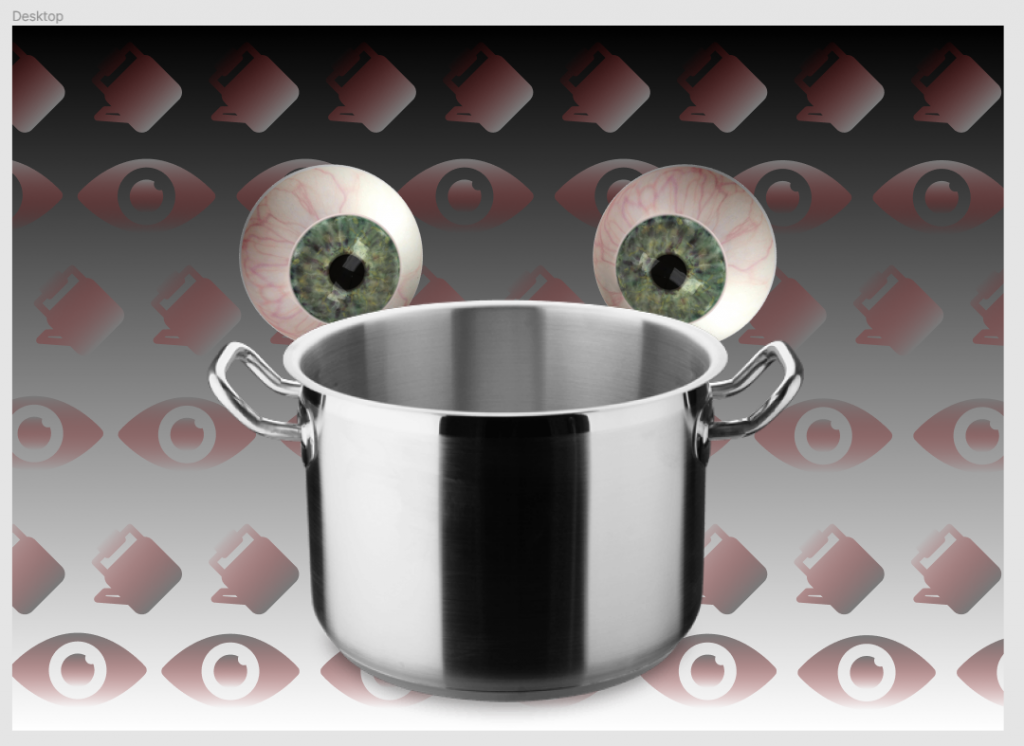
My favorite part of this design was the pattern in the background. I chose to have a slightly transparent gradient scheme with a touch of red to make it seem like each image in the patter was sort of oozing out of the background, or like it was a little bit difficult to perceive. I chose red to match with the veins of the bloodshot eyes looking at the pot.