

For this project I learned how to have consistency in my designs. I used my knowledge of color schemes to have my designs look organized.
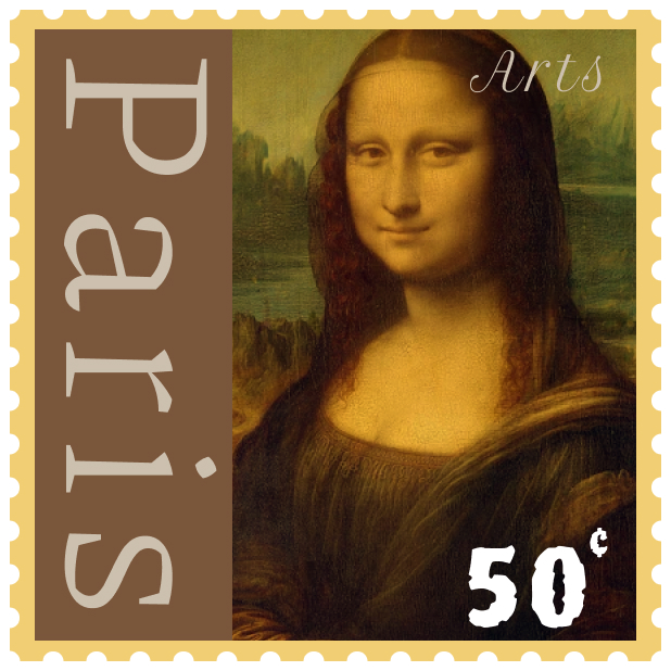
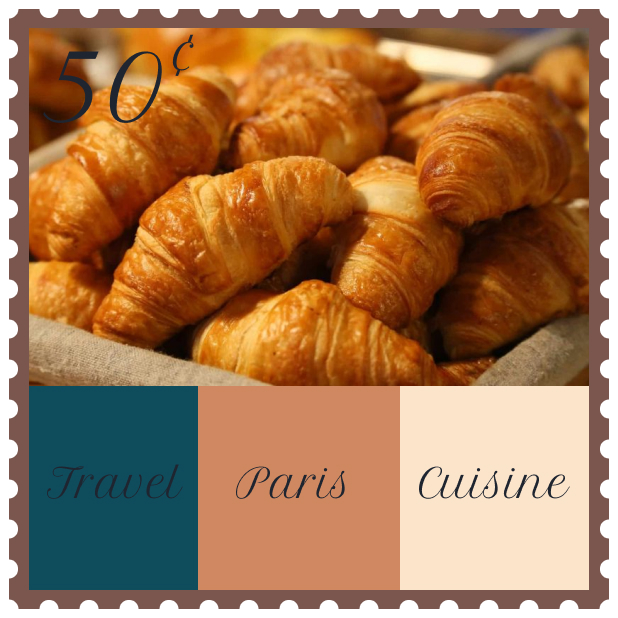
It was easy to pick color schemes I saw in the pictures. I tried to avoid using bright colors. I did no t want my designs to standout too much. I used different shades of green, brown, orange, and yellow to represent the buildings and sky. Using Paris as my location was easy because my grandparents had a lot of stamps from Paris. It was challenging to create different layouts for each stamp. Creating unique design for the stamps was challenging because I has limited space to work with.
My submission could be improved with more pictures of Paris. I limited myself to one photo per stamp which causes my designs to look too simple. Typography is not one of my strengths either, so I would practice more before submitting another assignment.
I could apply what I learned to future classes. I’ve learned how to design more efficiently in Figma. The skills I learned can help me create better unique designs for other classes.