What Did I learn? This “To Do” App was definitely a learning experience for me. I had only used Figma once before this assignment during my freshman year, but this project was a lot more complex. Something in particular I learned that I found useful is the ability to create components. Creating components made it so much easier to replicate a button, checkbox, etc. that I needed again. One more thing I learned was the concept of plugins. Plugins made it very easy to add icons or any additional features to your app that Figma doesn’t offer itself.
What was easy? In my opinion, this project was difficult to do on my own. Asking Professor Dunkle for help over zoom aided me with a great deal of this assignment. I consider myself a slow learner when it comes to learning new programs.
What was challenging? There were multiple challenging aspects of this project, but one thing I really struggled with was the navigation tab. It took me multiple attempts to get it to work the way I wanted. It took a big chunk of my zoom session with Professor Dunkle to get it working correctly.
How could my submission be improved? Now that my To Do app is complete, I feel there is nothing “wrong” with it per se, but I feel it is not very aesthetically appealing or creatively designed. It is a bit too simple looking in my opinion.
How could I improve my assignment for the next class? I believe I could improve my app by taking the time to learn the Figma tool better and possibly watching tutorials on how to use the app. I also could’ve viewed more of Professor Dunkle’s class lectures to figure out things I missed.
How might you apply your knowledge in future assignments or work scenarios? As somebody who wants to pursue social media and social media marketing as a future profession, I feel that Figma may be an extremely useful tool to know. There may be a time in my career where I need to mockup social media posts or app updates on Figma. It is a great tool to help an idea come to life.
How did a specific reading or video inspire or help you? What inspired the idea for my app was a challenge I was seeing on social media called the “75 Hard.” I thought it would be cool to base my app off of that instead of doing a regular To Do app.


Pictured above are three pages of my app that I am most proud of.
Work In Progress Images:

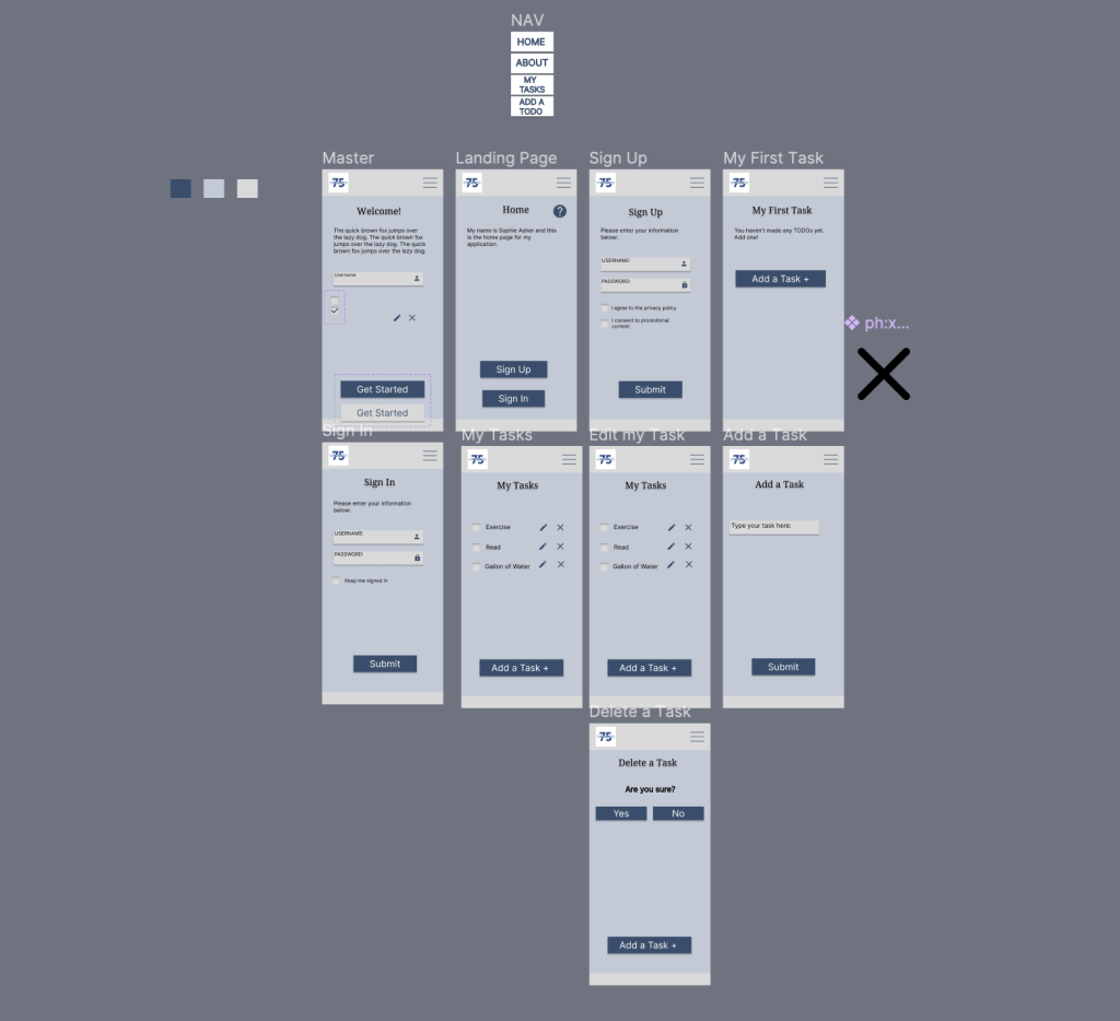
This screenshot was taken after about a week of working on the To-Do App. At this point, I was not feeling overwhelmed with the prototyping and the amount of pages. I only had a few button prototypes completed
Here is the logo I created. I think it is sleek and professional. I like how the text goes through the number “75.” It was recommended that I take out the “on task” banner from the 16×16 logo due to its size.
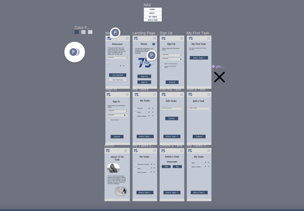
Here is a photo of my project about three-quarters done. As I needed more pages and prototypes, the assignment got more complex.
Here is my Figma Assignment fully complete. I was finally satisfied with the way everything was functioning.

Lastly, here is the color palette I made for my app. I created three different color styles for easy access. I named the colors (L to R) Navy Blue, Steel Blue, and Light Gray.