Photos:
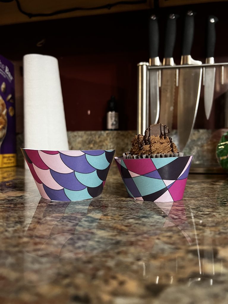
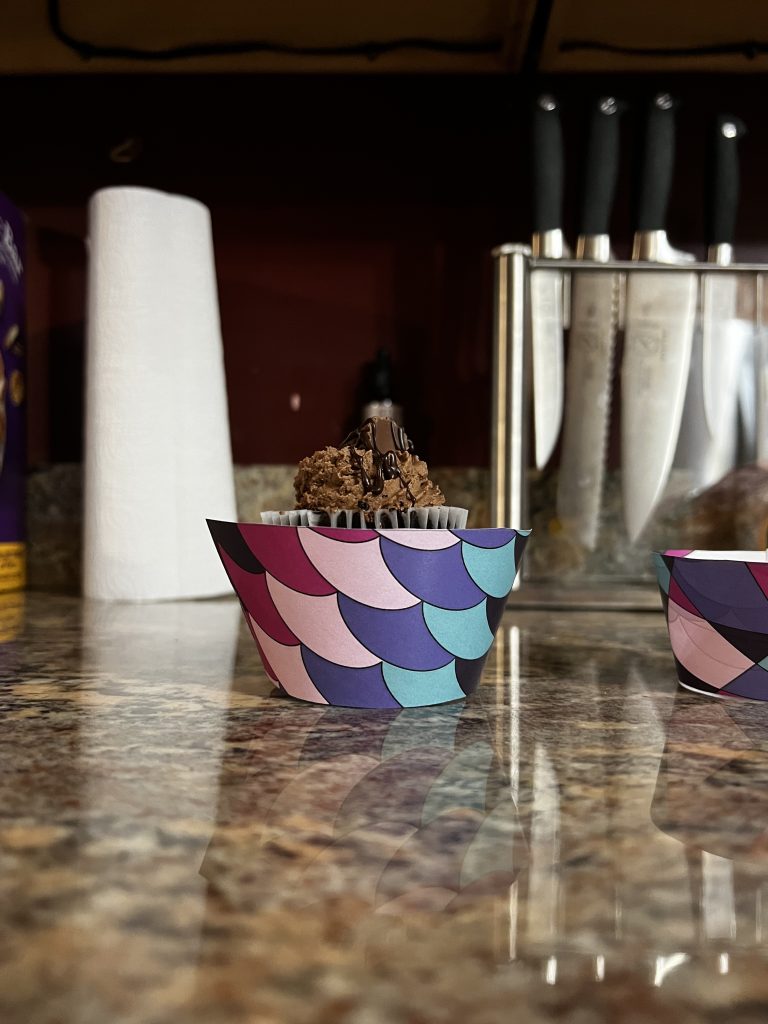
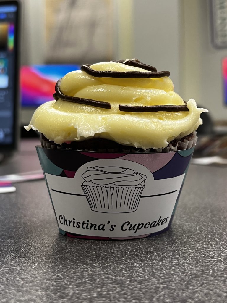
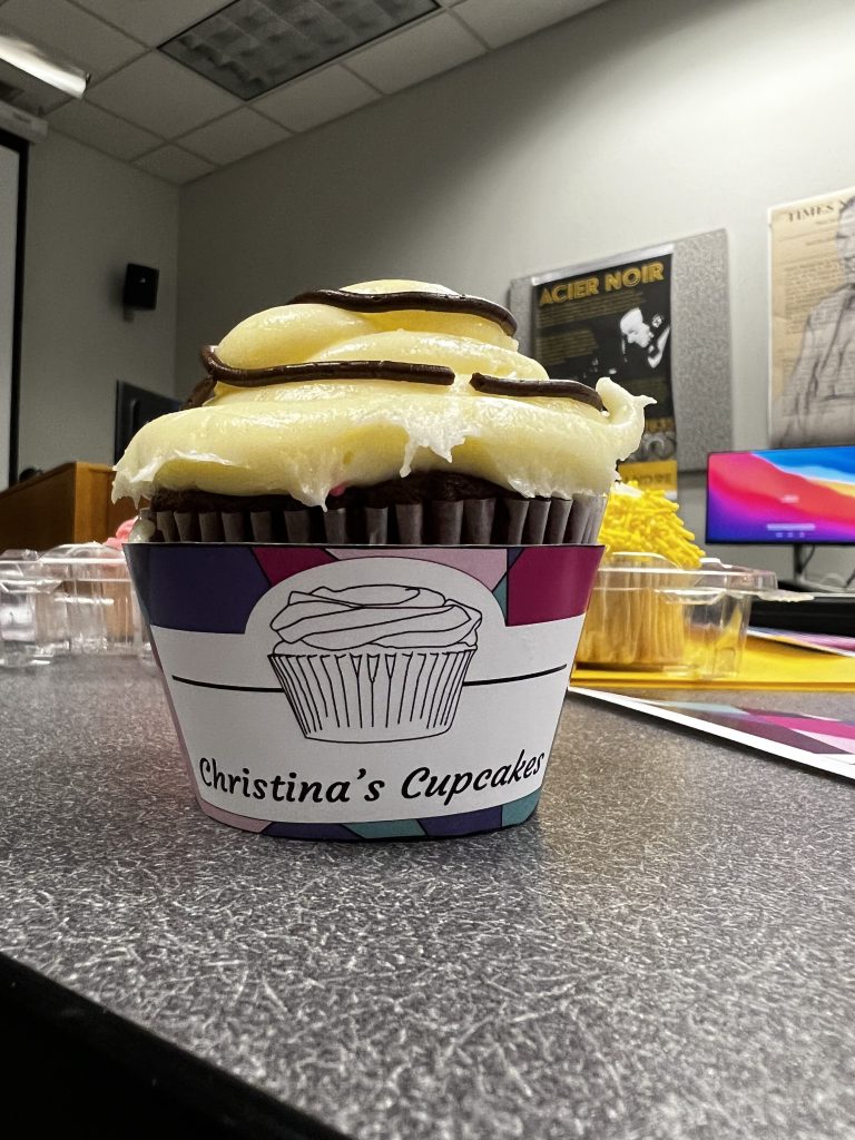
Reflection:
- What did you learn?
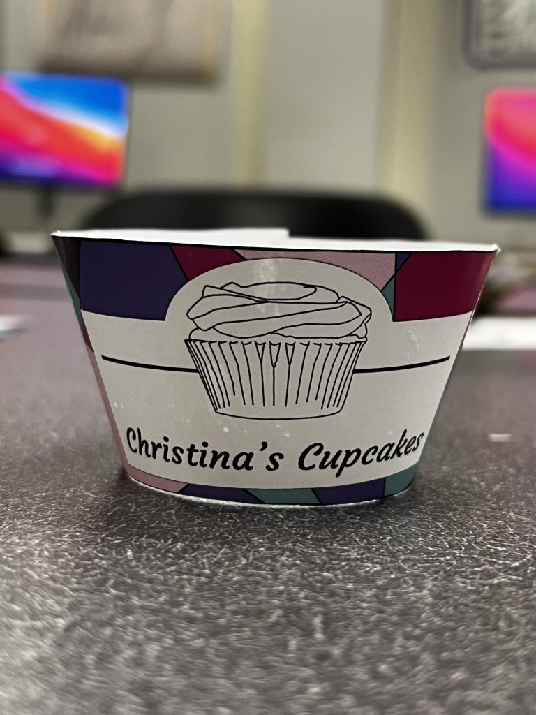
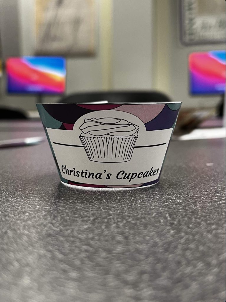
- I learned that when it comes to designing packaging that there are two ways to show how it will look on a product. The first way is by printing it out and putting it on the item, and the other way is by making a 3D version in illustrator.
- What was easy?
- It was easy deciding my color scheme and what designs I wanted to do with my product. I wanted the designs to be colorful and eye-catching since these were paired with cupcakes.
- What was challenging?
- It was challenging cutting out the liner because the reference lines were too light compared to the dark colors of my palette.
- How could your submission be improved?
- My submission could be improved if I figured out how to add a bottom to the liner so the cupcake would sit in it.
- How can the professor improve the assignment in the future?
- I don’t think anything needs to be improved on the professor’s end.
- How might you apply your knowledge in future assignments or work scenarios?
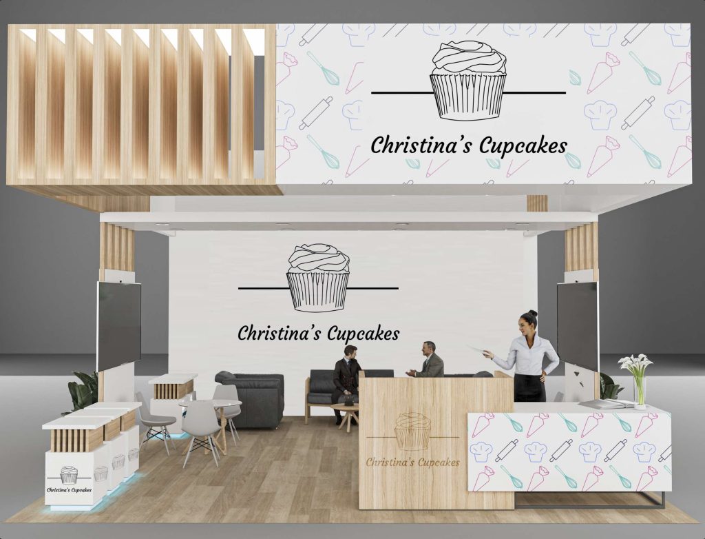
- I’ll apply my knowledge in future assignments or work scenarios if I’m designing a package of some sort I’ll have multiple ways to show the client the result and will be able to make a mock show booth display on how they can present the product.
- How did a specific reading, video, or example inspire or help you?
- I guess an example that helped me was the apotec bay booth design for when I created my trade booth. Another inspiration for this project was can koozie’s but I wanted to make them for cupcakes.
Mood Board Link:
https://docs.google.com/presentation/d/1BoQeDc1TcUq0ZczAbHUiLV4NTlVNRPgoFbgzY_KwH8c/edit?usp=sharing