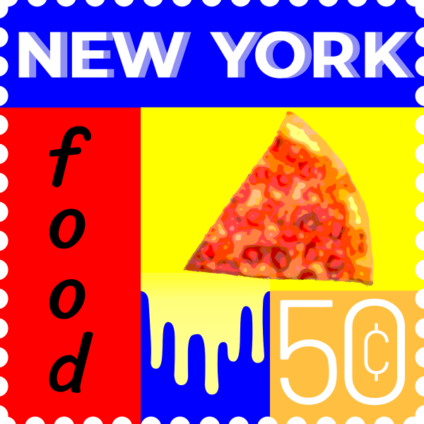
Food Stamp
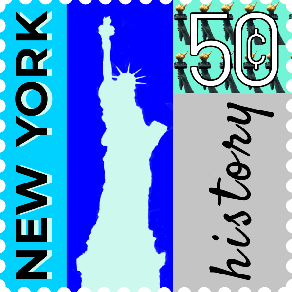
History Stamp
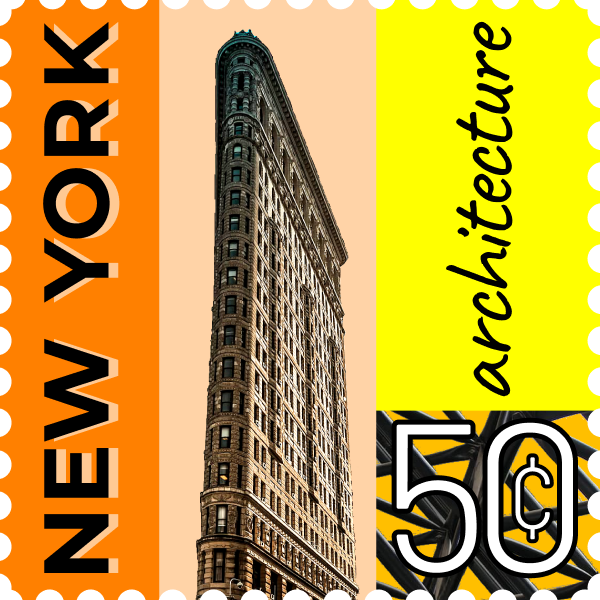
Architecture Stamp
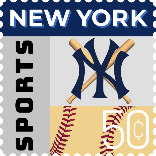
Sports Stamp
Sketches:
Reflection:
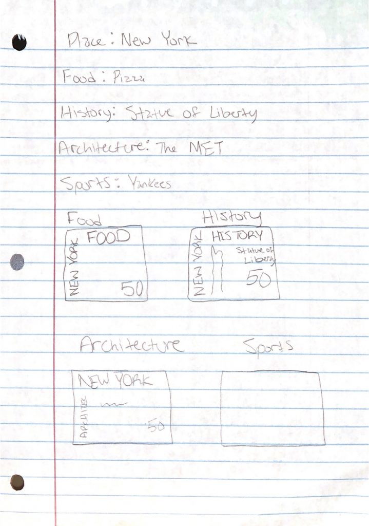
For project 4, we had to create four stamps based around a place of our choosing. Mine, as you can see, was New York. The categories of the four stamps were based on our locations, and the categories were food, history, architecture, and sports/culture. These are what makeup our locations identity to those who aren’t as familiar with it. I learned about different types of fonts and how you organize different types of fonts they can feel and look like groups. Especially when boxes or outlines of some sorts are involved, you can distinguish where these items should be. It was easy choosing what I wanted to do my project on, especially since I visit New York quite a lot. Since I’ve seen and been in contact with all the categories I touched base on, it was a lot easier and more fun to do this project. It was challenging to make sure the fonts fit the theme of each stamp. Along with that, ensuring it physically fits the stamp, so it doesn’t look too clumped or messy. My submission could be improved if I spent more time specifically on the color scheme on the food and history stamps and the two patterns on those stamps as well. I don’t think there’s any improvement needed for the next class. I’ll apply this knowledge in future assignments or work scenarios by using google fonts side by side with my workstation to look for different fonts that could fit with what I’m working on rather than settling on the default fonts that are given on systems. What I took from our lesson lecture that helped me the most for this project was the spacing between letters and how it affects the outcome of the final product. It encouraged me to adjust the spacing to where I felt it looked better rather than leaving it as it was. I was also inspired by Julia, one of the student examples that we looked at and how for each stamp, the category names she would use a different font that fits with that stamp which inspired me to do the same.