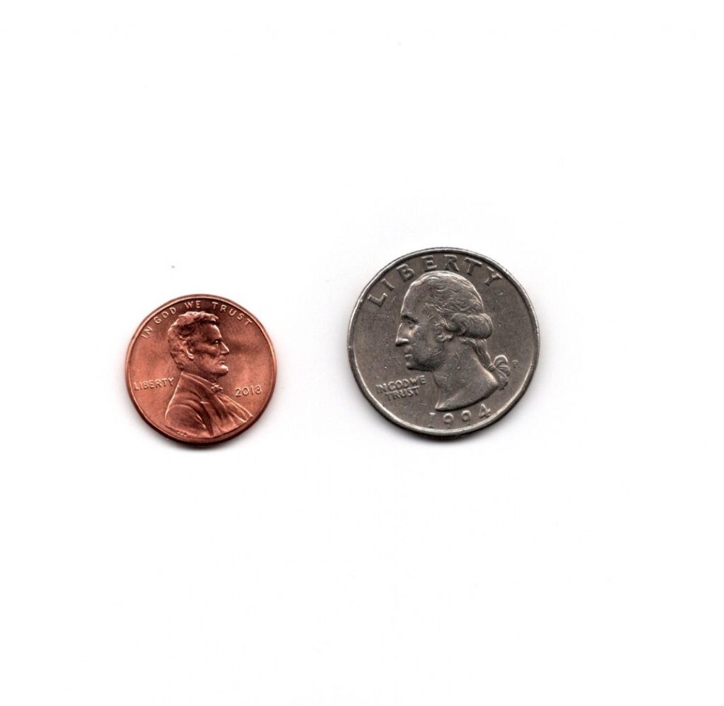
The first photo is from unsplash.com and I took the second photo on my phone. The unsplash.com photo has better lighting and proper exposure. The cat’s eyes pop and are the focal point of the photo. It has a higher resolution and is more aesthetically pleasing.
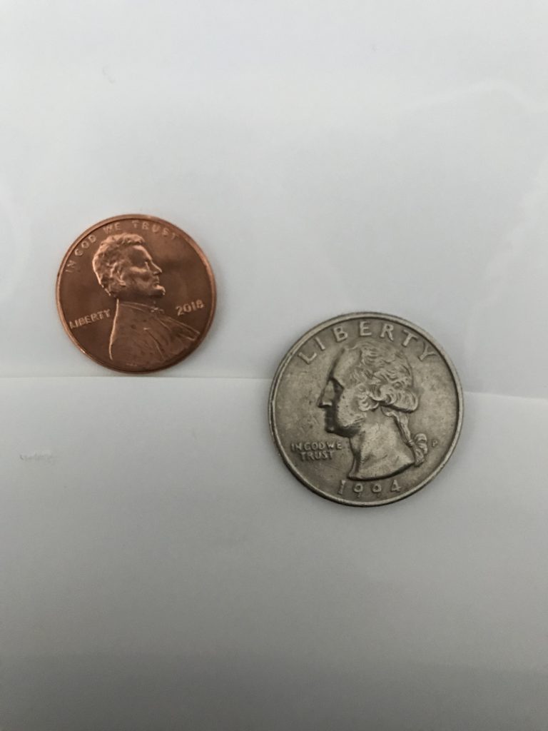
The images on the left were taken with a scanner and the images on the right were taken with an iPhone camera. The scanner images have a higher resolution and brighter lighting. They are sharper and look more professional. The difference in lighting stands out the most, so the iPhone camera images could be improved with proper lighting.
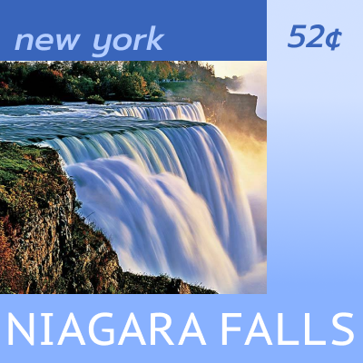
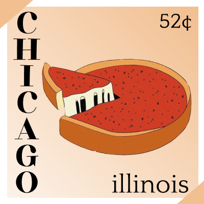
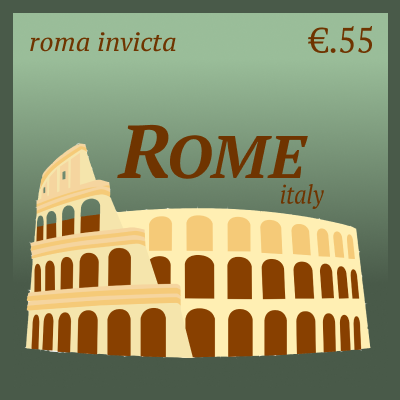
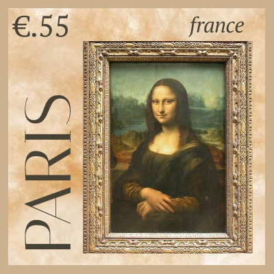
I learned how to combine all the elements of design that we have practiced this semester.
What was easy?
It was easy to decide on the imagery for each city and develop the concepts.
What was challenging?
It was difficult to arrange the elements of the stamps in the most effective way.
How could your submission be improved?
I am not completely satisfied with the color schemes of the stamps. It was difficult to make the colors work with the images and the essence of each city.
How could I improve the assignment for the next class?
I liked this assignment and wish we could have had more time with it. I know my submission could be better with some feedback and time for improvement.
How might you apply your knowledge in future assignments or work scenarios?
I learned how to effectively use type and fill space which is a valuable skill in all graphic design projects.
How did a specific reading or video inspire or help you?
Student examples helped with the creative process.
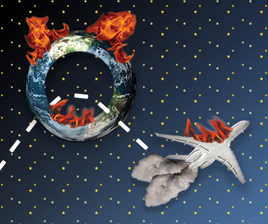
My project illustrates the metaphor “out of the loop.” Since this is a broad phrase, I created the image in terms of being out of the loop with climate change. The earth/loop with flames demonstrates the urgency of the issue, and the plane emitting pollution is out of the loop physically and metaphorically. It is continuing to damage the earth despite the situation.
What did you learn?
I learned how powerful imagery can be. Images can communicate a message effectively and sometimes better than words. Imagery forces the viewer to see something in a particular way and leaves less to the imagination than a written description.
What was easy?
The technical aspect of this project was the easiest. I am familiar with Photoshop and had all the tools I needed to execute my vision.
What was challenging?
The most challenging part of the project was developing the concept. Creating an image that communicates the literal meaning of the metaphor as well as the abstract meaning was difficult and frustrating.
How could your submission be improved?
Other people only understand the meaning of my image when it is explained to them. Though I think it makes sense, I could have designed the metaphor to be more easily recognizable.
How could I improve the assignment for the next class?
The guidelines for this assignment were a bit confusing at times. Sometimes it seemed that a literal translation of the metaphor was acceptable, but other times it required a double meaning. It made creating the concept difficult.
How might you apply your knowledge in future assignments or work scenarios?
This project required me to think carefully about how to communicate a message and this is something I will do with every future assignment.
How did a specific reading or video inspire or help you?
Past student examples are always helpful for gaining inspiration. I looked through all the articles linked in the project instructions and they were useful for understanding the goal of the project and how to properly execute it.
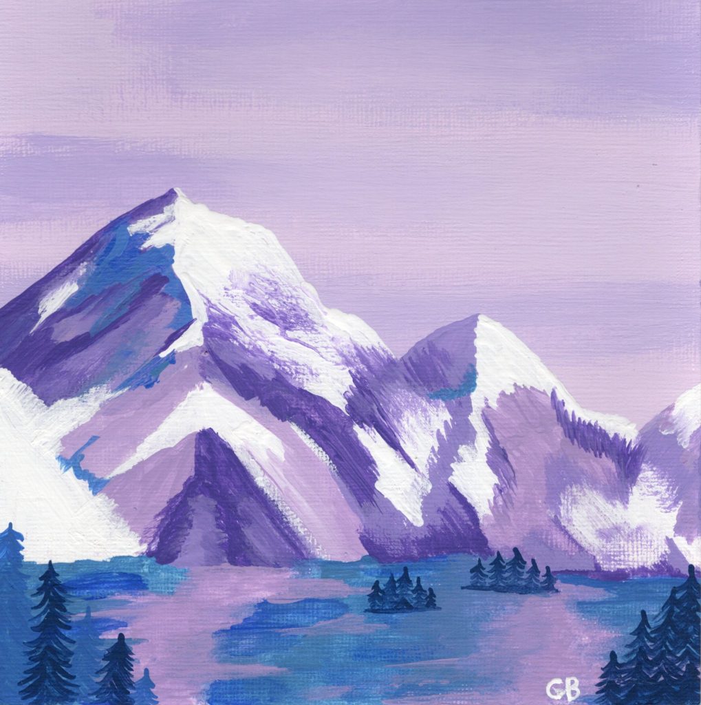
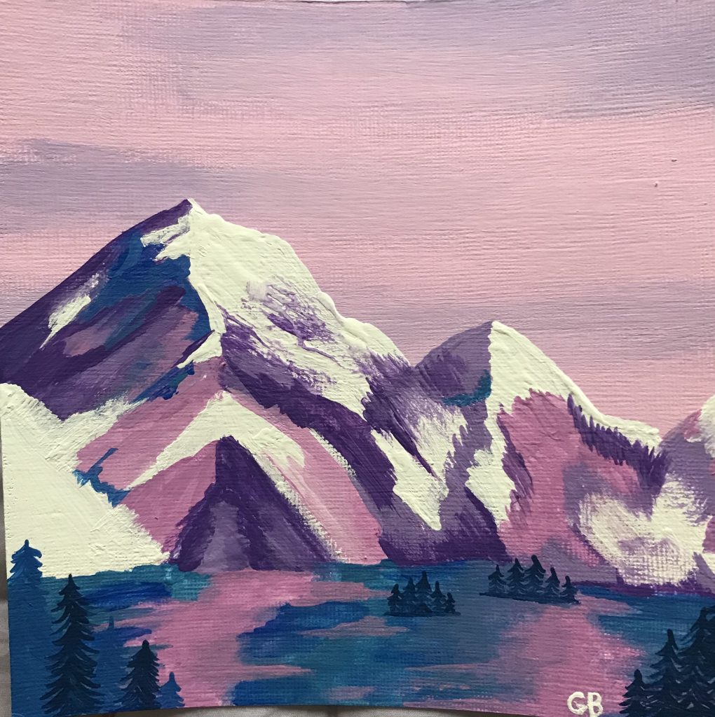
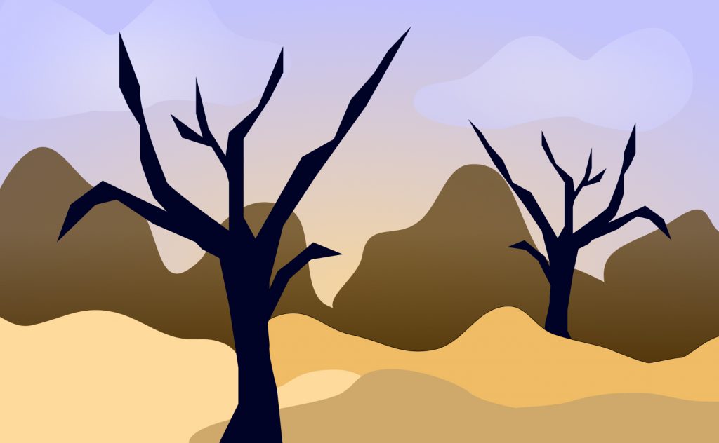
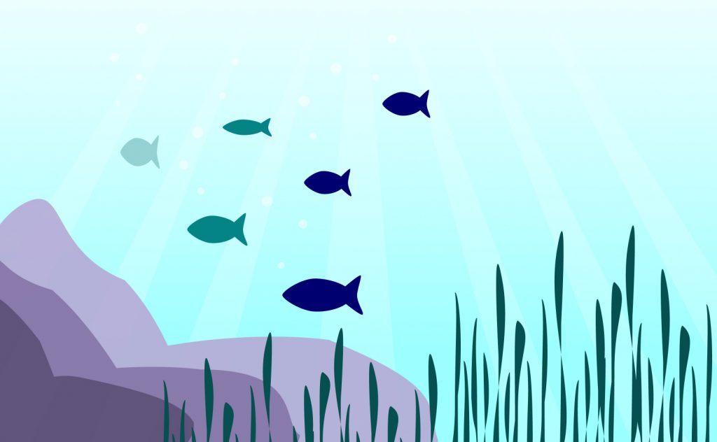
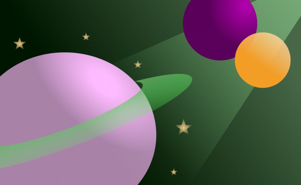
The goal of this project was to learn how to create color palettes and make them work together. I definitely gained a better understanding of this and was able to put together colors I typically would not. I also learned the importance of changing saturation, tint, and tone to improve the palette.
What was easy?
It was easy to form creative ideas for this project. I had a small creative block with Project 1 and it was hard to begin working, but I did not experience this with Project 2.
What was challenging?
I struggled the most with finding balance in my frames. Some landscapes looked too empty, but adding more objects made it too crowded. I had to figure out how to scale things appropriately to make the landscapes simple but still interesting to look at.
How could your submission be improved?
I could have chosen more diverse color palettes. My project is mostly cool toned and I would have liked to play with more warm tones.
How could I improve the assignment for the next class?
I enjoyed working on this project and often used it as a break from other classes. I found it very helpful and I honestly would not change it.
How might you apply your knowledge in future assignments or work scenarios?
Color conveys mood and building an effective color palette can pull together a design. I think I will use this knowledge in all future projects.
How did a specific reading or video inspire or help you?
The Smashing Magazine article was a good reference and very informative. I also found that looking at student examples was helpful and inspired some ideas.
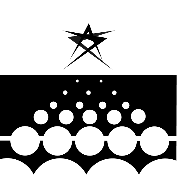
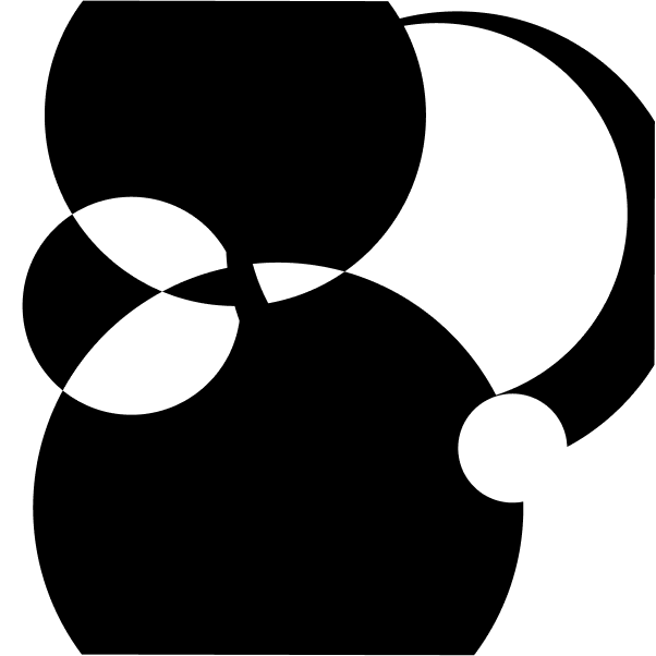
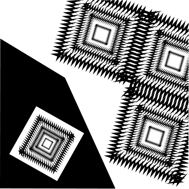
I learned how to use Figma and gained a better understanding of the gestalt principles. Applying it in my own work taught me how to use the principles to convey a message.
What was easy?
Once I got in a creative rhythm it was easy to be productive. Figma is also easy to navigate and work with. It was nice to concentrate on the work itself and not worry about struggling with the program.
What was challenging?
Getting started was the most challenging part of the project. It was hard to know where to begin and put ideas together. Designing in completely black and white was more difficult than I thought it would be. I never realized how much color and value is used as a crutch.
How could your submission be improved?
I think some of my frames are a bit boring or bland. I could definitely make them more interesting and creative.
How could I improve the assignment for the next class?
I enjoyed working on this project and learned a lot from it. I think I could have benefitted from a bit of practice (possibly a smaller assignment along with the lab) before diving in.
How might you apply your knowledge in future assignments or work scenarios?
The rule of thirds is extremely important and will definitely be applied to every project in the future. I can also use the gestalt principles to establish a focal point and create contrast.
How did a specific reading or video inspire or help you?
The Smashing Magazine was informative and helped me understand the principles. Student examples were also helpful and inspired some ideas.