Project 4

This was a project for pretty much combining everything we learned for the semester. One thing I learned more of is the fact of the image trace more in depth. It allowed to expand and mess around with the images I used to make them more of a vector image.

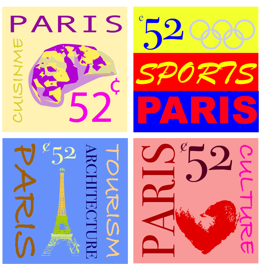
I found it very interesting to make this with a city because the ideas flowed with me endlessly.

There was nothing too challenging about this assignment because I felt that I gained experience using illustrator. I guess I could say the organization of the words was tough along with complementing it with a color scheme.

My submission could be improved by mostly adding the stamp rip like you showed or making the color schemes pop more.

I generally like this assignment along with all of the ones in this class but maybe add some more stamps to make.

This knowledge will help with design in the future knowing color schemes and allowing to transform images to pretty much whatever you want it to be. It will help with my creativity in the future with projects I am sure I will have to encounter.

Project 3

Out of all the projects so far this was probably the easiest one for me due to the fact that I have a little experience with photoshop and how it works.

What I learned from this project is the use of patterns. I have never used patterns before in anything so that was something to get used to. Though they are easy and fun to play with I kept forgetting where they saved to but obviously I figured it out after a few clicks around. I also learned that you can morph the picture by using the command along with moving the object since I have also never done that before.

The hardest part was to come up with the metaphor I was going to use to make it visual. I thought that thinking about a metaphor was the most difficult part for me.

To improve my submission I could play around with the suit more and maybe add some shadow on the bottom of the suit since it cuts off with no lower body.

The only thing I would think is to have 2 metaphors because it took me not that long to do it. It would challenge me to think of another metaphor would have been something I would have to dig around for.

This knowledge will help me because I will be using photoshop plenty of times in future classes and eventually work. It helps me learn how to make a metaphor into a picture and to think outside of the box. Being able to think of objects as words like synonyms to make something pop and make sense.

Project 2

For me project 2 was a little easier than the first because of the color aspect.

What I learned from this is the use of the color wheel. I never really thought of it like a color wheel, I just thought of colors. It was interesting to see the different variations of one color and that it can speak into a whole piece of work. I also learned the different types of gradients because I only have used gradients for backgrounds for power point presentations and that only has one choice. The radial gradient was all new to me.

The easiest part was to come up with ideas believe it or not. I am not that creative when it comes to thinking from scratch but I thought I had some smart scenes from my perspective. Also messing with opacity was simple to do. It really shows depth which I used in some of my pieces.

The challenging part was to make the color pertain to the project. This is because I was just thinking what colors I wanted but they were not pertaining to the types on the wheel. Also the pencil tool with blending, I had a difficult time with but with your help it made it easier.

To make this better I probably should have went to the optional class to work on the nit-picky details to make it better but I have senioritis and I am sure many people did the same as me.

Through work experience eventually I will probably move into a role where I have to use illustrator and after effects so using these tools we used in class for when those times come for a promo poster in the future.

Project 1

Project 1, I learned a ton. After not really having an identity of this course and what it was all about, everything was new to me. I found it very interesting how basic shapes can be put into effect to tell a full story.

The easiest part for me was drawing the shapes that I wanted and to be honest that was really it. The shift button helped out a ton with that.

The challenging aspect of this assignment was to think completely outside of the box because we were just using basic shapes. Also the word tangent was challenging. Whenever I would place something down I would then realize that it was to close to another object. That was probably the most challenging part.

My project is not a 100 whatsoever. This was a real learning curve for me because I have never done anything like it. I probably could have thought more outside the box because my project is, to me, very simple. I could probably improve on the placement and positioning of my project as well.

I thought this assignment was interesting so I would not change it.

The knowledge gained will help me by using the power of the thirds in my workforce. With Channel 4 I will be able to frame better by gaining the knowledge of the thirds.