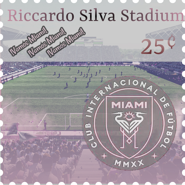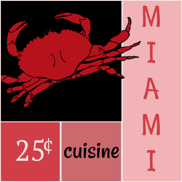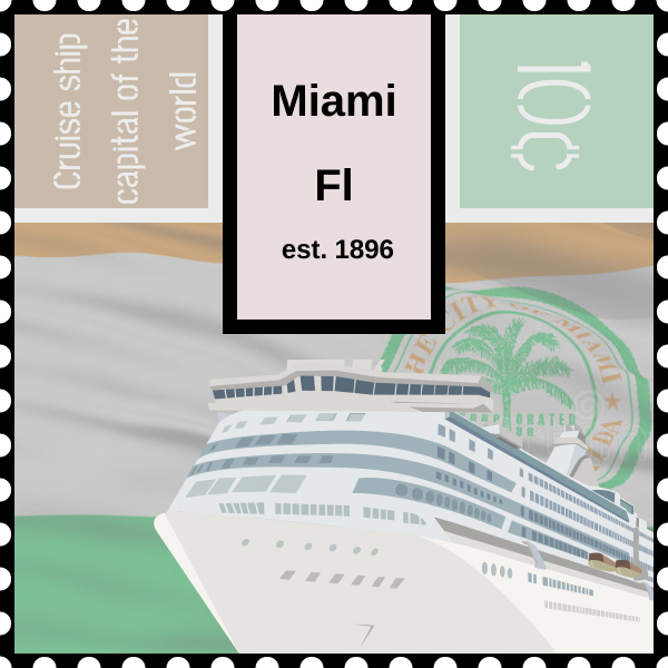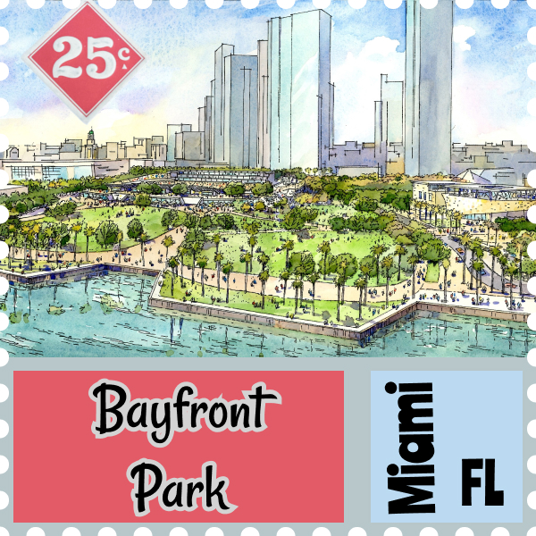


- During the completion of this project, I had learned how the importance of typeface and how they must complement each other within each design to keep a consistent tone of art. This project had also opened my mind as far as how Miami’s culture was developed and is now in the present.
- The easiest part of this project was researching and finding the base photo that I wanted to use for each particular stamp.
- The most challenging part was figuring out what fonts/ general design concept would really compliment my photo. I tried making everything blend together so that nothing looked forced or out of place.
- My stamps could have improved with more research on actual stamps. Over the duration of my project, I had looked at a few actual stamps, however, I do believe that if I further researched for more stamps for each individual attribute of Miami, I may have been able to get a few more ideas on how to make them look authentic.
- I believe that this project was able to bring together every aspect of digital design that we had used in the past classes. From typeface to color schemes, and even aspects from project 1. I believe I was well prepared for this project and the only way I could improve for future classes would be through refreshing on the older information from class.
- This project has the potential to show up in many future work scenarios or classes. I believe that it is always necessary to have an appealing typeface in order to really give the reader a connection and idea of what you are really trying to send a message about. This project was entirely about appeal and how things can combine to look unforced with a steady flow of ideas. This type of work is seen in Marketing to persuade consumers to click and/ or read the ads
- Since this project was a combination of all past class work, most of my inspiration came from all of our past class videos and past assignments. I had also viewed many of the past student’s submission in search for inspiration and ideas.