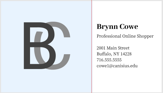
- In this project I learned the importance of balancing fonts, colors, and line weight to create a cohesive and branded look on a professional business card.
- The right side of the card was fairly easy. I enjoy spacing out text and playing around with the size and weight of certain fonts to contrast with other parts of the text.
- The logo itself was challenging. I still struggle to create and manipulate lines and shapes freehanded. It definitely stunted my creativity.
- If I had better practice with line creation, I may have been able to be more creative with shape.
- Perhaps only using one program and teaching us step by step how to use it. I was overwhelmed at learning a new program and also trying to keep up with the information provided during class.
- I could use this knowledge/skill when creating icons, logos, shapes, and sketches to spice up a piece of marketing content.