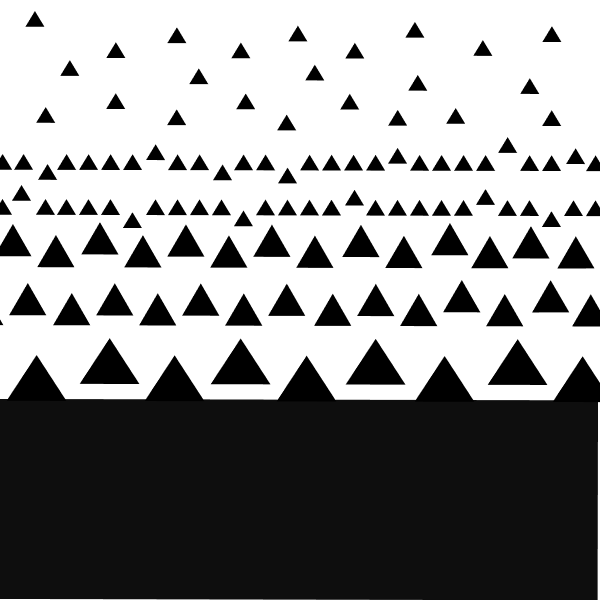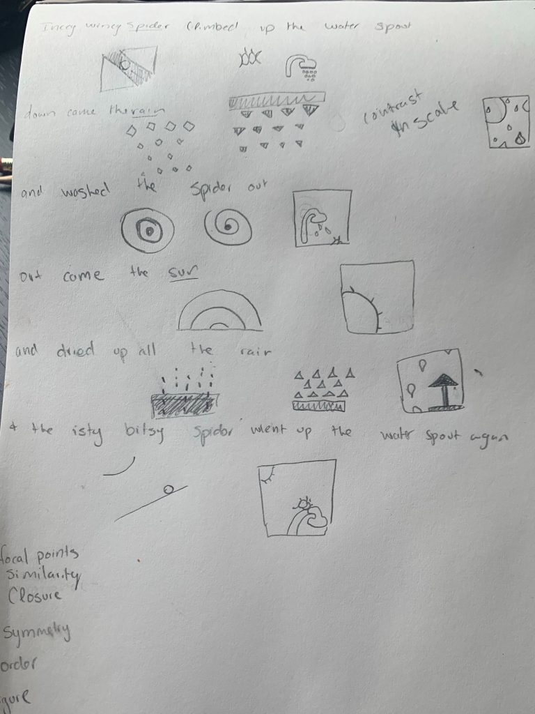
Climbed up the water spout


And washed the spider out


Climbed up the spout again

Climbed up the water spout


Climbed up the spout again

What did you learn?
This project really helped my understanding of the gestalt principles. It’s one thing to hear a lecture on it or read an article, but it is entirely different to put these concepts into use. I never knew there was a rule of thirds but following this rule really makes a huge difference when making the frames look aesthetically pleasing.
What was easy?
Using figma was pretty easy compared to my previous exposure to Adobe Illustrator. It was very user friendly to use and gave this project an interesting spin. Since I concentrated less on how to use the software, I could focus more on the frames and the ideas conveyed by the frames themselves.
What was challenging?
I have never in my life done anything like this project before. Thinking about things abstractly and making this abstract drawing be visually appealing and still have the viewer understand where I was coming from was a challenge. This project challenged me to think about graphic design in a way I never thought before, from similarity, proximity and continuity. Taking in all ideas I learned from lecture and from the multitudes of articles I read and then bringing the Itsy Bitsy Spider story to life in a creative and interesting manner has been a very fun challenge.
How could your submission be improved?
I feel like my submission has a lot to improve. I feel like still do not have enough understanding on some of gestalts principles, like closer. I tried to use all of the gestalts principles in this project but I do not think I am at a understanding where I can successfully implement all the different rules make my story even more compelling and aesthetically pleasing. So having more time and more experience with these principles when it comes to graphic design would really help my submission.
How can the professor improve the assignment in the future?
It would be interesting if each frame had to represent a gestalt principle as well as a frame from the story. It would really help with each principle since the best way to learn something is to actually physically work with the idea.
How might you apply your knowledge in future assignments or work scenarios?
I am interested in game design and using any ideas from gestalts principles and the thirds rule will always be useful when making different game covers or any design needed. I really enjoy these kinds of design projects, so this knowledge will always be useful for any other design project.
How did a specific reading, video or example inspire or help you?
I really enjoyed Sam Hampton-Smiths article on “The Designer’s guide to Gestalt Theory”. Sam explained each principle in the contact of graphic design today. It was easy to understand and it helped me identify and use the different gestalt principles in my work.