

What did you learn?
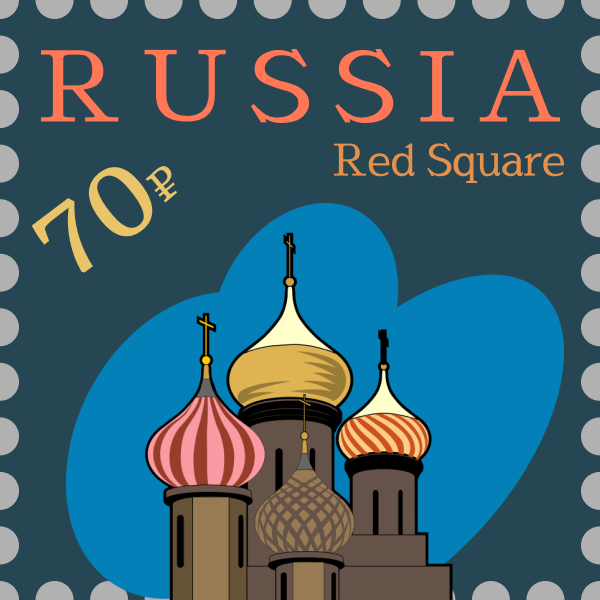
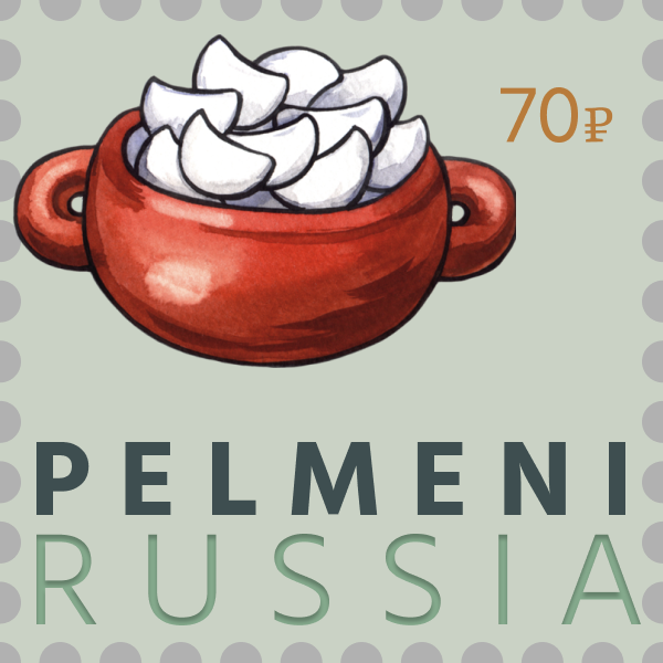
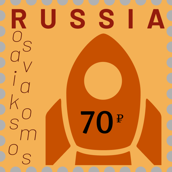
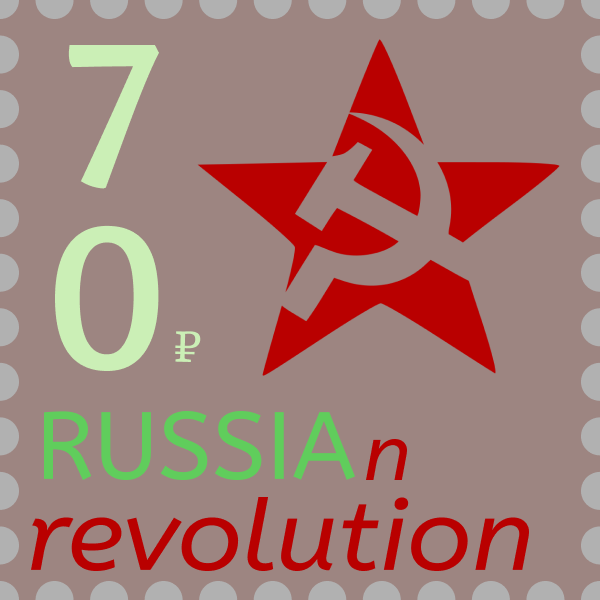
As in theme with this class, I learned how important typography is. It can be so complex or simple but it is a very powerful tool. It can really make or break a project. I really noticed how some type just simply looked bad with the different themes but some really highlighted exactly what I wanted it to.
What was easy?
Figuring out what I wanted on each postcard was pretty easy. I am Russian so I decided to do this project on Russia, was a no-brainer! I know all about the culture and history. Also, choosing the color scheme was pretty easy. I have started to get the hang of using color, so it was pretty easy to find colors I wanted to use.
What was challenging?
It was hard to choose which type would look best. Firstly, Figma does not give an example of what type I could use. Also, some of the type could not be modified, so was not capable of adding any contrast to that type. It was also a bit tricky planning exactly how I wanted each postcard to look since I wanted each postcard to be unique.
How could your submission be improved?
Like my past projects, if I had more access to Illustrator I believe I would have been able to do many more interesting things to the fonts. I am personally pretty proud of these postcards but everything can always have more work done on it. For example, the post card on industry could have had more work done to it to make a more interesting type.
How can the professor improve the assignment in the future?
I really liked how creative I needed to be for this project. Maybe having specific requirements for different types of font that should be used in the project. Having some form of check list of different types I should work would have been helpful so that it is less likely to get into a habit of using the same theme for each postcard.
How might you apply your knowledge in future assignments or work scenarios?
I will keep in mind how a different font can greatly affect my game title, since I believe this can be the reason a person would be interested in playing my game. It is very important to catch the eye of possible consumers, and the font is very important for doing this.
How did a specific reading, video or example inspire or help you?
Coolors.co was incredibly helpful in finding a color scheme. If I used a specific color on the postcard I could just plug in that color and an amazing color scheme was generated. This really helped bring my project together.