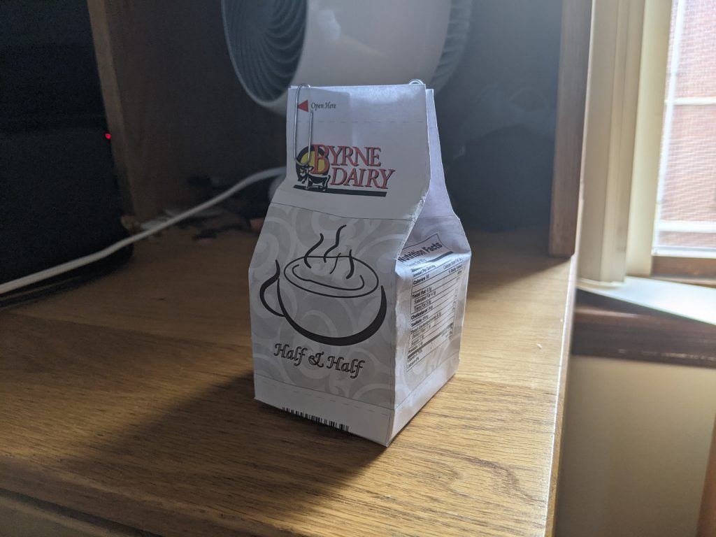
Through the package design project, I got a better idea of how companies formulate their physical products, and specifically learned how to utilize tools such as the pen tool for the coffee cup graphic and the roughening of the rectangle.
Setting up the initial design of the pattern with the previously-designed ‘Byrne Dairy’ logo was easy, and drawing the coffee mug itself was not difficult.
Constructing the physical carton itself was moderately challenging, but within the program itself, ensuring everything was legible after being ported was the most challenging part.
I could definitely work on the physical carton a bit more, but in terms of the design, the font choice and stylization could have more consideration placed on it.
I did not find any instructions to be missing or unnecessary.
Knowledge of Adobe Illustrator is definitely beneficial as I could see myself using the application to design other logos such as this, whether it be for a company, website, magazine, etc.
The mock-up construction video at the end of the slide helped me formulate the paper carton without absolutely destroying it.