DMA214
Emily Scherer
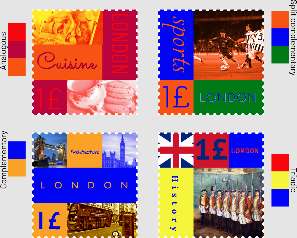
Cuisine: I used the typefaces Sacramento and Barlow/Barlow condensed because I thought they paired well together and wanted my word cuisine to look fancy and then the other words to be pretty basic.
Sports: I used the typefaces Tangerine and Josefin Sans because the same thing I said above, I wanted the word sports to look fancier than the other words like London.
Architecture: I used the typefaces Gloria Hallelujah and Gill Sans because I wanted the word architecture to look like it was built like a building and had character and then I wanted the word London to be basic and show off something similar to London’s typeface called Johnston that they use on everything with their underground subway system and maps.
History: I used the typefaces PT Mono and Lora because I felt like they went together really well and complimented each other and gave a more basic vibe because there wasn’t a need to make anything fancy on this frame.
- I learned that the typography that you use actually matters and there are ways you can space out the words or condense them to fit the space without having a lot of margins. I learned to use up my space and fill it up with the text. I liked how in this project we had to combine things that we learned in class like the typography and the color schemes.
- What was easy for this project was picking the place I wanted to base it on because I love London and all the aspects of it like the cuisine, architecture, sports, and history, and thought it would be a fun place to base my stamps on. I also thought placing the pictures and the typography went pretty smoothly and didn’t have too much trouble with where to place it while also using the rule of thirds.
- What was challenging about the project for me was finding a color scheme that works with my images and the place I chose and also doing a different color scheme for each frame. I would have to make a rectangle with a color in my color scheme and put it behind my photo to make it fit in more.
- My submission could be improved by possibly improving the typography to fit the boxes more because sometimes there is blank space around it. I did go and fix my submission after I already submitted it because I only had one generic color scheme for each frame and was too boring so I added more color schemes to give variety.
- How you could improve the project for next time could be to emphasize more about the different color schemes because I wasn’t sure If we needed a different one for each frame or if I could stick with just one and I realized it was for each frame because it said something in the google slides, but I don’t believe it says it in the actual instructions.
- I will apply what I did on this project to future scenarios because I am sure when I have a job someday I will need typography for a project I will have to send my boss and is just a good skill to have. Also knowing how to create a color scheme will come in handy if I am on the creative side for a marketing team.
- The reading that helped me with this project was “Alignment Principle of Design” because it showed me examples of what is good alignment and what is bad alignment and what I should try to avoid doing. Also showed me how useful a grid can be when trying to create good alignment.