DMA370: Designing for mobile devices
- I learned a lot about coding in this project because I have had very little practice with coding. I learned that it is very particular and you have to make sure you type everything right or else it won’t work. In my experience I had a typo and couldn’t figure out why my pictures weren’t showing up on my website but then realized that the code wasn’t spelled right and once I fixed that it worked. It is definitely an interesting concept and fun to learn once you know what you are doing.
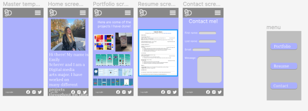
- What was easy for me was following along with the code on the google slides and putting it into my website code. Also making the figma version of it to see the draft of what it is going to look like and see how similar it looks on the website from figma. Having the navigation go from page to page was simple because you did it from figma and then put it in your code. This makes it easy when you click on something like portfolio and then it goes on that page and then is the same for all the tabs. Also when you click on the emily scherer design it would take you to the home page no matter what page you were on.
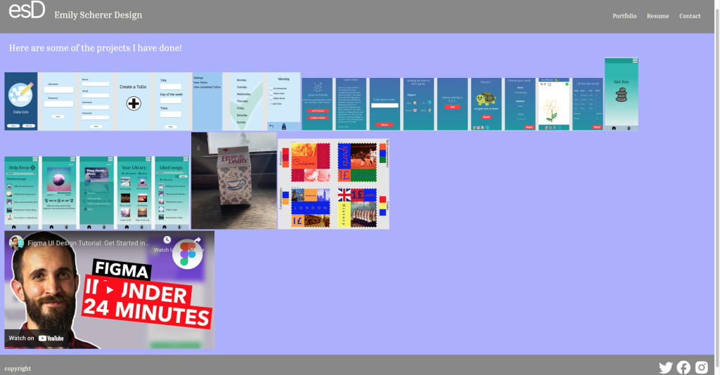
- What was challenging about this project was like I said before getting my pictures to show up on my portfolio page because it was in the code but not showing up on the website. This was fixed because there was a typo and shows how particular it can be. Another thing that was challenging was my header and footer on each of my pages because they also weren’t showing up in the website. I noticed that there were a couple things wrong in the code after looking at it. The text was set to the same color as the header so you couldn’t see it so once I changed it to white it was there. Also I had to copy and paste my header and footer to the other pages in the coding because it wasn’t there in the website and had to do some organization with padding and other things like that.
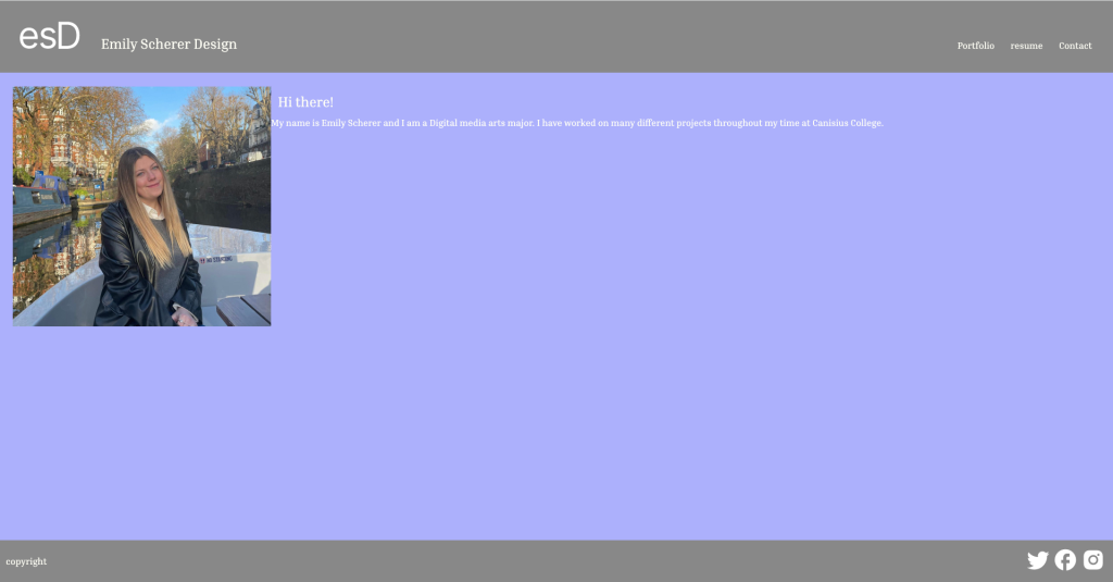
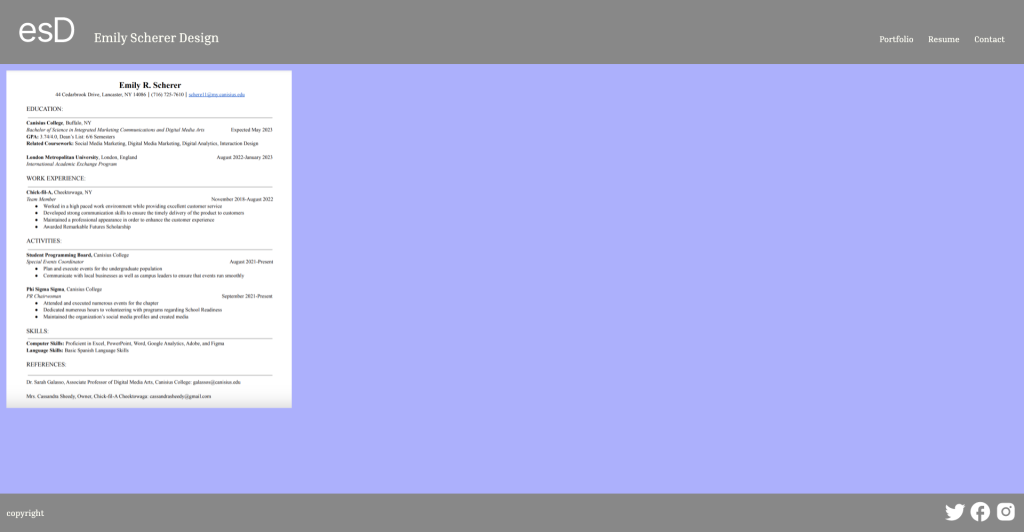
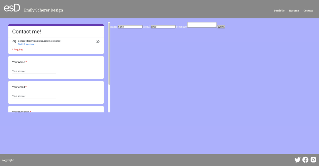
- My submission could be improved by adding more organization so my home page and the other pages wouldn’t look so empty. The pictures and words are so small on the page and leaves a lot of room. Could probably use a little more padding as well.
- The professor could improve this for next time by showing how to have more organization on the website. Have a way to make it look more aesthetically pleasing.
- I will apply what I learned in this project to my future career because if I am on the creative side of a marketing agency and have to create a website for the company I will have knowledge of coding so I will be able to create it for them.
- Class time and the professor’s website helped me learn a lot about coding because I could inspect it and see that code and helped me to see what I did wrong and see why something wasn’t working and what had to be fixed on my website.
https://www3.canisius.edu/~Schere11/dma370/project2
https://www.figma.com/file/rFcjENHymd0ytWXFtcfBHp/Untitled?node-id=0-1&t=Qo4cYvMn1rGxsTbE-0
