DMA370: Designing for mobile devices
Emily Scherer


- What I learned from this project is how to make things animate using a prototype. I also got a lot more practice using auto layout and how to make my frames look really organized from it instead of free handing it.
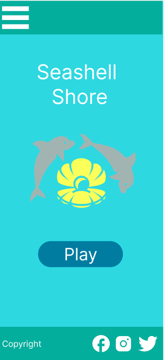
- What was easy was coming up with the idea and creating the layout by sketching it first. Coming up with the name and the logo was very simple and easy to do as well. Once I learned how to animate things everything became easier and was very repetitive when making the levels.
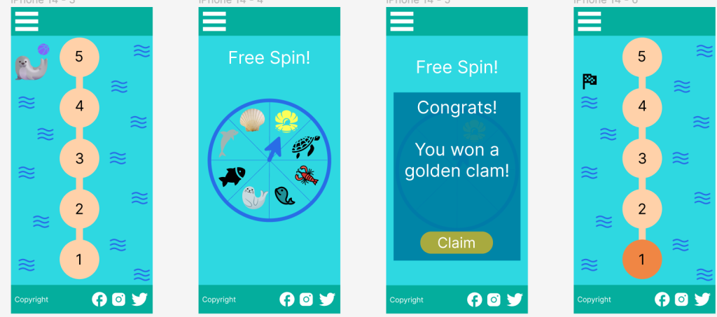
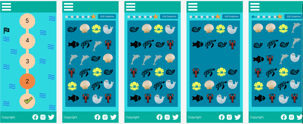
- What was challenging was getting the hang of auto layout because it wasn’t working for me at first when I was trying to make my frames and organize and then learned I had to group them in a specific way for it to work. Learning how to animate the seal so the ball would move and spinning the wheel and swiping the animals to get them to match in the levels was hard to figure out but once I got the hang of it, I was good and realized it is all just used with the prototyping tool.
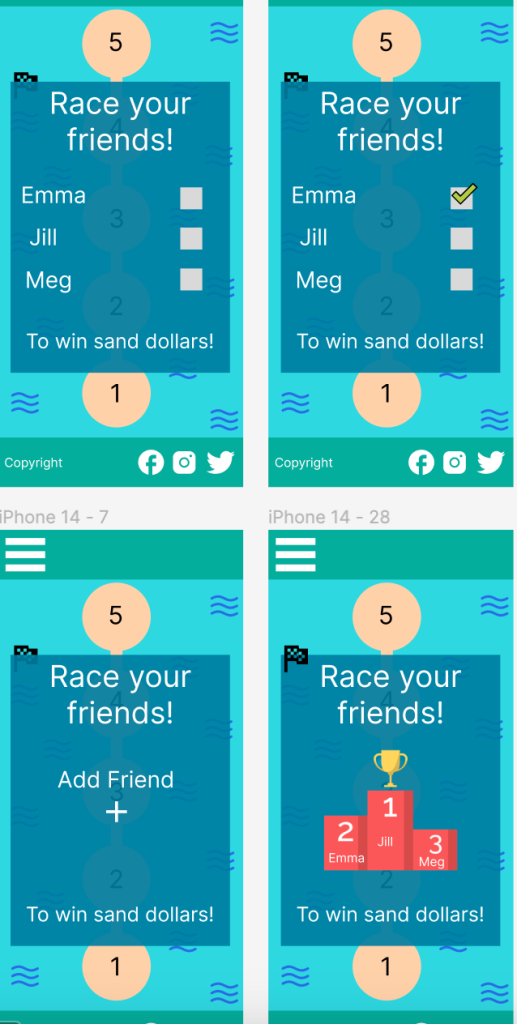
- My submission was improved because I added a menu button and improved my add friends so it was more advanced and interactive and changed some of the colors so they fit the scheme better. Also fixed the scoreboard so it was more aesthetically pleasing.
- The professor could improve the project for the next class by teaching more in depth of the prototype tool and how to make auto layout work for a whole frame of things in it, like how you have to put them in groups for it to work. I don’t think anything really needs to be changed.
- I will apply the knowledge I learned from this project in my future career because I now have a lot more experience using figma and will be comfortable and confident doing a project for them in my job using this knowledge.
- The app Candy Crush helped inspire me for this app I made because it is a simple fun app and is addicting. I did my own spin on it while also using some of the same ideas and also made my own version of it.