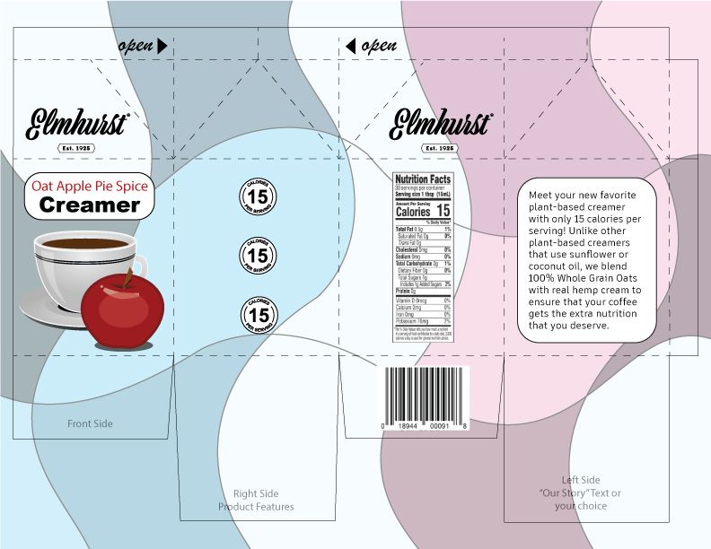
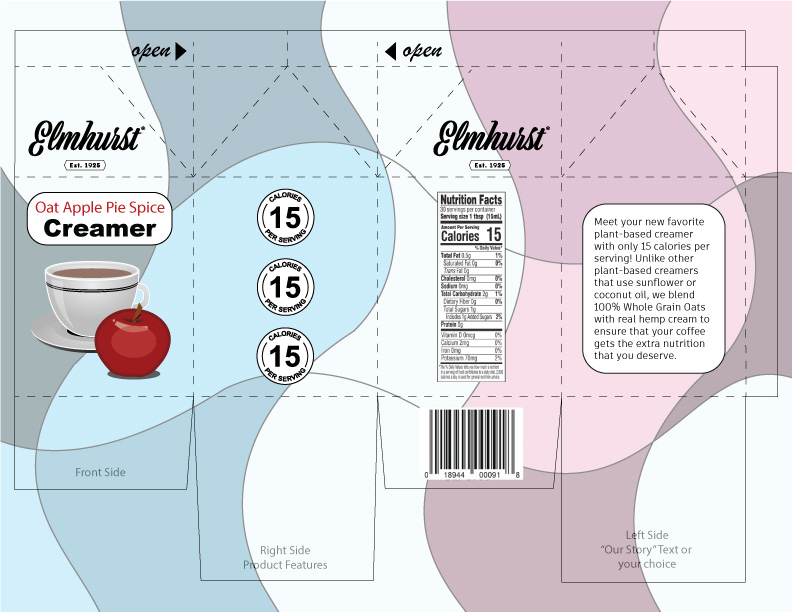
For this project I wanted to use less saturated and lighter colors to match the lighter aesthetic of the creamer. I added the white to the pattern in the back because I wanted it to look like the creamer was going down the sides of the packaging. This also helped to neatly separate the blues and the pinks and make the pattern look a bit less chaotic. Overall, this resulted in a very simple design which I feel fits nicely with the concept of the product as well as Elmhurst’s already existing branding.