In this lab, I learned how to manipulate the contrast of an image in Photoshop. It was relatively easy to adjust the images using the curves and levels panels. This lab also taught me how to convert an image into CMYK and the differences in color that this change creates.
scanned coinscanned drawingmagazine with dslrscanned magazineobject with phone cameraphotoshop creationmagazine with phone cameradownloaded imageobject with dslrscanned printed image
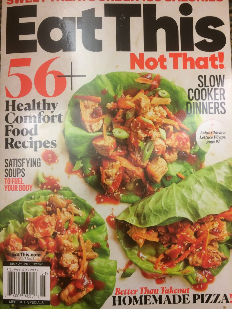
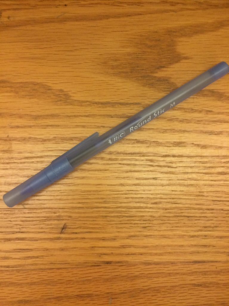
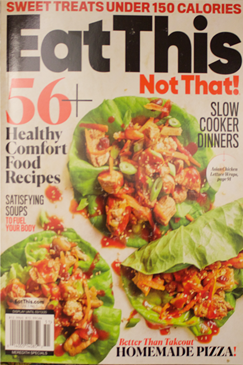
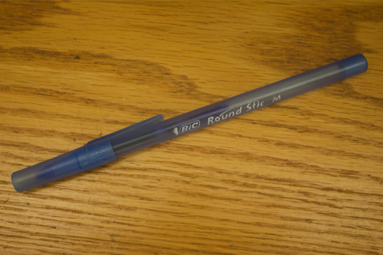
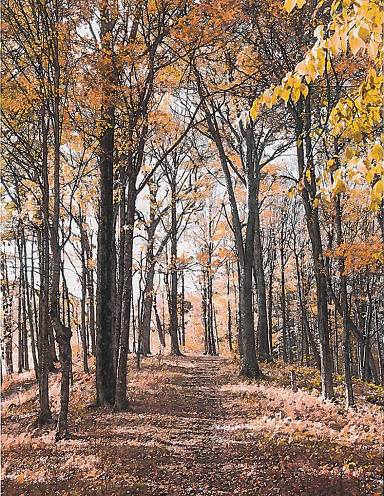
In this lab the images taken on my phone were much lower resolution than the high-end images from the DSLR camera. Scanning also lowered the quality of the images and made them appear blurry. For the Photoshop image, I decided to make the dimensions 1500 x 1500 pixels with 300 resolution
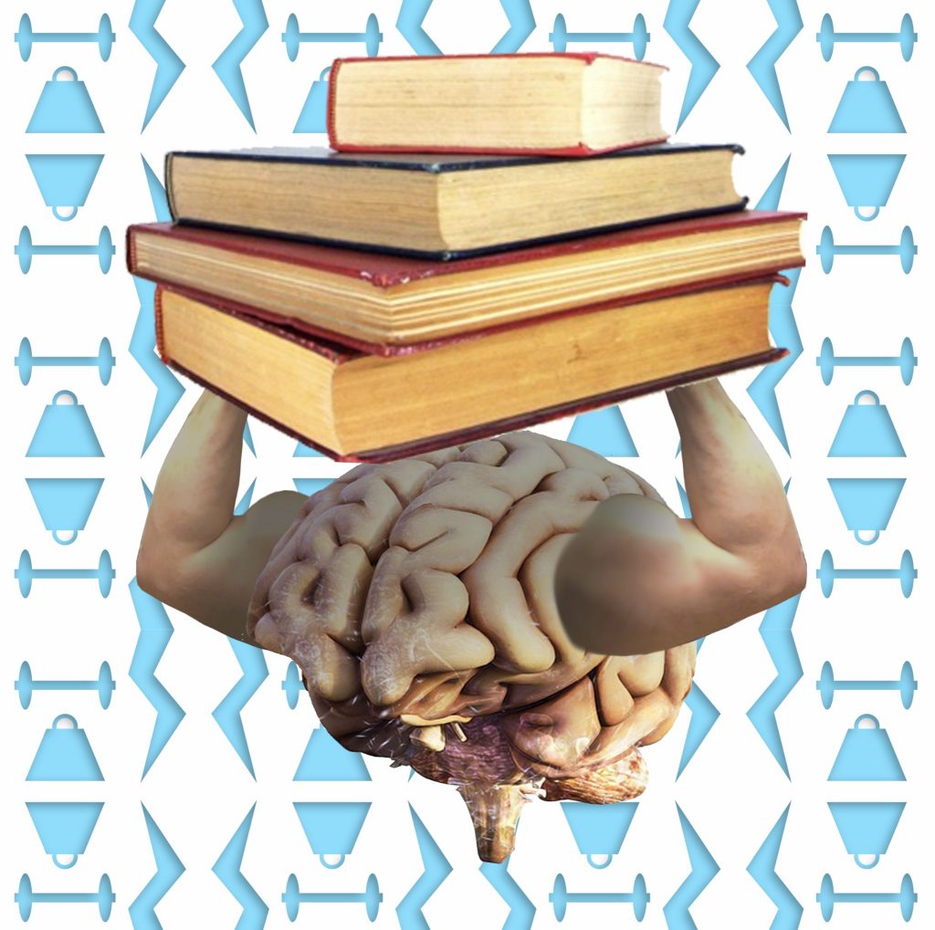
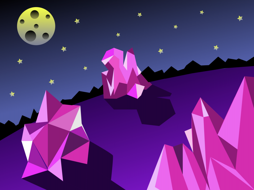
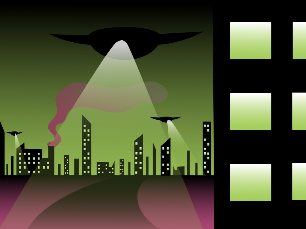
In this project, I learned how to create patterns in Illustrator.
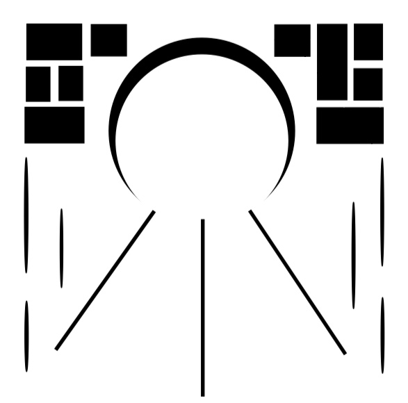
The easiest part of the project was coming up with the metaphor.
The most difficult part of the project was fusing the images in photoshop.
My submission could be improved by making the images blend together a little more seamlessly.
The assignment could be improved in the future by providing a selection of metaphors to choose from.
I will apply the knowledge I gained about photoshop to future projects.
One article that inspired me for this project was the Design Shack article entitled “10 Reasons Why the Best Design Is Invisible”.This article taught me that some of the best design choices are the aspects of a piece that the viewer wouldn’t even know were changed.
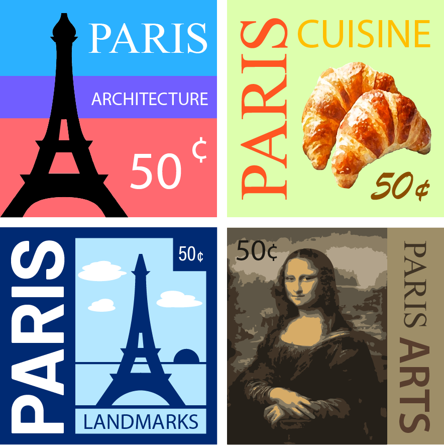
I learned how to create designs using the different kinds of color schemes.
The easiest part for me was deciding which colors to use.
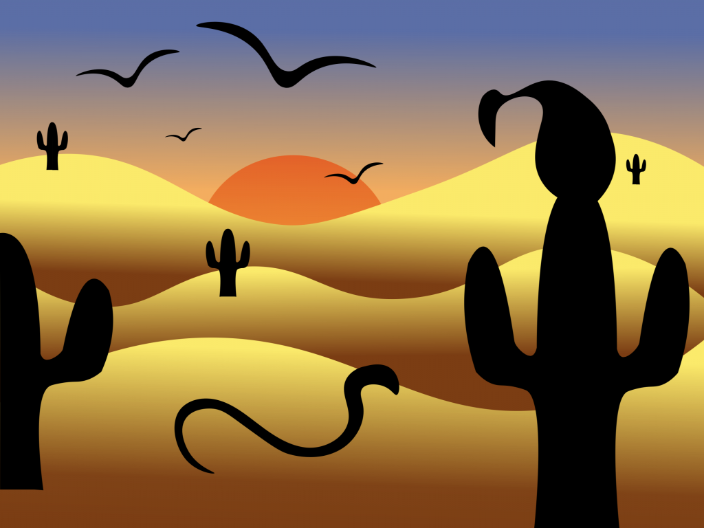
The most challenging part for me was drawing vectors in Illustrator.
My submission could be improved by utilizing the gestalt principles more.
This assignment could be improved in the future by allowing any kind of landscape to be made.
I will apply the skills I learned in Illustrator to future assignments.
One specific reading that helped me with this project was the article on color theory by Cameron Chapman. This article taught me about the different color terminologies and how to use color theory to enhance my designs.
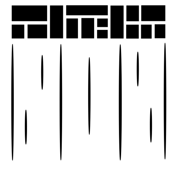
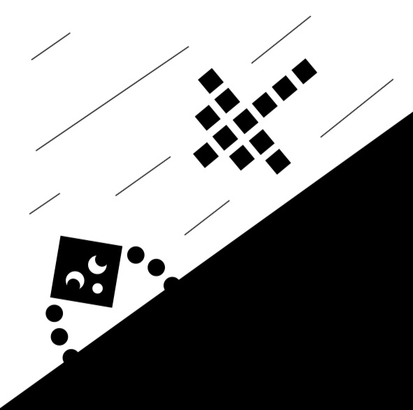
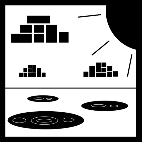
I learned how to use Gestalt principles to enhance my designs.
The easiest part for me was coming up with the designs.
The most challenging part for me was figuring out how to create the design I was imagining in Illustrator.
My submission could be improved by making more consistent margins.
The assignment may be improved in the future by making each frame demonstrate a different Gestalt principle.
This project gave me a better understanding of how to use Adobe Illustrator. I will apply what I learned about the program as well as the Gestalt principles to my future assignments.
A specific video that inspired me was the “Design and Discovery” Ted talk by David Carson. His talk showed me that small changes to a design can make a large impact on the way that a design is perceived.