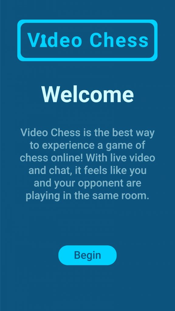
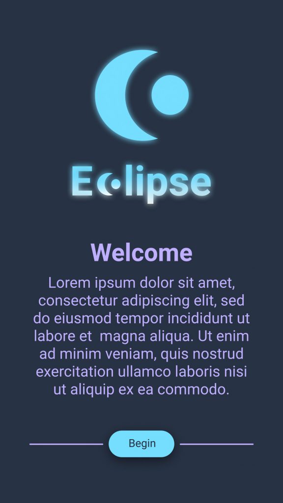
Name of app: Video Chess
In addition to being able to play chess online, this app would give players the option to see each other over video calls, interact with each other in a live chat, and use emotes. The purpose of this app is to allow players to experience their opponent’s reaction despite not being in the same place.
User stories:
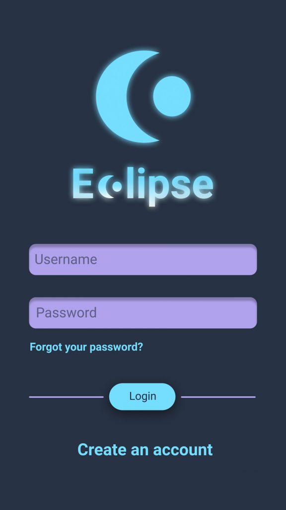
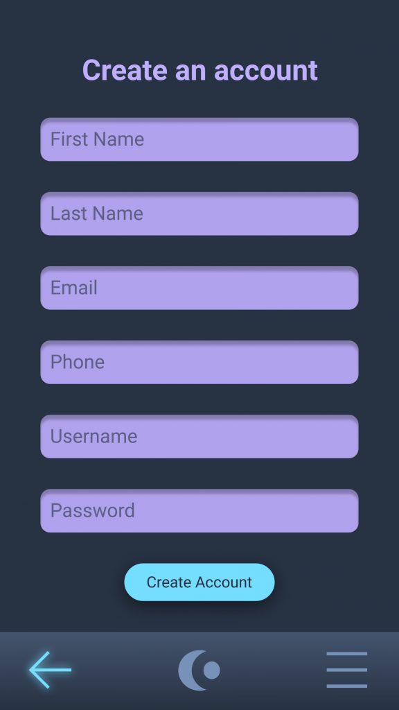
- Creating an account
Once users open the app, they will be given the option to create an account. They will have to submit information such as their name, email, and password. They will also be able to create a username and submit a profile picture.
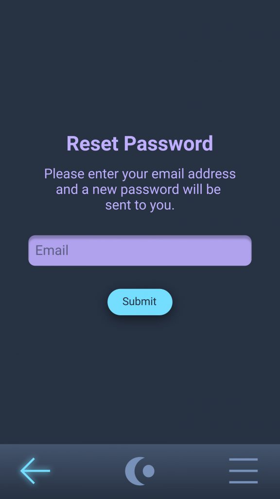
2. Logging in
On the first screen of the app returning users will have to log in with their username and password. In the scenario where they forget their password, they will be given the option to reset it.
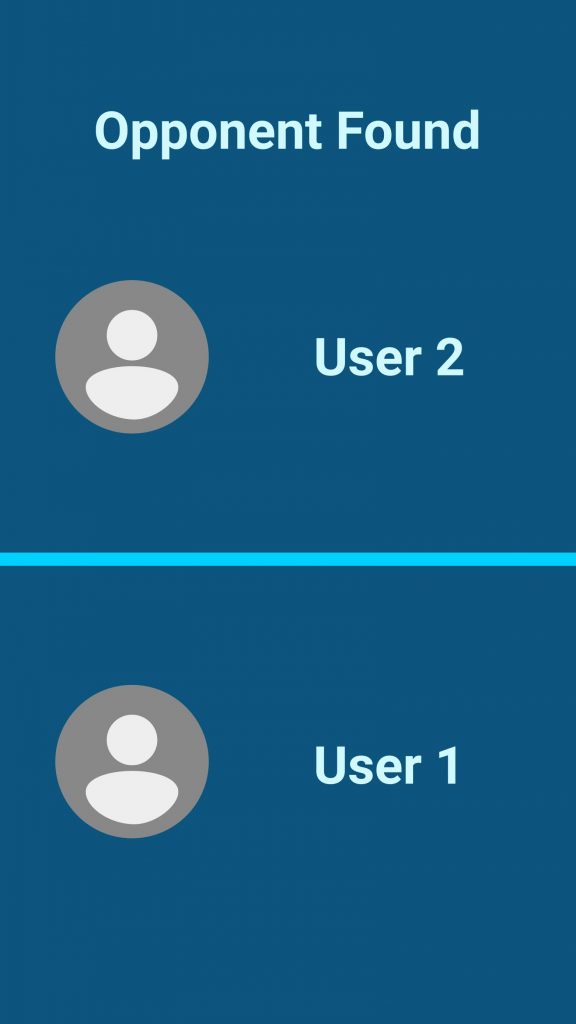
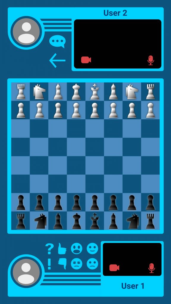
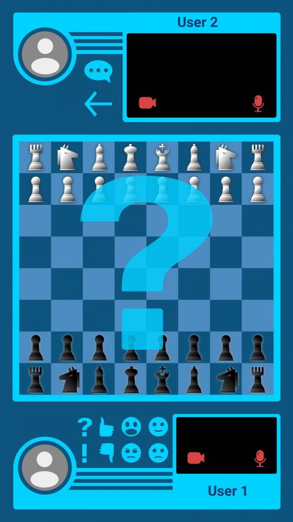
3. Playing chess
Once 2 players have connected, they will share a virtual chess board. While playing each player will have the ability to share video and see each other in real time.
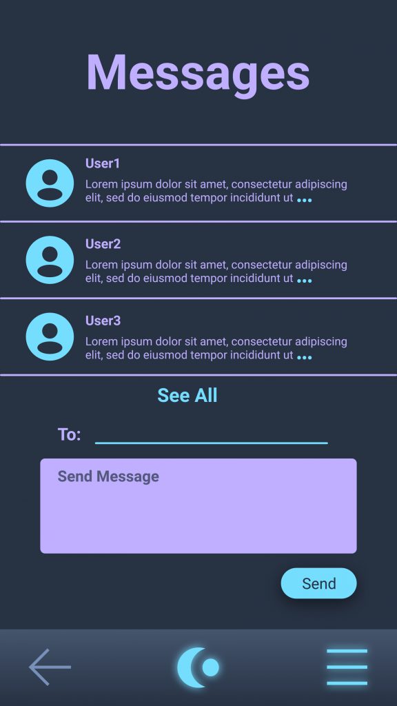
4. Live chat
If players decide not to share video, they will have the option to speak to each other in a live chat during the game.
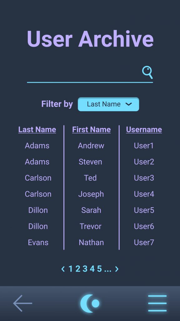
5. Adding contacts
In order to add friends, users will be able to search for other players usernames or send friends an invitation through email or text.
6. Emotes
If users decline video chats, they will still be able to react to what is happening by clicking on emotes. The opponent will then be able to see the emote in game.