Making a card in Photoshop:

Through working on this project, I learned a lot. Before this class, I had never used Photoshop, but now I’m able to use it and have a basic understanding of how to complete simple tasks within the software. I also learned the importance of asking questions and using the instructions provided, because while it might seem clear, not everything is straightforward while actually working in Photoshop.
Cropping images and moving them around was probably one of the easier parts of this project for me. Doing these activities is very similar to cropping and moving images in other programs. In addition, adding text was relatively easy, as it has a similar process to Microsoft products, Canva, and other programs.

Overall, getting acclimated to Photoshop was a challenge. Having never used it before I began this class, it was completely new. While I am getting used to the program, there are still many things that remain a challenge, whether it be remembering which icon means what, or more challenging tasks that require a more in-depth knowledge of working within the program.

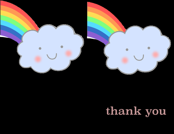
I think my submission could be improved by cleaning up the edges of the images a bit more. I did the best I could and spent a long time touching and retouching the edges of the shapes to have a clean look, but they still are not completely perfect.
For the next class, the assignment could have a clearer set of requirements, but also looser restrictions that allows for freedom and creativity. In addition, having the requirements reflect the way a greeting card found in stores looks would be beneficial.

I might apply what I’ve learned in future assignments by using Photoshop to manipulate images and make more personal for the assignment that I need it for. Furthermore, in terms of work scenarios, I currently have an internship where I am tasked with working on the monthly newsletter. The woman that I work with typically sends a file to her brother if she needs something done with Photoshop, but now that I have some basic knowledge and understanding of the program, I can offer to do those aspects.

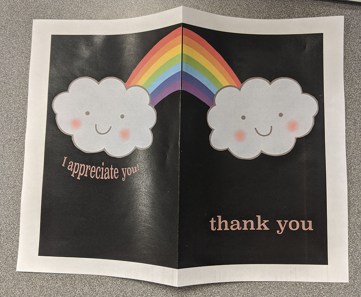
How did a specific reading or video inspire or help you? I used a reading I found on my own that helped with a step I needed for my card specifically. I wanted to flip an image on the back of my card so that it was reflective of the image on the front of my card. Doing so allowed me to have an entire rainbow spanning the width of the card. In addition, I also browsed the card aisle while shopping, which helped with inspiration.
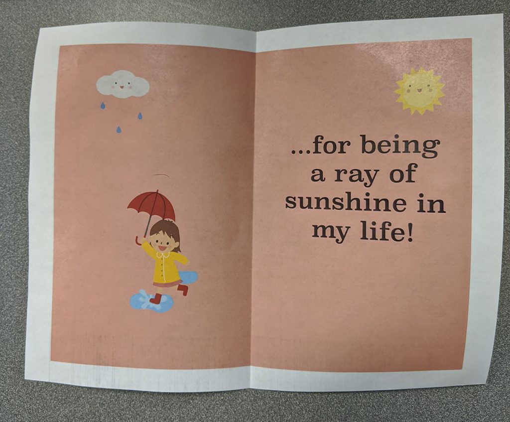
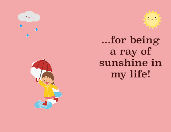
For my assignment, I chose a black background on the outside of the card to help provide emphasis for the colorful image. It also helps to enhance the message in the card by providing darkness in contrast with the “ray of sunshine” message inside. In addition, I used a lighter color text against the black to make it easy to read, and used a classic font. Inside the card, I inversed the colors to have a light background with dark text, again making it easy for the reader.

I wanted to create a lighthearted card that could cheer someone up, say thank you, and fit any time of the year. Overall, I enjoyed making the card but brainstorming an idea was challenging.

Before cleaning up the image
