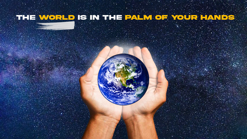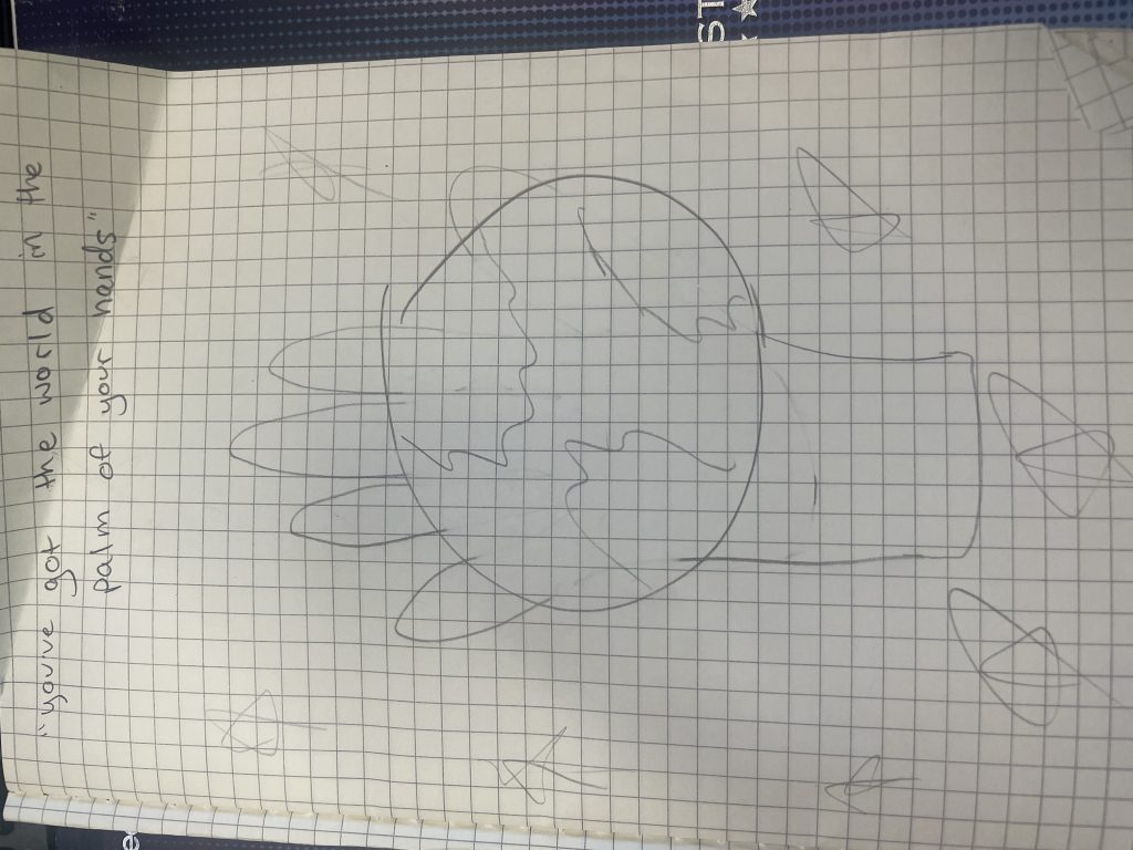
Being able to visualize a metaphor into something of your own is a very fun process. Since I was working on this project primarily in Photoshop, it gave me a lot of creativity in using different filters and effects to create the perfect concept. Photoshop is something that I would definitely consider myself more efficient in than Figma, but there were still a few things that I learned through trial and error, such as layering and cutting out different parts of an image.
While I’m sure for some being able to find a good metaphor to dabble with may have been a struggle, this one came right to me while I was brainstorming.

The idea of placing the globe into the palm of a person’s hand is pretty self-explanatory, so the most challenging part of this whole project was conjuring up or obtaining a background that I thought really fit the scene; and I think I did so with the image of space.
If there was something that I think I could improve with this image, it would probably be making the palm and the globe on top of it looking like it came from the same image. To me, I think I can tell they are two differently cropped images placed into one shot. It isn’t jarring, but it could be improved. The only way that I believe the professor could improve this assignment for next time is showcasing even more of the ideas and images that other students created, I think it could really be more of a creative spark for current students.
This project could really help me moving forward because if graphic design is really an avenue I would like to continue to go down, then I’m going to need to be able to combine images into one complete project such as in this display. John Saito’s article detailing how metaphors can add to your designs really put into perspective how detailed, yet simple to understand my project needed to be.