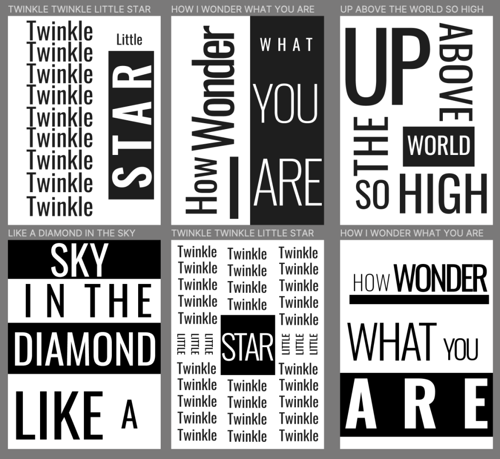
Finding new and inventive ways to make a nursery rhyme be visualized with just words is a really intriguing project. It allows for some real creativity to shine through with the ability to use different fonts and different fills on those fonts to make separate verses really pop and stand out from one another.
During the process of this project I learned how to manipulate fonts in different ways, such as thinning letters or space them out. The most challenging part of it all was trying to not be repetitive in my designs, but it was also fun to try and come up with new ways to make each frame stand apart.
I think if there was anything that could’ve been improve from the project, it was that I don’t feel I even touched the surface when it came to discovering different fonts that each allowed for different effects to be performed with them. If there was anything that could be improved for the project in the future, I think allowing for more than one universal font to be used in different frames could be a lot of fun.
If there’s ever a future project where I am required to make a graphic really pop with words, then I’ll be able to draw back to this typography activity to help me out.
I really liked this blog post: https://creativemarket.com/blog/what-is-typography. It gave me a really good understanding and foundation of typography as a whole, and benefitted how the final product came out.