With this being a summative project of everything that I’ve been introduced to up to this point in the semester, there wasn’t much for me to learn. It was definitely more of just taking the concepts that I’ve already gotten a handle of and applying them to this last creation.
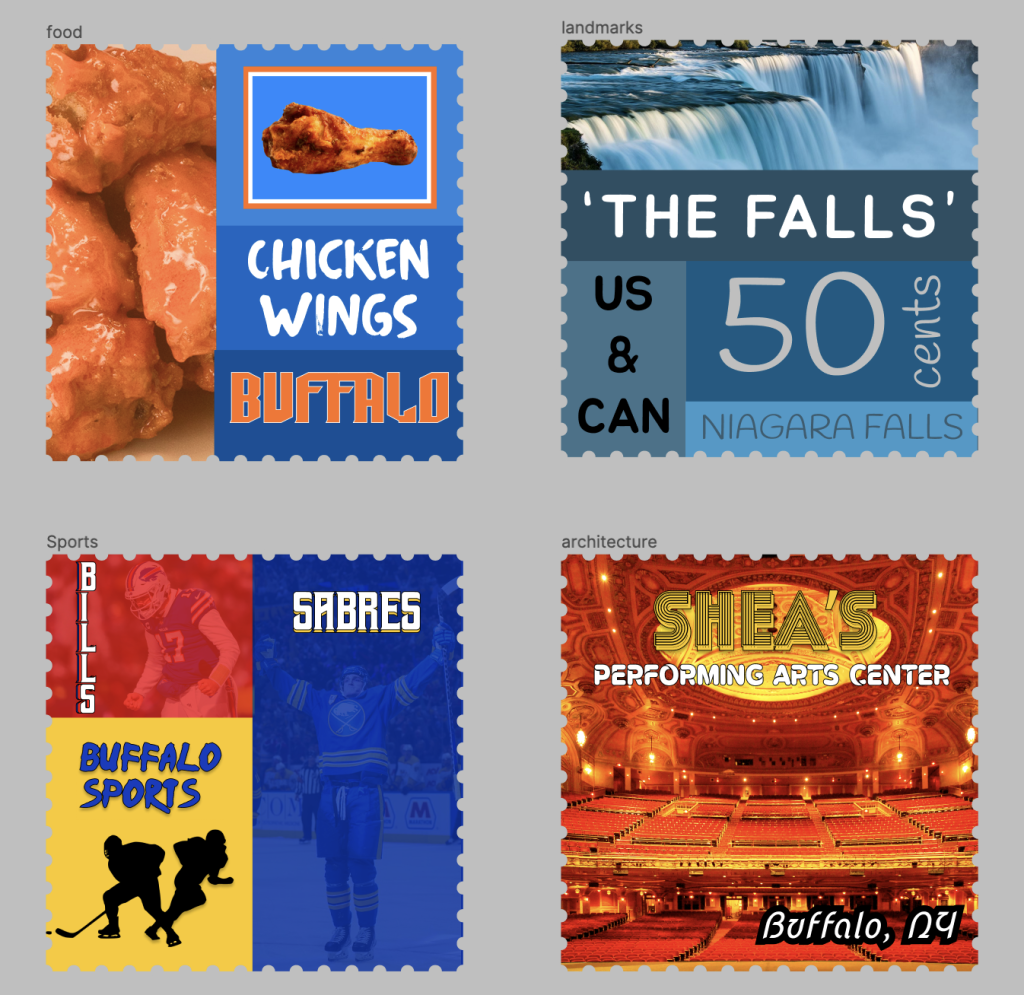
With this stamp collection, it was really easy to come up with four subjects of interest that represented the city of Buffalo as a whole, and to stylize them in a very creative and unique way. If there was anything that was challenging, it was narrowing the list down to just 4 entries, as there were many other different idea and directions I think I could’ve gone in.
If I could improve my submission, I think I could’ve spent more time cataloging through different fonts to make these stamps pop more. I’m satisfied with the ones that I ended up choosing, but I think there was possibly even more (if allocated more time) that I could’ve chosen from.
I believe the project could’ve been made even better if students were possibly given the option to combine two different places. Perhaps the scale of the project would increase, but putting two places that really differ from one another together could be a fun twist on this project.
Using different elements, pictures, fonts, and effects on the stamps in order to create a cohesive project that showcases a place like Buffalo in frames is a great set of skills that I’ll be able to take forward with me through this experience.
One reading that I really enjoyed reading was this article: https://www.canva.com/learn/how-different-fonts-speak-to-you/ Breaking down how each font creates a different feeling and vibe really helped contribute to my search for the correct fonts for each stamp.