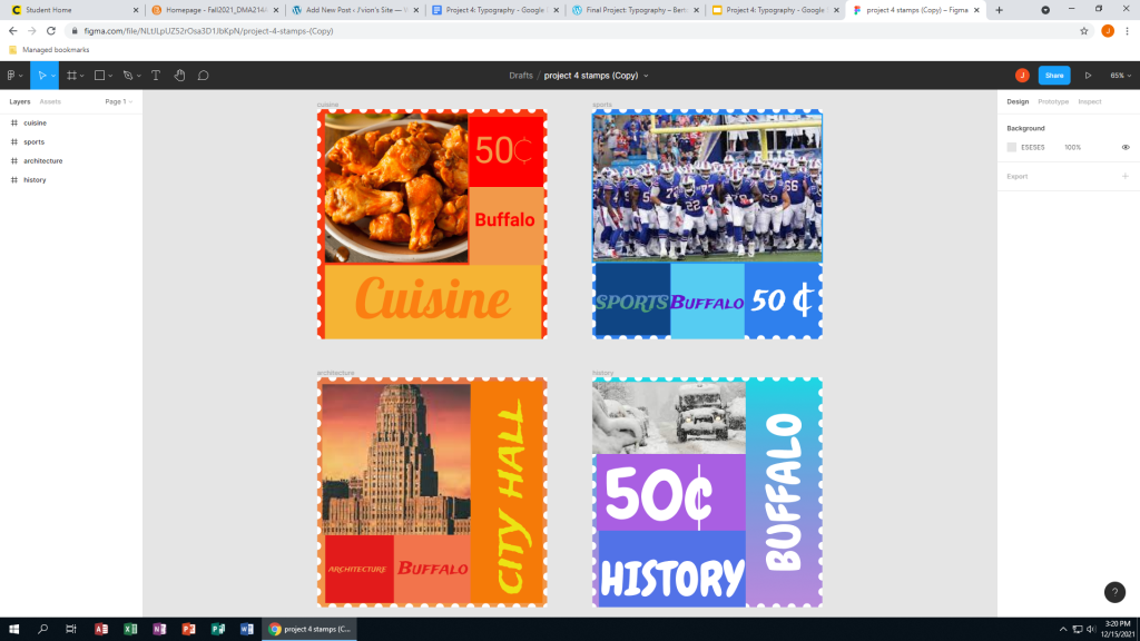
In my project I used the city of Buffalo since I was born and raised here. In this project I learned how to crop an image in Figma. It was easy setting up a grid to follow and use the rule of thirds. There really was not too many challenges and this was personally the easiest project this semester as it only took me two hours to complete. One ‘challenge’ was figuring out which colors I wanted to use. Another thing is figuring out where to put the colors on the stamp. One thing I would have improved on is blending the colors a bit more. Some of the stamps with different tiles could have been mixed better but other than that the project came out pretty solid. In the future I could apply the rules of thirds to any future assignments in future DMA classes and even real world projects. I could also blend in colors more precisely. One example that really stood out to me is from a former student named Alberto Pena. In his design, I liked how he positioned everything, from the price to the name of the city. I also like the Los Angeles stamp where he adds the lights spelling ‘Hollywood’.
