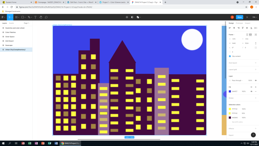
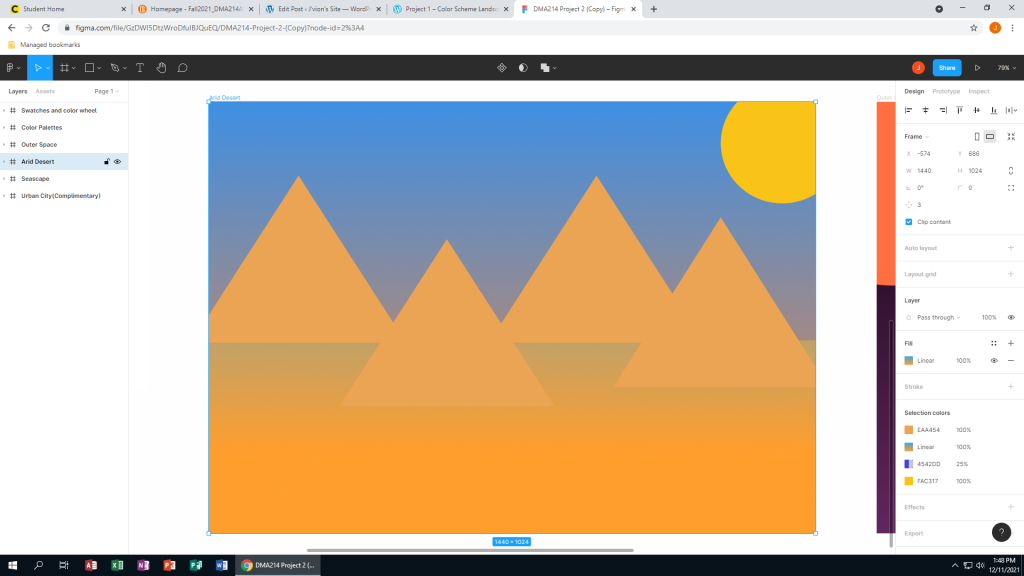
In this project I learned how to coordinate different colors on Figma. I also learned how to use more than just the solid colors. It was easy adding the basic shapes to each slide and the solid color background. I did find it challenging when I got to the desert and figuring out how I can add more than one color to the background. That was before I was realized that I had to change the setting from ‘Solid’ to ‘Linear’. I was also stuck on what exactly I wanted to put on each frame. There were many ways I could improve on my submission but the main two were colors and detail. I could use better colors and adding more detail to each frame to give it some life rather than just look like an third grade art project. One way you can improve is making the instructions a little more clear. I looked at the examples for help to really understand the project. Looking at JonneMarie’s example from her WordPress page really inspired me. For example, I loved the way she set up her landscapes. From the background color, to the way the buildings looked, it was incredible.

