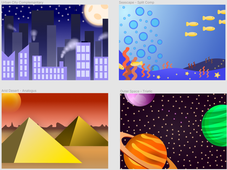
1.) Urban City (Complementary)
For this design I really wanted t make the city seem as dense as possible. Because of this I added different gradients on the buildings and made them darker as we got farther back. To me this made it seem like the skyscrapers just kept coming and coming. I knew I wanted to do the city at night so I chose blue as my primary color. For the night sky I used a liner gradient. As you get closer to the city the gradient lightens up as the city presumably would be giving off it’s own light. And finally I used the Figure/Ground principle for the moon and stars. This in turn created contrasts between the stars and moon compared to the rest of the sky/buildings in the background. To do this I made the moon and stars orange which ultimately gave us a complementary color scheme.
2.) Seascape (Split-Complementary)
To me this was the hardest of the four landscapes to complete. This was due to the fact that I wanted to use blue and green but ultimately could not as I already used a color scheme (Analogous) that would truly allow me to use this. With that said however, I actually think it ended up coming out very nice. To begin I added the coral, star fish and sand dollars. I made the coral and sand dollars in the back a darker shade. This was an attempt to try and add depth to the piece. I also added fish to make the piece feel alive and full of life. With the use of my vibrant colors this helps as well. With all this as well I wanted to add a gradient to the background. I wanted this to be in the corner and come down in a diagonal fashion as light reflects against water differently. And finally To add less dead space, I added various bubbles of different sizes to the piece.
3.) Arid Desert (Analogous)
This was the landscape that was the most fun for me to accomplish. For this design I really wanted to highlight the pyramids that I created. I feel this piece has the most depth and this was accomplished with the use of gradients. Particularly in the sand, or more noticeably, in the pyramids themselves. The pyramid in front is lighter than the one in the back which contributes to the depth of the piece immensely. I used an analogous color scheme as I really wanted the piece to look dead and dull. I think I accomplished this as the only bit of real color in my eyes comes from the red sky. In addition to the red sky I added a sun which has a mask over it creating a really nice effect. I also used the Figure/Ground principle in this particular landscape, which can be seen with the pyramids.
4.) Outer Space (Triadic)
For this piece I wanted to have fun and use vibrant colors. This is because up to this point, my landscapes featured either a lot of dark blue (urban city, seascape) or bland dry colors (arid desert). Because of this I used a triadic color scheme of very saturated green purple and orange, and set out to make a colorful landscape in an environment not known for bright color. I feel this really came out nice and the planets really did pop against the dark eggplant background. I also added a ton of stars in the background to help add more to the piece and not just be a dark background. If you look closely as well I also broke the stars up by adding a couple in a different color that looks like the big dipper.
Final Thoughts
Overall, I really like how this project came out. Each piece stands out on their own but if combined they all look like they fit into a cartoony style, something I originally didn’t prepare for. I also learned how changing the colors of an object ever so slightly can have a huge effect on the piece. Finally I realized how important gradients are. I had never really used them before and with out them I feel my pieces would look incredibly flat and one dimensional.