DMA 214: Project 4

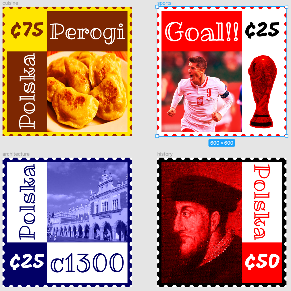
This project was a ton of fun and probably my favorite of the 4 we had to complete. In project 4 we were tasked to pick a place: a country, city, neighborhood, or important historical site, real or fictional, that you like and think of 4 cultural aspects that make up the country’s identity. Then take those 4 aspects and create stamps from them. For me I am 50% polish so I decided to use that for my project. The 4 aspects I chose was cuisine, architecture, sports and history.

Cuisine: For cuisine I went with a traditional polish dish called perogies. Pierogi are filled dumplings made by wrapping unleavened dough around a savory or sweet filling and cooking in boiling water. These are also very popular around Buffalo as we have a heavy polish population.

Architecture: For architecture I chose Cloth Hall. Cloth Hall is perhaps the world’s oldest shopping mall has been in business in the middle of Krakow’s central Grand Square for 700 years. Built c1300 a roof was put over two rows of stalls to form the first Sukiennice building – Cloth Hall – where the textile trade used to go on. It was extended into an imposing Gothic structure 108 meter long and eight meter wide in the second half of the 14th century.

Sports: For sports I chose to highlight soccer. This is because Soccer is the most popular sport in Poland (as is the case for most European countries) as well as the fact that Robert Lewandowski is the biggest sports figure in Poland. I also chose to add the world cup as that is every countries goal.

History: And finally for history I chose to highlight Sigismund II Augustus. Sigismund II Augustus Was the king of Poland from 1548–1572. I chose to highlight him due to the fact that he established the first regular postal service in Poland, which is still in service today known today as Poczta Polska. This also worked really well since we were designing postal stamps for this project.

Ultimately I am very happy with how these came out and wouldn’t change anything. Despite featuring a lot of red I still think they are all unique in their own ways. In the end as well the 2 fonts I used (Ribeye Marrow, Mogra) played off another nicely. Ribeye Marrow gave a nice aesthetic look while Mogra made the stamp costs pop.

DMA 217: Project 2

  • What Did You Learn?

The main thing I learned how to do animations in Figma as well as improving my prototyping skills. Learning how to use certain animations was very helpful as it saved steps that other wise would have taken longer. In addition to the animations I felt as with more time in Figma I managed to improve my prototyping skills. As a result I feel I was able to take my skills up a notch compared to the first project.

  • What Was Easy?

It was easy coming up with the app concept I wanted. I am a huge sports fan in general and I feel with all the apps out there this one simplifies everything.

  • What Was Challenging

The hardest thing for me in this project was surprisingly the color scheme. With so many teams using different colors I wanted to make sure I had a theme that worked well with that. As a result I kept it simple with black, silver and white. But this also felt to bland on it’s own so I added the teams colors on their corresponding pages. It was also challenging to find sources I liked because I wanted to use other sites for content and not just main stream articles.

  • How Could Your Submission be Improved?

I think my submission could be improved if I had more time. I probably spent to much time doing the team webpages and in turn wasn’t able to spend more time on the chat screen (a key feature of my app). Overall however I think everything came out great including the layout coming out in a very clean way.

DMA 214: Project 3

Metaphor: “Laughter is the best medicine”

This project despite being simple had some challenges that I had to overcome. For starters however I learned how to take two photos and make them into one picture. While I had done similar stuff in the past this ended up looking far more realistic something I was striving to achieve. I also knew the theme I wanted to use right away as I am a very positive person. What’s more positive than laughter!? If I could improve this design, I would like to add a little bit more effects with the prescription container and try and make it look even more natural. To incorporate a pattern, I added a pattern to the script rather than having the patients name/information. The main challenge I faced in this project came in the form of perspective and scale. My first attempt at this project (Seen below) had 3 prescriptions. However the scale was far to small to effectively see the pattern I had developed. Instead I went back to the drawing board and reinvented my design. In this design the prescription bottle is in the foreground making it of larger scale.

DMA 217: Project 1

What Did You Learn?

Overall the main thing I learned in this is to not overcomplicate things. When I began I thought bigger and realized it was becoming too crowded. From there I made the font more normal and made my color scheme far less involved.

What Was Easy?

Once I got my idea down the actual transition from panel to panel was quite simple. Once I decided to keep it simple the flow of doing certain tasks was very simple.

What Was Challenging?

The most challenging thing for me in this particular project was designing the icons. This is because I felt that they became too simple. However when I tried to add more complex icons I felt like they were out of place with the rest of the design. In the end while I think they came out okay I definitely found it to be the most challenging aspect of this project.

How Could Your Submission Be Improved?

I think my submission could be improved in my maze scoring. In the end I don’t feel I gave good enough hints/instructions on how to accomplish certain tasks. Other than maze I would say once again my icons. While they are solid I feel they could be improved apon.

How Could I Improve The Assignment For The Next Class?

I would say spend a little more time with maze. I felt like it was thrown at me and while simple took me a couple looks to fully understand. I did feel like you gave us just the right amount of tasks and I am not sure I would have been able to accomplish this task as well as I did with additional things thrown our way.

How Might You Apply Your Knowledge In Future Assignments Or Work Scenarios?

I think I would apply knowledge in future assignments or work scenarios by taking a step back and planning the way I did. In this particular project I planned out how I wanted the different screens to interact and that reduced plenty of time in this project. I would do the same for future projects as planning ahead could potentially save me a lot of time.

How Did a Specific Reading Or Video Inspire Or Help You?

I didn’t have any true inspirations for this project however, the labs assigned at the begining of the year teaching us figma in a more in depth manor really helped. Without these I feel I wouldn’t have ended up with such a solid project.

DMA 214: Project 2

1.) Urban City (Complementary)

For this design I really wanted t make the city seem as dense as possible. Because of this I added different gradients on the buildings and made them darker as we got farther back. To me this made it seem like the skyscrapers just kept coming and coming. I knew I wanted to do the city at night so I chose blue as my primary color. For the night sky I used a liner gradient. As you get closer to the city the gradient lightens up as the city presumably would be giving off it’s own light. And finally I used the Figure/Ground principle for the moon and stars. This in turn created contrasts between the stars and moon compared to the rest of the sky/buildings in the background. To do this I made the moon and stars orange which ultimately gave us a complementary color scheme.

2.) Seascape (Split-Complementary)

To me this was the hardest of the four landscapes to complete. This was due to the fact that I wanted to use blue and green but ultimately could not as I already used a color scheme (Analogous) that would truly allow me to use this. With that said however, I actually think it ended up coming out very nice. To begin I added the coral, star fish and sand dollars. I made the coral and sand dollars in the back a darker shade. This was an attempt to try and add depth to the piece. I also added fish to make the piece feel alive and full of life. With the use of my vibrant colors this helps as well. With all this as well I wanted to add a gradient to the background. I wanted this to be in the corner and come down in a diagonal fashion as light reflects against water differently. And finally To add less dead space, I added various bubbles of different sizes to the piece.

3.) Arid Desert (Analogous)

This was the landscape that was the most fun for me to accomplish. For this design I really wanted to highlight the pyramids that I created. I feel this piece has the most depth and this was accomplished with the use of gradients. Particularly in the sand, or more noticeably, in the pyramids themselves. The pyramid in front is lighter than the one in the back which contributes to the depth of the piece immensely. I used an analogous color scheme as I really wanted the piece to look dead and dull. I think I accomplished this as the only bit of real color in my eyes comes from the red sky. In addition to the red sky I added a sun which has a mask over it creating a really nice effect. I also used the Figure/Ground principle in this particular landscape, which can be seen with the pyramids.

4.) Outer Space (Triadic)

For this piece I wanted to have fun and use vibrant colors. This is because up to this point, my landscapes featured either a lot of dark blue (urban city, seascape) or bland dry colors (arid desert). Because of this I used a triadic color scheme of very saturated green purple and orange, and set out to make a colorful landscape in an environment not known for bright color. I feel this really came out nice and the planets really did pop against the dark eggplant background. I also added a ton of stars in the background to help add more to the piece and not just be a dark background. If you look closely as well I also broke the stars up by adding a couple in a different color that looks like the big dipper.

Final Thoughts

Overall, I really like how this project came out. Each piece stands out on their own but if combined they all look like they fit into a cartoony style, something I originally didn’t prepare for. I also learned how changing the colors of an object ever so slightly can have a huge effect on the piece. Finally I realized how important gradients are. I had never really used them before and with out them I feel my pieces would look incredibly flat and one dimensional.

DMA 214: Project 1

Principals Used:

Continuation: Used in frame 1. Elements following the cow in a smooth line are perceived as a group and are interpreted as being more related than elements not on the line. Another group that could be interpreted as being more related than elements not on the line are the circles located on the moon.

Closure: Used in frame 2. Our eyes “close off” the implied edge of the moon. When we look at a crescent moon, or even a half moon, we imagine the moon as a round whole, rather than as a sliver.

Proximity: Used in frame 3. The elements that are closer together on the fiddle are perceived to be more related than elements that are farther apart behind it.

Shared Fate: Used in frame 4. The idea that something outside of a group can be considered part of the group by dynamic forces at work, such as motion. In this case the laughing of the dog in the top right can be associated with the dog in the bottom left.

Similarity: Used in frame 5. The elements that look like a pair of eyes are similar and perceived to be more related than elements that are dissimilar spread out across the background.

Repetition: The lines on the road create the same visual element or effect over and over. This creates a tendency to perceive a set of individual elements as a single, recognizable pattern, rather than multiple, individual elements.

Reflection:

Overall, this project taught me a multitude of things. The most obvious thing I learned was the gestalt principles as I had never heard of these until class. It also made much more sense once we began actually working on the actual projects as it reinforced the ideas presented in lecture. I also never knew about the rule of thirds. This made a huge difference and I feel helped make the frames look far more aesthetically pleasing.

I wouldn’t say this lab was easy but it was definitely simple. It was simple in the sense that creating 6 tiles of a nursery rhyme isn’t too bad. What made it difficult was showing a line of these rhymes with just basic shapes, as well as NO color.

At the end of the day I thought my project came out great. The only thing I would redo would make the lines following the cow in frame 1 arc around the moon.

Kacalski – Project 4

For this project we were tasked with creating a map of an area. Instead of making a very busy map of a large area, I wanted to make mine a tad more simplistic. I almost wanted this map to look like something I’d see in my elementary school as the area I chose was not to far from it. Since I wanted a more simple look, I went for bold colors such as the vibrant red and blue. I switched up a few things from the critique. To begin I moved the legend to the bottom and the banner and compass to the top. This made the banner more front and center which definitely made more sense. I also removed the stroke from the text as this made reading the labels much easier.