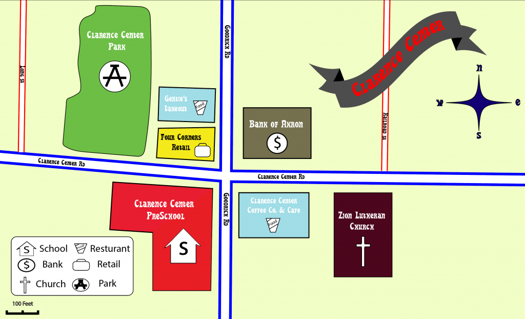
For this project we were tasked with creating a map of an area. Instead of making a very busy map of a large area, I wanted to make mine a tad more simplistic. I almost wanted this map to look like something I’d see in my elementary school as the area I chose was not to far from it. Since I wanted a more simple look, I went for bold colors such as the vibrant red and blue. I switched up a few things from the critique. To begin I moved the legend to the bottom and the banner and compass to the top. This made the banner more front and center which definitely made more sense. I also removed the stroke from the text as this made reading the labels much easier.