Kacalski- Project 3

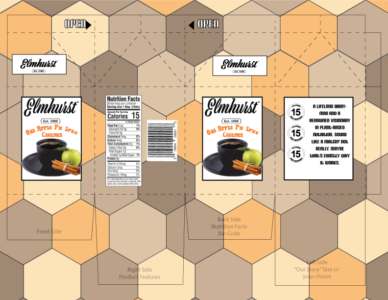
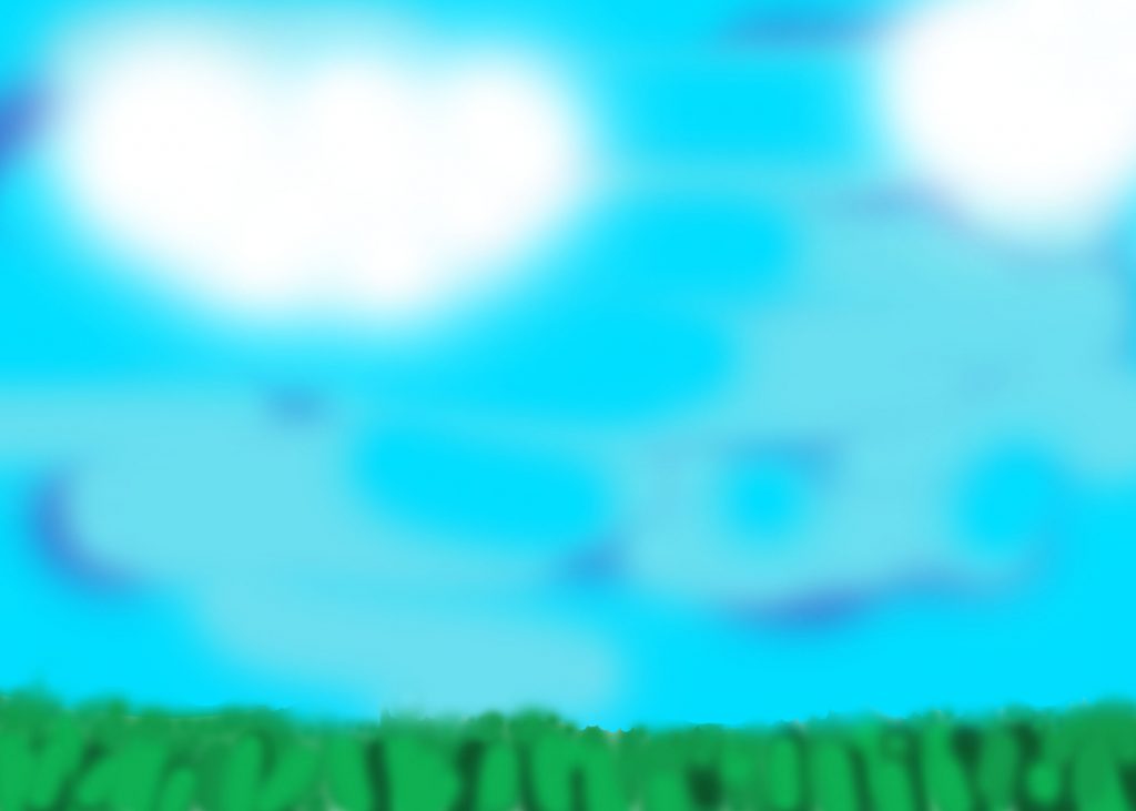
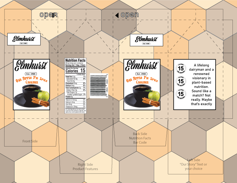
For this project I really wanted to focus on the background as that’s what most people first see. The hexagon pattern I feel helps it stand out as its bold and very direct. I chose the colors I did for one reason, and that is fall. When is one most likely to enjoy a product like this? In my mind no better time then a nice day in October. I took a couple pointers from the critique as well, them being to change the font on the story as it was too hard to read and also lower the opacity even more of the background to not make it too overpowering. Both suggestions I really think help this piece come together.

Project 3 Critique

I tried to keep the over all package design relatively simple since all their products follow this approach. However the all white they use now is boring so I thought id add some fall colors since when I think of apple spice I think of an October day. As for the front I tried to keep that as simple as I could as well as the background is already busy enough I didn’t want to add too much to the package.

Kacalski – Project 2

For project 2 we were tasked with creating composite images from our project 1 imagery. In My case here I used Vader as my center piece and after that continued with the villain theme. I used different blending techniques to make it seem like one cohesive image the primary ones being, color dodge and linear dodge. I used Darken on the two figures in the corner as I tried to give the image more depth. The most challenging part of this lab for me picking certain images as I loved all my pictures from project 1. This lab I also heavily used the stamp tool to get rid of certain things such as speech bubbles.

Kacalski – Lab 5

In this Lab we got introduced to adobe Illustrator. Specifically we used the pen tool. Unlike what we have done so far, I wasn’t that used to working with illustrator as I have primarily worked in Photoshop. Like most labs this one was fair and straight forward with it gradually getting harder as you went from shape to shape. The easiest part would no doubt be the first tree as there isn’t much to it. What was challenging for me was the “Curved Lines with corners”. I’m not sure why but it was annoying especially trying to get the handler to show up. The picture above are the first two objects we had to construct in the exercise.

Kacalski – Lab 4

In this lab I learned more about the different ways to make textures from scratch as well as master the stamp tool in photoshop. While I am fairly familiar with many tools in photoshop the stamp tool was one I haven’t used as frequently. While this was a simple lab Iā€™d say the easiest part was creating the first couple textures as it didn’t require much editing after it was generated. What was challenging for me was making the pattern look good and cohesive, using a lot of the stamp tool. I often found myself stepping back as I tried to make it look as natural as possible. Using an extra layer was also very beneficial as if I made a mistake it became an easy fix. The two pictures above are the cloud generation and my custom pattern which is from an early 2000’s Buffalo Sabres jersey.

Kacalski – Project 1

For project 1 we were tasked with creating a portfolio of 16 images that have a personal meaning to us. My first thought was to do the 05-06 and 06-07 Sabres teams, however we had to use original images and finding newspapers to scan with those team pics in them would have been very difficult to accomplish. Instead I turned to Star Wars. One of my earliest memories was of my Dad and I watching “A New Hope” on VHS in the basement. He had to convince my mom to let us watch it since she thought it was to violent. But ever since then I was hooked. I started collecting the books and comics and just became enamored with the lore. Whenever I was board or feeling down and out I just went in my room and explored this galaxy far far away. The pictures I used for this project were either scanned in or taken with my phone camera. They represent all different eras of lore with the first pic taking place over 5000 years before Episode 4: “A New Hope” and the last taking place nearly 120 years after that movie.

Kacalski ā€“ Lab 3

In this lab I learned more about the different masking tools in photoshop. Although I’ve seen most of these tools I haven’t worked with all of them and some where more challenging than others. While this was a simple lab I’d say the easiest part was masking with the pen tool it was very straight forward and gave more control in masking. What was challenging for me was the final part, Pulling Selections. This was primarily due to me being dumb and clicking the layer and not the layer thumbnail.

Kacalski ā€“ Lab 2

For this lab we had to color correct two images. For the first image, I really wanted to enhance the deepness of the blacks and increase the green in the cats eyes. This creates a much bolder image. The second image was scanned from an old Dark Horse Star Wars comic which I plan on using in my project 1. In this case I added the grey scale in the image so it allowed the color of the lightsabers to “pop”. In this lab I learned that sometimes having too much black can be an issue, after awhile however, I feel I got the right balance of darkness. A challenging aspect of this lab too for me was the eyes with the cat. I wanted it too look semi-realistic and finding the balance between not much added and it being way over the top was more challenging than one would imagine.

Kacalski – Lab 1

Unsplash image.

Photo of an object with my phone.
Photo of the same object in the same light with a high-end DSLR.
Photo of an image from a magazine with my phone.
Photo of the same image with a high-end DSLR.

While initially the photo’s look incredibly similar this is not the case. With the low end phone camera the textures of the objects are not made out as crisp compared to the high-end DSLR. The best example of this can be seen in the champagne bottle. With the low end phone camera you can’t make out the grey texture on the top of the bottle while with the high-end DSLR its pretty obvious. The lighting with the high-end DSLR is also picked up much less to that of the low end.

Scan an original photograph.
Scan a small, flat object.
Scan an image from a magazine.
Scan an original photograph

There are many things that effect of scanned resolution on image size. In many cases such as the magazine scan, drawing, and object, the resolution allows the object to be crisp and clear without any major limitations. However with the original photo, in this case a digital one of my dog, the resolution will only be as good as that original photo. It may look a little crisper due to the lighting of the scanner, but as stated earlier the resolution will only be as good as that original photo.

Photoshop image created from scratch.

When setting up the dimensions I knew i wanted to make a landscape so I went with dimensions of 7 in by 5 in. I also did it this way as if I wanted to print it it would be correct dimensions for a traditional digital photo. I also set the resolution to 150 as thats a good median to use in an image for both web and as a hardcopy photo.