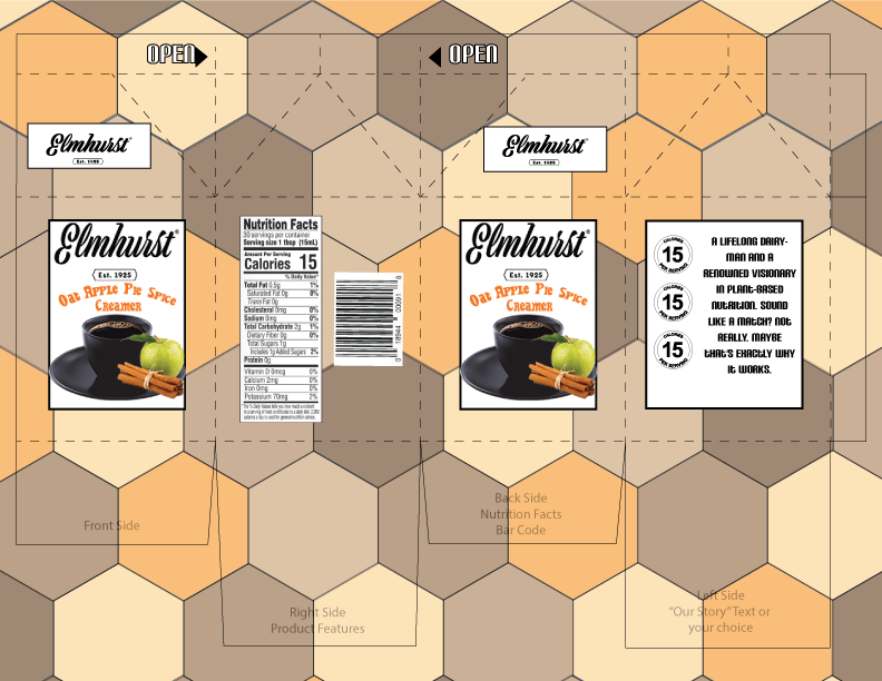
I tried to keep the over all package design relatively simple since all their products follow this approach. However the all white they use now is boring so I thought id add some fall colors since when I think of apple spice I think of an October day. As for the front I tried to keep that as simple as I could as well as the background is already busy enough I didn’t want to add too much to the package.