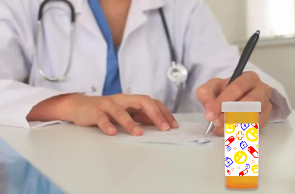
Metaphor: “Laughter is the best medicine”
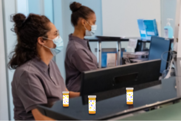
This project despite being simple had some challenges that I had to overcome. For starters however I learned how to take two photos and make them into one picture. While I had done similar stuff in the past this ended up looking far more realistic something I was striving to achieve. I also knew the theme I wanted to use right away as I am a very positive person. What’s more positive than laughter!? If I could improve this design, I would like to add a little bit more effects with the prescription container and try and make it look even more natural. To incorporate a pattern, I added a pattern to the script rather than having the patients name/information. The main challenge I faced in this project came in the form of perspective and scale. My first attempt at this project (Seen below) had 3 prescriptions. However the scale was far to small to effectively see the pattern I had developed. Instead I went back to the drawing board and reinvented my design. In this design the prescription bottle is in the foreground making it of larger scale.
