After brainstorming some ideas for how I want to approach my second app, I thought of how much music means to me in my daily life, and how the social atmosphere from live music/concerts is gone. As a possible solution, I want to create an app that acts as a “virtual” concert, where users can follow artists who are a part of the app and plan live streams for scheduled dates. The user could then pick a “concert” date to attend, and on that day, the user can join a room where they can watch and hear their favorite artist perform, as well as chat with other virtual audience members.
Note: This idea is broad in scope and I am working on ways to narrow down its functionality and goal.
I will solve the problem of artists losing revenue by providing a profitable subscription-based service, to help musicians accomplish earning money for “live” performances.
I will solve poor streaming quality by providing live shows to be streaming based on the audience’s area , to help live music audiences accomplish a virtual concert experience as close to real life as possible.
I will solve the disconnection of fan bases by providing a live chat room during shows to help “fandoms” and fan culture accomplish connection through music once again.
I will solve ticket purchasing by providing a subscription service instead of individual tickets, to help listeners accomplish unlimited virtual concert attendance.
I will solve finding artists by providing a genre-oriented database, to help fans accomplish finding new and current favorite artists more easily.
I will solve user-testing by providing a free trial with no credit card requirement, to help potential users accomplish a trial of the app with no commitments to see if they want to purchase a subscription.
When I began designing my app for Project 1, I had the challenge of deciding how far into the “developing” aspect of the app I wanted to go. This was a matter of deciding what I should leave as a prototype portion of the app, such as giving the user the ability to actually input information (which I later learned you cannot accomplish with Figma alone). Therefore, the app’s design and development with the Prototype feature in Figma became a thing to wrestle with.
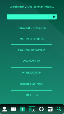
I wanted Businex to be as close to functional as it could be. And as far as the features and depth of my app go, I think I was pretty ambitious with the app’s functionality. For instance, I gave Businex a main interface that can navigate to Emailing, Archives, Financial Reports (and graph creating), Calendar Lists, and my own “Nexus Team” sector. The app flows pretty easily from screen to screen, although I should note that certain screens like the General Search are strictly designed and not fully developed to be functional. Below is that screen displayed, but due to time constraints and a learning curve, I was unable to really make this screen do anything more than appeal visually to the user.
Question 2: What was easy?
In my personal experience, the most straightforward part of the app was the design and its framework. Creating components that I could later reuse was extremely convenient and efficient for creating a consistent color scheme and design, and I learned that Figma is a really great app for designing vector logos like my “Businex” main logo and the icons on the bottom taskbar. The design was easiest for me because I have much experience in graphic design, and this was not my first experience with Figma, so I was able to flesh out ideas in real time because of a more nuanced understanding of the platform’s interface. I also would add that the “ALT” shortcut to see the geometric measurements and spacing of objects quickly became my favorite feature in Figma during the development of Businex.
Question 3: What was challenging?
I recall two specific things about this project that I found myself griping with: the Prototype feature in Figma, and how to properly integrate feedback into the development of the app.
First, the Prototype feature is not complicated in theory. It is actually quite user-friendly to shift back and forth between the Design and Prototype tabs when one needs to make a small tweak to a design before giving it some travel capability, and vice-versa. However, what I found was that the further into the app I got, the more components I created and so on, the more intertwined the paths of the Prototype buttons became, and this is where I needed to understand my app very well. For example, I designed a semi-permanent taskbar to be constrained to the bottom of nearly every frame in the app so that the user can travel from page to page quickly and easily. But this tended to be convoluting visually, as I needed about 6 paths out for each icon on every single frame. This is why the Prototype feature is meant to be, at least I’d presume, limited to a threshold that can only then be surpassed with some actual coding.
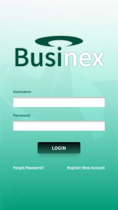
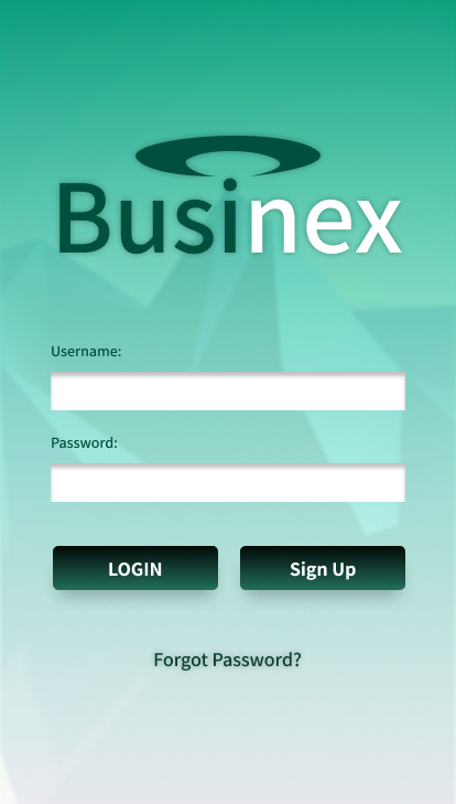
Second, the feedback I received from my professor and my friends alike was helpful all in all, but also tough to decipher. I mean, sometimes, I would receive constructive feedback that I knew was highlighting a positive change for the design. Such a time can be observed when Professor Dunkle pointed out my aforementioned Register and Forgot Password buttons, which he said lacked contrast and carried too little weight for the user to easily see. This was a simple fix:
BeforeAfter
However, other times I was not sure on certain feedback because of user subjectivity. I would ask myself “Would it actually be easier this way? Or, is my standing design going to appeal to more users as it is?” Thankfully, I believe that as I kept considering feedback and different perspectives, I could holistically make a version of the app that was comprised of many different viewpoints and opinions, but still true to my own vision.
Question 4: How could your submission be improved?
Honestly, I would love to see how the app could work if it was fully developed with HTML, CSS, JavaScript, etc. The design and interface as it is definitely isn’t perfect, but I’d like to humbly think it has potential in the business world, possibly as a real interface for a small to medium sized company that needs a way to connect their workforce. If I had more time and the hindsight to make minor changes to the design and bring it up to the ambition I had for it, I could see it being pretty useful and professional for others to use in the future.
Question 5: How could Professor Dunkle improve the assignment for the next class?
Despite my terrible tendency to lack real constructive criticism on this question, I really did love this project and learned quite a bit from it. One possible way to improve the assignment could be to build this into another assignment. To elaborate, I was proud of what I could accomplish within the scope of the expectations for this project, but I’d also love a cumulative project where we could get into the back end of the app, learn how to code some of its processes, and then finish the course with some kind of finished, or at least polished app that we could maybe give to a client.
Question 6: How might you apply your knowledge in future assignments or work scenarios?
Undoubtedly, the skills I learned in Figma and slightly in CodePen for this project will be extremely useful in my future work, both for DMA courses as well as my work in the field. Since I intend on obtaining an internship in the near future, I could easily see myself coming back to Figma for anything design related.
Question 7: How did a specific reading or video inspire or help you?
The video we watched near the beginning of our class about the TX-2 computer was eye-opening for me, and really taught me that you can always work with what you’ve got, and there are certainly endless possibilities with the technology available to us today.
Furthermore, the article discussing “user-centered design” allowed me to see my project through the lens of the user, and was ultimately helpful for decision-making when it came down to picking an affordance or just writing out a clickable button in text.
Finally, I really enjoyed and got to learn a lot from our guest speaker, Jonathan, who works at HelmUX. He was able to afford a lot of knowledge from an esteemed vantage point when it comes to app and program development, and I greatly appreciated the time he took to speak with us and provide some dialogue on the class.