Work from DMA 384, Typography.
Lab 1:
Figma:
https://www.figma.com/file/d4OHzrDwWhWa5y32Mq9zLk/Untitled?node-id=0%3A1
- What did you learn? – How to manipulate and adjust text in Photoshop, Illustrator, Indesign and Figma.
- What was easy? – Changing the fonts, downloading them, moving them.
- What was challenging? – Trying to manipulate each point was a bit tricky depending on the font (because there are a lot of anchors and would take a bit to get perfect)
- How could your submission be improved? – More effects, and font changes (like turning, adjusting)
- How can the professor improve the assignment in the future? – I think it is fine as it is just because it’s a basic tutorial that shows the difference between the multiple programs we’ve all used before.
- How might you apply your knowledge in future assignments or work scenarios? – It will certainly help throughout this class and any designing or text based things I will need to do, as they are the basics.
- How did a specific reading, video or example inspire or help you? – N/A
Lab 1 Type hunting:
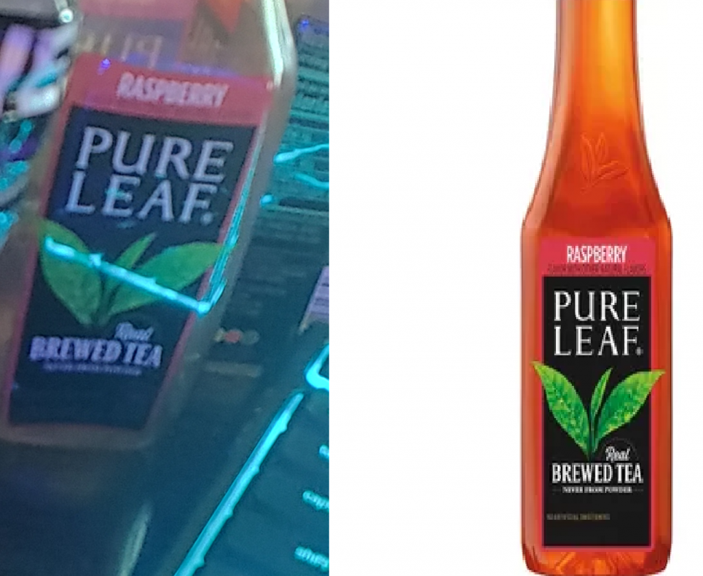
(one photo taken from online due to poor camera quality)
The reason that Pure Leaf’s type has stood out to me is because of how simple and square it seems. It’s easily blockable, or stackable, and easy to read, but it also just has that tiny bit of flair with the tail of the U, and the sharpness of the R. I also really enjoy how “Brewed Tea” is in an incredibly similar font, however a bit simpler.
Lab 2
https://www.figma.com/file/EH4q7CQRDS7viU0dk5xjZ8/Lab-2-Copy?node-id=0%3A1
- What did you learn? I learnt that different types of typography may look good, but may be rather difficult to read, especially when converted to pixels. I also learnt a bit more about how to use figma
- What was easy? It was easy to do the very straight fonts.
- What was challenging? The curvy fonts I attempted to do, but I disliked the way they looked a lot despite a lot of tweaking and editing.
- How could your submission be improved? I could probably make the shapes look a bit better of the fonts
- How can the professor improve the assignment in the future? Maybe having us do most of them instead of just a few?
- How might you apply your knowledge in future assignments or work scenarios? Knowing this I can try to avoid creating unreadable fonts
- How did a specific reading, video or example inspire or help you? N/A
Lab 2 Typehunting:

The reason I liked the font for Flipz is because the way the font looks reminds me of a pretzel. The preztels have those little “nubs” or knots where they overlap and it looks very comparable to the font. Also the slight bubbliness of the font makes it a perfect fit for the product.
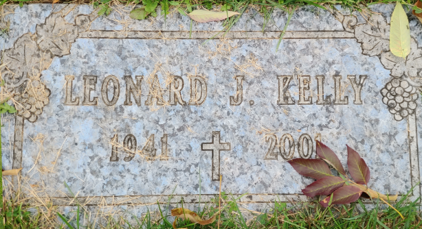
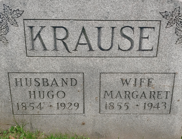
Lab 3: Forest Lawn Typehunting
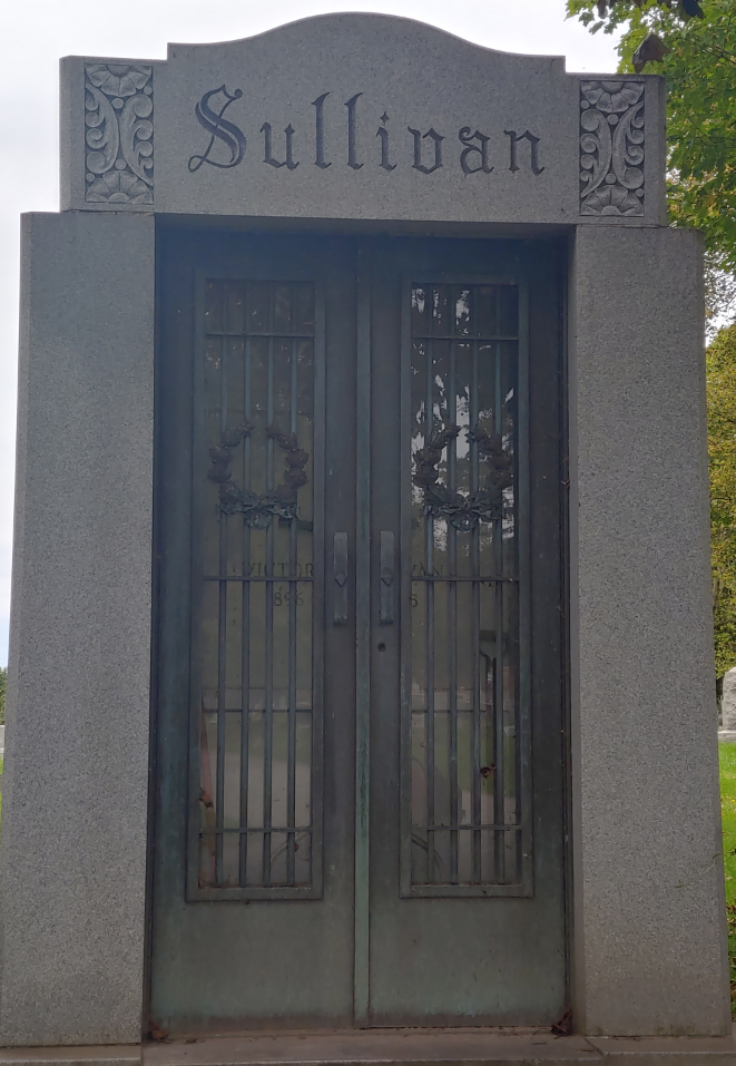
This is Blackletter because of the overly fancy look of the letters.
This is a slab-serif font because of the blocky feet on the letters.
This is a serif font because of the feet on the letters.
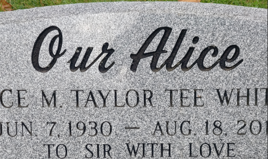
This is a script font because of the cursive look to it.
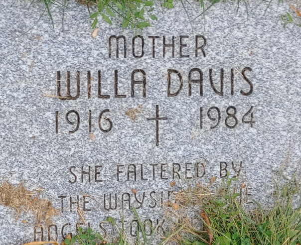
This is a sans-serif font because there are no feet to the letters.
Project 1

Project 3
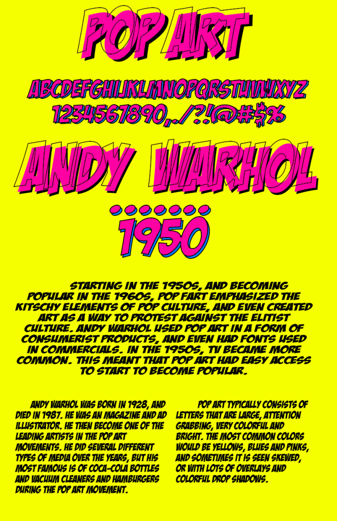
- What did you learn? How to incorporate typography into a poster
- What was easy? Doing the research, and finding out which font style/movement I wanted to do
- What was challenging? Making it look good, Pop Art is incredibly obnoxious to stare at for long periods of time, and it became difficult over time to stare at the bright colors, and the font
- How could your submission be improved? I think the way the paragraphs are layed out could be better, however I tried my best to make them organized.
- How can the professor improve the assignment in the future? It was a bit unclear if I had to put the essay in the poster, or seperate it, I eventually assumed it would go on the poster based on the examples. (Based on the instructions)
- How might you apply your knowledge in future assignments or work scenarios? Making posters with blocks of information on them could be very useful for businessess.
- How did a specific reading, video or example inspire or help you? N/A